Archive for the ‘Art History’ Category

h1

How I Became an Alcoholic

September 29, 2018

I have been drawing my whole life, but I’ve never been very comfortable using color, so I avoided it and secretly felt some shame that I was supposedly an artist but couldn’t paint.

In the rare instances when I did use color, I usually went with colored pencil or water-based Tombow markers. I enjoy working in both of those mediums, but I’ve never been totally satisfied with the results. The markers don’t blend well, and I can’t get much vibrance out of colored pencils.

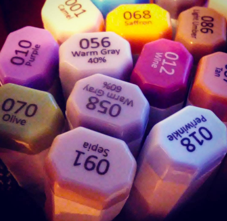
Then one day last year I bought a small set of alcohol-based markers. I wasn’t really paying attention and kinda bought them by accident. To be honest I didn’t know the difference between alcohol and water-based markers. But I used those markers to make some photo-booth props for a party I was helping to plan, and I was thrilled with the results. They blended so well, and the colors really popped.

Photobooth mouths

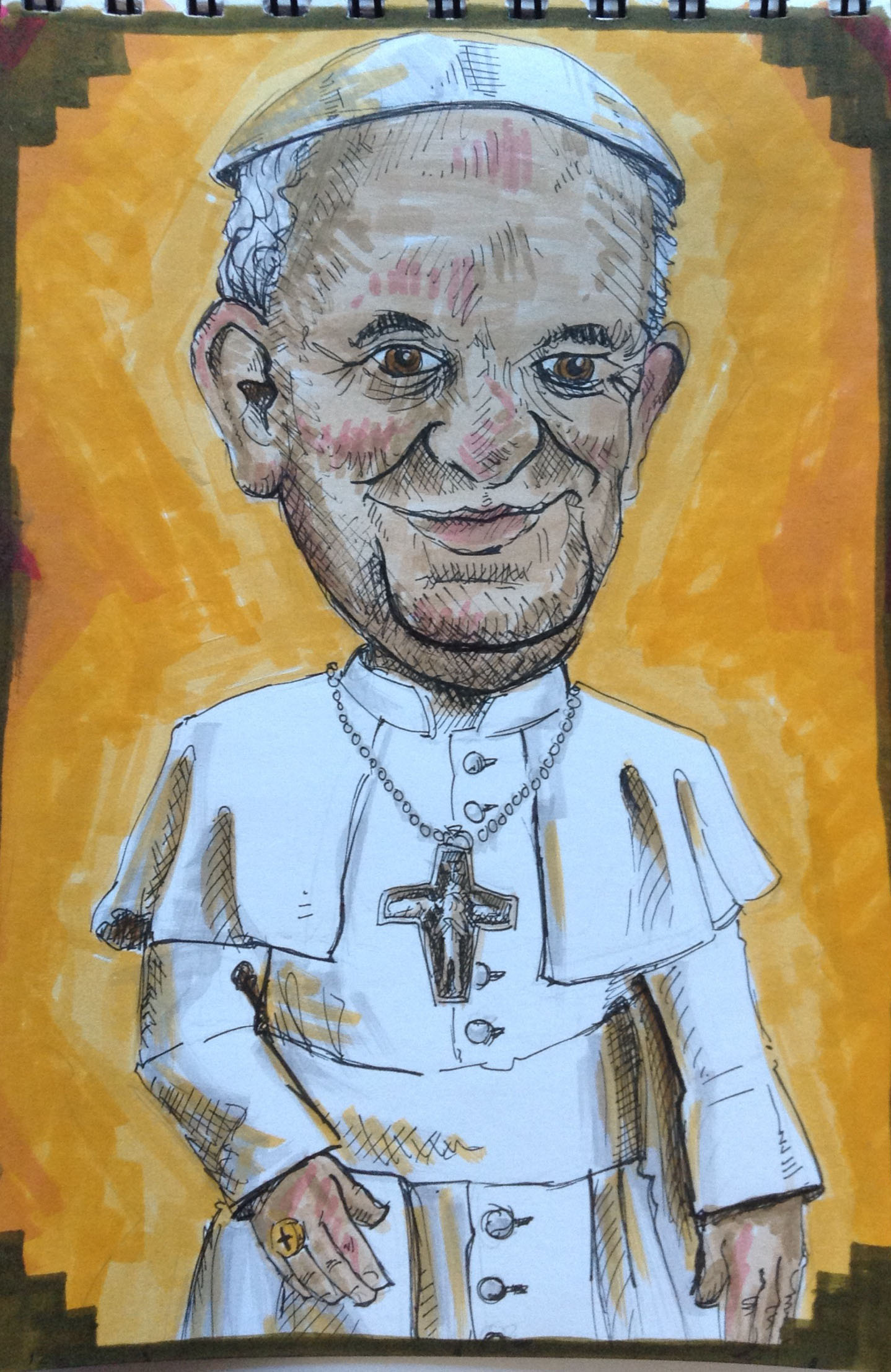
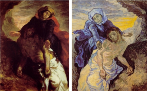
I had long been toying with the idea of doing big head caricatures of old master portraits, and these rad new markers seemed like the perfect medium.

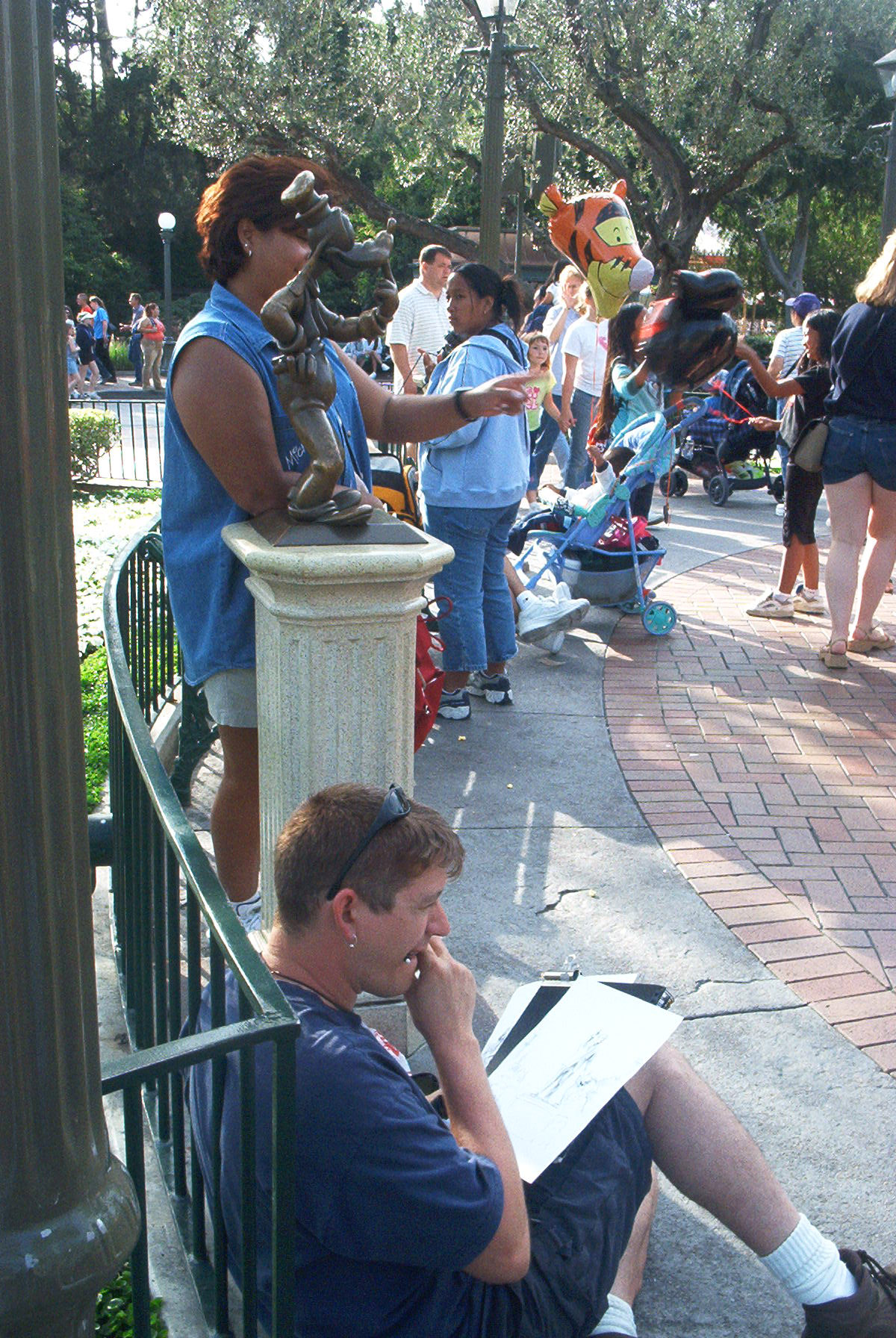
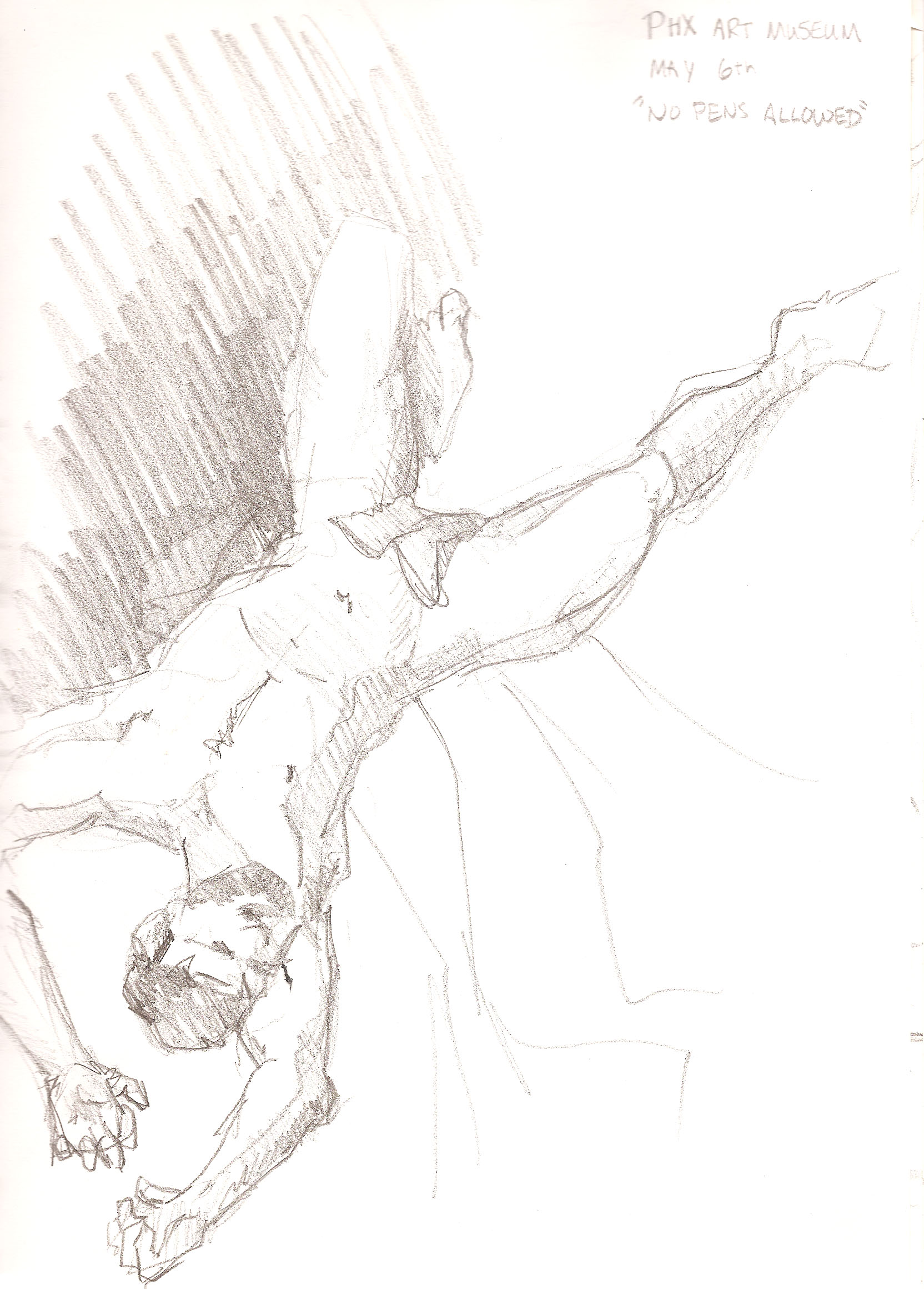
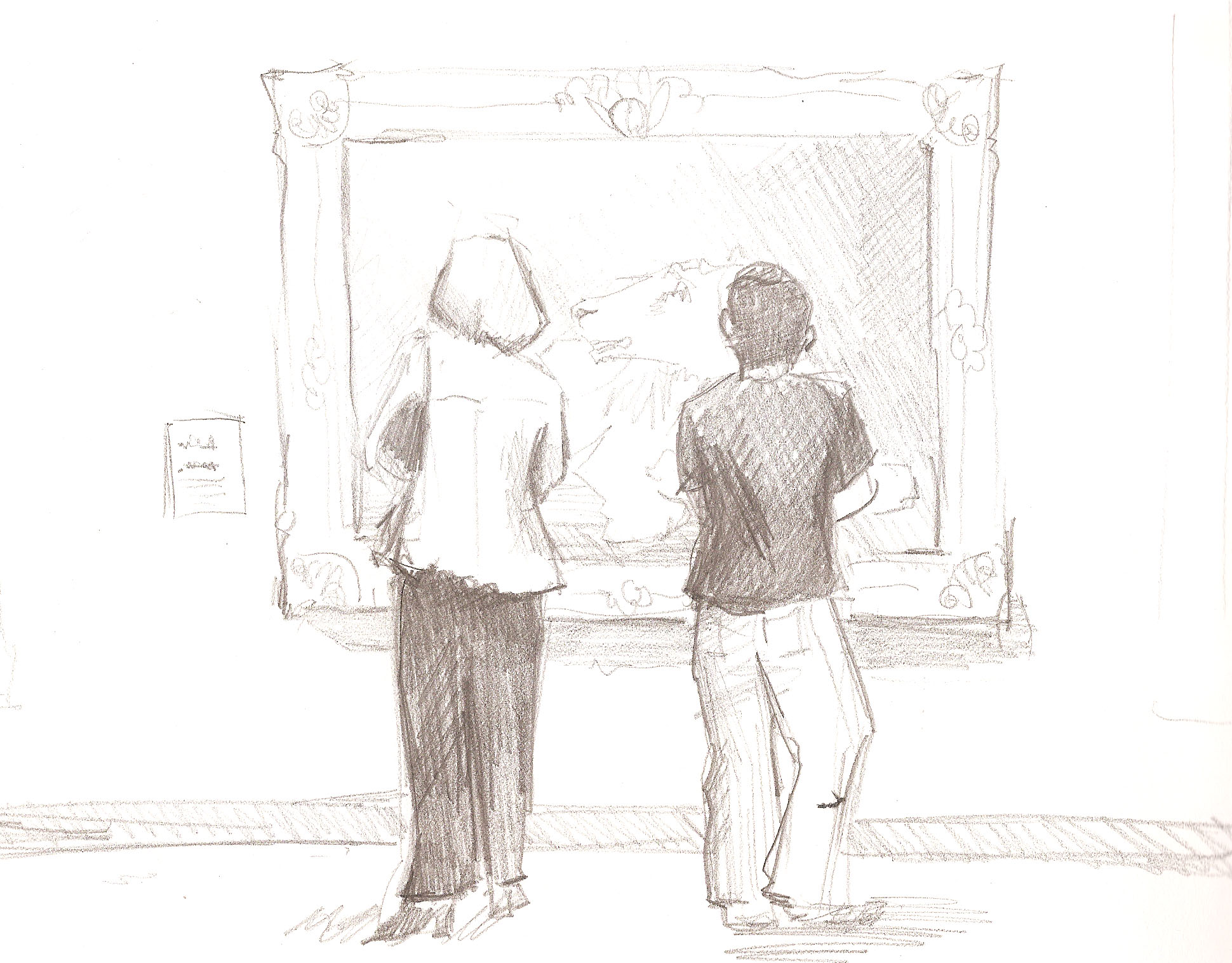
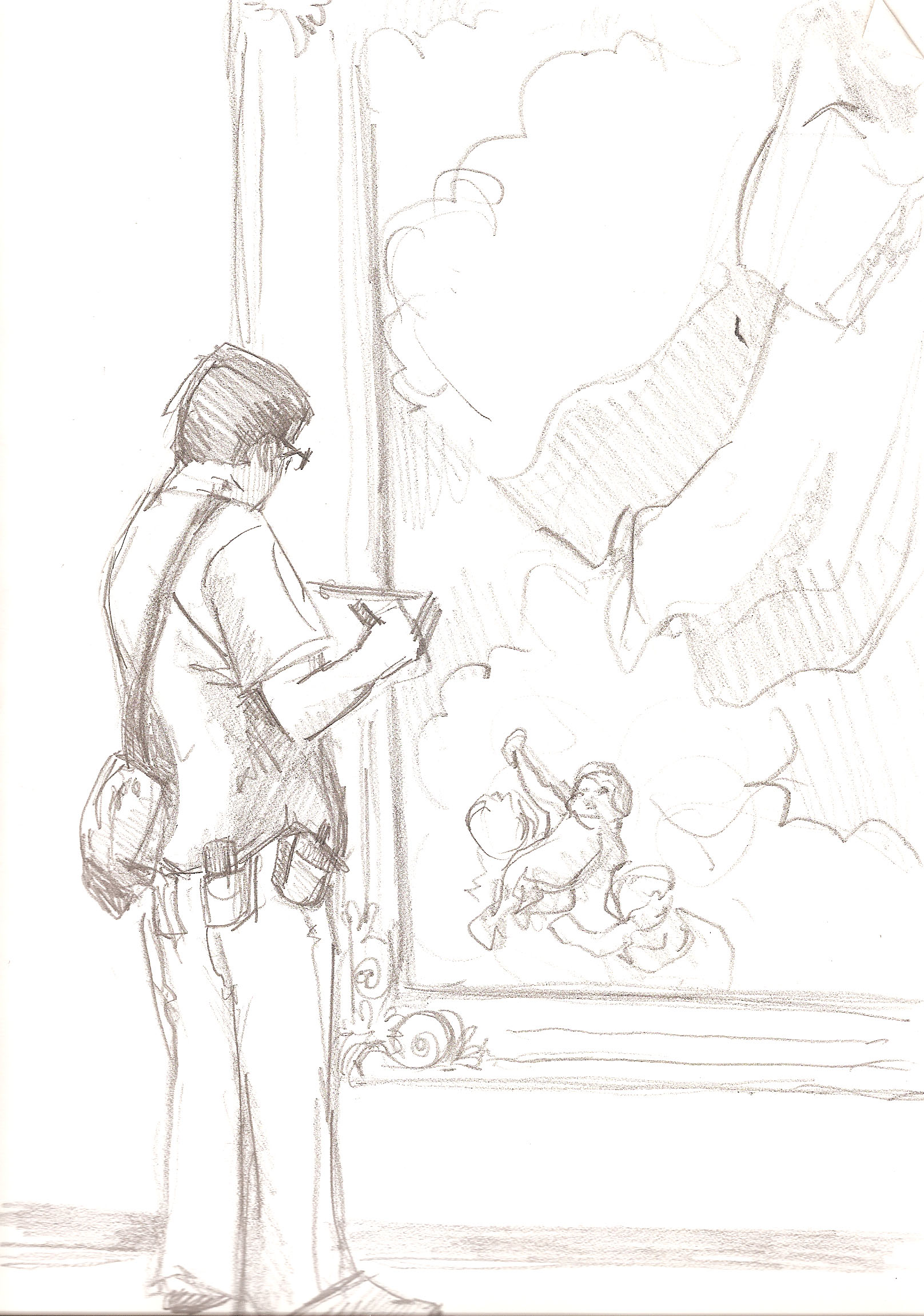
Right around that same time the Phoenix Art Museum opened a new exhibition called the Schorr Collection which had a bunch of old master portraits. So I did some pencil sketches of a portrait on location at the museum, and then went home, very excited to complete it in ink and color.

My set of alcohol markers only had six colors, so I attempted to add in some of my Tombow markers in order to have a wider palette. And that’s when I learned that water-based markers and alcohol markers do not mix…


My first attempt at an old master caricature was a total bust.

I returned to the store with the intention of buying four or five more colors to add to the mix, but ended up buying eighteen!

18 new markers

Then I went back to the museum, did more sketches of portraits, brought them home and markered the s#¿+ out of them.


I was really pleased with how some of them turned out.


Others not so much.


But I watched some tutorials online and learned some tricks on how to use alcohol markers.


It was by far the most success I’d ever had using color. Whenever I completed one I  felt excited to do another.


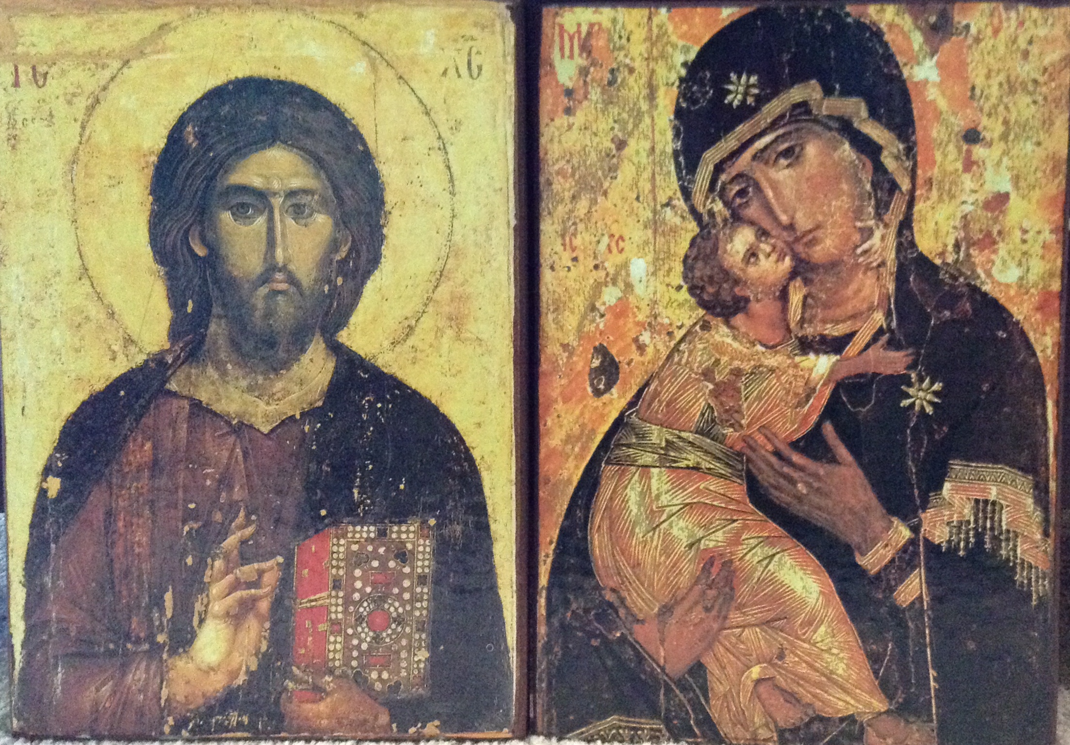
I lost my photos of the original portraits on these two. 😦


After I’d done a bunch of these things I decided to take another shot at that first Lorenzo Lotto portrait using my newly acquired skills. Here are some WIP pics…


I was much happier with the result this time around.

0827170816

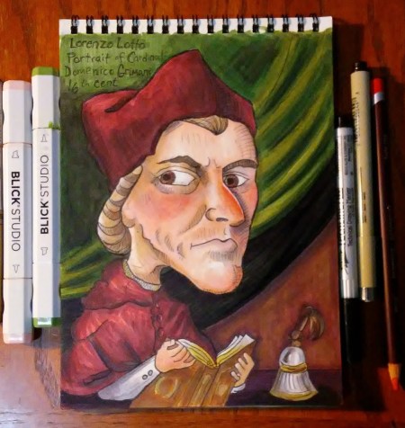
And when comparing it to my first attempt I could really see the progress that I had made. It felt good. This was the biggest leap forward I had taken with my art in years. All because of alcohol markers.

I hate to admit that I had to buy myself some new toys in order to become a better artist, but that is kinda what happened.

Here’s a before and after to show how much difference a few weeks of practice (and 18 more markers) can make. 🙂


h1

Comic Strip Dots

June 29, 2014

Yesterday Richard and I went to the ASU Art Museum to see some new Andy Warhol prints that are on display there. They were okay, but R and I both agreed that Warhol the person is way more interesting than his work.

Luckily they had another exhibit going on called Funny Papers that was really cool. It included prints from many 19th century political cartoonists like Damuier and Nast (the guy who basically designed Santa as we know him).

There were also a ton of original early American comic strips such as “Blondie” and a bunch of others that I had never even heard of before. I loved looking at those because you could see where the artists had put white out over their mistakes, and you could also see where they had applied Ben-Day dots onto certain areas, such as a piece of clothing.

Looking at all the different comics displayed next to each other, I really noticed how much more realistic the figures look in the dramatic strips than they do in the funny ones. There was a panel in one particular strip that I couldn’t stop looking at, because the artist had done a really good job of capturing the posture of a boxer resting against the ropes in a boxing ring between matches.

So while I was there I attempted to recreate that panel. Then when I got home, I remembered that I had a sheet of “Maxon Comic Strip Pattern” that an art store was giving out for free at a special event I attended last year. I had been saving that sheet for something special (translation: I was too lazy to try to figure out how to use it) and decided that now was the time.

comicboxer


Basically this stuff is a sheet of adhesive paper with a halftone pattern printed on it. You cut out the shape that you want, peel off the back paper, and apply the pattern to the section you want to have the halftone. Then you scrub it with a burnisher. Or in my case, the handle of your scissors.

My halftone experiment was a little sloppy because I did it hastily on a cluttered desk with scissors too large to be precise. But I really like the effect, and I am glad that I finally gave it a try.

I am definitely going to incorporate this technique into more of my stuff, but next time I intend to execute good craftsmanship by taking the time to trace the area accurately, and cut out the pattern with an exacto knife rather than a clunky pair of scissors.

h1

A New Pope

February 8, 2014

Sometimes, for reasons unknown, you gotta draw the pope. Like when you see him on the cover of Time Magazine and think to yourself, “Now that’s a chin.”

pope2

My drawings of late have generally been very colorful with lots of contrasts, so a guy with white hair in a white outfit was a good exercise in holding back.

When I did the yellow background I guess I was thinking about heaven and halos and the light of God or something. When I showed it to Richard he said, “It’s like those icons.”

To which I replied, “Say what?”

Then he went into his office and came out with these two religious icon things that he got in Romania. Both have yellow backgrounds. 

idols

So maybe it was the religious art from the days of yore floating around in my subconscious that inspired the yellow background.

h1

Lincoln

January 28, 2013

With that Lincoln movie up for an Oscar this year, it got me thinking about all the sketches I’ve done of Lincoln over the years. He was kind of an odd looking guy with that long gaunt face and weird beard, which makes him very fun to draw.  Lucky for me, there seems to be more statues of him around than anyone else in history. So whenever I come across one, I sketch it.

bust of lincoln

Disneyland art gallery, 2011

Rushmore 2

Mount Rushmore, 2003


Abe Mem 1

Lincoln Memorial, 2009


Abe Mem 2

Lincoln Memorial, 2nd attempt, 2009

Mount Rushmore, 2012

abe statue

A park in Portland, 2004

Great Moments with Abe

Great Moments with Mr. Lincoln, Disneyland, 2012 (I did this one in the dark)

h1

Not that you asked…

January 25, 2013

I was on an airplane last year and an older woman was sitting next to me, looking over my shoulder as I worked in my sketchbook. After a while she told me that her granddaughter, who was in kindergarten, was exhibiting a talent for drawing. (By the way, EVERYONE’S grandchild exhibits a talent for drawing). The woman asked me if I had any advice for how to nurture the child’s talent.

I was very flattered to be asked this. I thought about it for a while and realized I have no idea how one should go about nurturing a child’s talent. My mom wanted me to get into medicine, and it was her disbelief in my ability to make a living in the arts that first pushed me to buckle down and start developing some skills. (By the way, my mom was right. I am not making a living from my creative pursuits, but I’m a better artist and writer than I would have been had she believed that I could.)

In the end I told the woman not to worry about nurturing her granddaughter’s talent. If the girl is meant to be an artist, she will be, whether her family encourages it or not.

As for the aspiring artists themselves, I do have a few things to share. For anyone who wants to learn to draw (no matter what your age) here is my advice:

1) Copy copy copy! Get out the newspaper and copy the characters on the comics page. Copy them over and over again until your drawings looks exactly like the ones in the paper. Then move onto some more complicated drawings and copy those. Then go into art museums and copy the masters. This is not cheating. This is how you learn to see. The masters became masters by copying the masters. Some of my favorites to copy are Heinrich Kley, Robert Henri, Rembrandt, and Van Gogh.

My copy of “Madonna With the Long Neck” by Parmigianino

madonna w long neck

2) Get a sketchbook and take it everywhere you go. Draw trees, chairs, buildings, flowers, statues, your friends, your family, and total strangers. Learn to be inconspicuous about it. Actually forget that. Learn not to care if people notice that you’re drawing. So what if you are? You’re trying to develop a skill. What are they doing? Sitting there drinking a beer? You’re working to improve yourself. Own it. Be proud. Let people look over your shoulder. Let them see if they ask to see. Even if what you’ve drawn sucks. And believe me, those first few years, it will suck.

My pal Mike Petry, who taught me to always bring a sketchbook

IM000508

3) Be okay with sucking. It’s going to take a lot of sucking at drawing before you get good at drawing. Just accept that fact and start drawing. You are going to do some 100 thousand crappy drawings in your life. You might as well get them out of the way as soon as possible so you get get onto the good ones.

On the left is Delacroix’s “Pieta”. On the right is Van Gogh’s copy of Delacroix’s “Pieta”.

pieta

h1

A VanGoghish Chair

July 14, 2012

Richard and I recently traveled to Buffalo where his aunt and uncle were kind enough to put us up for a few days. I loved the entire town and was particularly struck by houses, which were colorful and historical and so so so different from the rows and rows of cookie cutter houses here in AZ.

(For the record I hate the term cookie cutter houses.)

Anyway, the houses all had a real sense of history. The room we stayed in had this awesome old chair that I became obsessed with drawing.

The reason I was so drawn to it was because it reminded me so much of this painting by Van Gogh.

I’ve been trying to draw more chairs lately, as well as trees and buildings and other non-human things. I have a bad habit of just drawing people all the time, so I’m trying to make myself branch out. The chairs have been quite a challenge because there are so many angles and you really need to get them right or else it will come out pretty wacky looking. Drawing people doesn’t really pose that problem (although it poses many others). Also chairs usually sit still (unlike people) so it forces me to exercise some patience and take time to study the details.

h1

A Little Behind In My Processing

March 22, 2012

This is my first blog post in several months, and I can’t believe how easily it slipped away from me. I am still sketching all the time, but I have a difficult time finding the patience to scan and post them.

When I was taking photography in college and we learned about this one famous photographer who was constantly taking pictures, like he would go to a party and take seven rolls of film. He basically lived life through the viewfinder of his camera. But he wasn’t nearly so productive when it came time to develop the film and make prints. Whenever his friends asked how his photography was going he would joke “I’m a little behind in my processing.” When he died they found hundreds of rolls of film that had yet to be made into prints, and hundreds more that hadn’t even been developed.

So that’s me. I’m still out there making sketches. Just not doing anything with them. I have drawings that I’ve been meaning to post for months.

Here are a couple of old master copies that I did one Sunday morning in January when I probably should have been doing something else.

Portrait of an old man, late 15th century by Francesco Bonsignori. My guy came out a little more friendly-looking than Mr. Bonsignori’s.

And here is a Woman’s head, by Rubens…

Both are conte on toned paper.

I enjoy the meditative state I go into while doing old master copies. It’s not the most creative activity, since you are just copying another drawing, but it’s a nice way to get some marks on the paper when you are not in the mood to do any thinking.

h1

Carrie’s Big Adventure

October 18, 2011

Last March I went to the exciting metropolis of Cedar Rapids, Iowa to attend my little brother’s wedding. If you aren’t familiar with the reputation of this wild and crazy city, go rent the movie by the same name and you will get the idea.

I brought along my sketchbook so as to capture all of the important family moments.

Such as this gem that I did at the rehearsal dinner. By the way, I was drunk out of my gourd when I did this, so hey, not bad. I recognize some of those people. I also stole two glasses from the restaurant, and found out the next morning that I’d been unknowingly drinking doubles all night. Damn you, Annie!

Later that night the party moved to our hotel where we celebrated the upcoming union the Behrens way, by playing poker. Actually, I sat the game out. I was never allowed into the game when I was a kid, so by this point I figured, why mess with tradition? Also, I was still intoxicated.

Ah, here we are at the wedding. When I got married my friend Michael did a lovely little sketch of me and my husband saying our wedding vows that turned out to be the greatest gift we could have ever received. I had hoped to do the same for Brady, but alas, It just didn’t come out too good. That’s the problem with sketching. Or at least, that is the problem with me. I never know–or have any control over–when I’ll be on fire and when I’ll draw as though someone replaced my hand with a dead fish.

I did this one at the reception sometime after dancing the Macarena but before pocketing several fistfuls of M&Ms to ensure that I would have some food for the next day. Hmm. I really committed a lot of theft on this trip. I guess Cedar Rapids just brings out the criminal in me.

The day after the wedding most of my family left early to return to their various midwestern towns. But my flight didn’t leave until that evening, so I figured I had better take in all the Cedar Rapids I could while I still had time. I took a cab down to the Cedar Rapids Museum of Art, where I did sketched these three guys.

Fun Fact: Grant Wood, the guy who painted American Gothic (you know, the old farm couple with a pitchfork standing in front of a house) came from–you guessed it–Cedar Rapids! And while I was not fortunate enough to see American Gothic at the CRMA (it’s in Chicago) I did see another one of his major works: Woman with Plant.

By the way, in case you’re now doubting my skills (and really, I can’t blame you) I would just like to point out that in the real “Woman With Plant,” Grant Wood painted the woman’s black shirt to look extremely flat. Google it if you don’t believe me. My flat crosshatching of the shirt was an attempt to copy that. Also, does that poor woman look miserable or what?

After a few hours at the museum I spent the rest of the day walking across the entire city. I could have taken a cab, but that would have cost $20. And more importantly I would have missed out on an opportunity to experience the true flavor of Cedar Rapids. Some highlights include: Coe College, Mount Mercy Hospital, and at least two Hardees.

We have now reached the conclusion of the trip. I will close this post with a few scenes from the airplanes and airports as I journeyed to and from the great state of Iowa.


 Thanks for reading.

h1

Covers

July 14, 2011

Here is the sketchbook that I’ve been using lately. The covers are flimsy and don’t provide that support that I need, so I collaged things onto them in order to make them a little sturdier. On the front I have some pictures I saved from an old Futurama calendar.

The inside of the front has some random postcards from art shows, along with a sticker from Phantom Ranch to remind me that this is the sketchbook that I lugged down into and back out of the Grand Canyon.

On the inside of the back cover I attached a pocket so that I can keep postcards and other random papers. It is always handy to have a couple postcards around in case you want to draw something and you have no interest in drawing your surroundings. (Better artists than me would draw things from their imagination)

The photo of the old man sculpture is from a catalogue of an exhibit we had at the library a month or two ago. Sketches from that exhibit can be seen here:

https://sketchbookfactory.com/2011/05/27/chinese-statues/

On the back cover I pasted a large postcard that I got from the Bodyworlds exhibit a while back. The art anatomy reminds me of the life drawing books I studied in college. I had to add the Disneyland sticker to remind me that I’ve got drawings from my last Disneyland visit in here too.

h1

No Pens Allowed

July 9, 2011

A few drawings from the Phoenix Art Museum, where it is absolutely forbidden to draw with a pen. They only allow pencil, which seems to be a rule enforced by only the lamest of museums. In the Louvre you can can take pictures with flash, you can set up and easel and do a painting right in front of the art, but in stupid old Phoenix Art Museum (which has a nice collection but seriously, nothing famous) it’s pencil only and even then you will have guards breathing down your neck. Same thing with the Guggenheim Vegas.

I actually enjoy drawing in pencil but it makes a big mess of the sketchbook and after a couple years of rubbing against the next page you are left with nothing but a large grey smudge. I have taken to taping a piece of wax paper over pencil drawings, and that seems to protect them  pretty well.