Archive for the ‘People & Places’ Category

h1

How I learned to stop worrying and love the color wheel…

December 17, 2018

When it comes to drawing people in public I always run into two big challenges:

1) People rarely sit still.

2) I don’t want to get caught staring at them.

That’s why I love going to play readings.

If you aren’t familiar with the theatre world, a reading is part of a playwright’s development process. Once they have finished a draft of their play, they invite actors to come read the script aloud for a small audience of trusted friends and creatives, who then give feedback about their experience. The playwright uses that feedback to help inform their rewrites.

Play readings provide a great opportunity to draw people because the actors sit in relatively the same position for the duration of the play, and as an audience member I am supposed to look at them. So I get to hear a play for free, be part of a playwright’s creative process, AND get some good sketching in. Triple win!

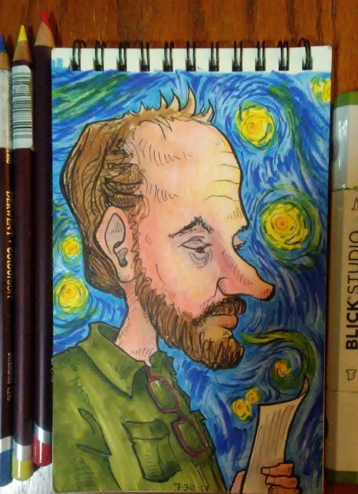
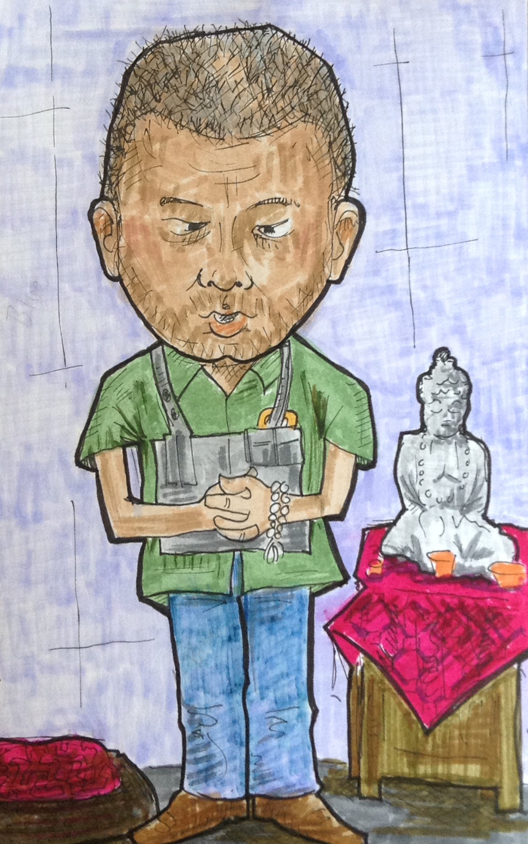
Some time ago I attended a reading of a play called Ear*, written by my brilliant friend, Ashley Naftule. Ear is a f’cking great script, loosely inspired by my man Vincent Van Gogh.

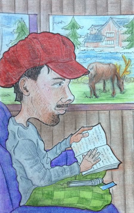
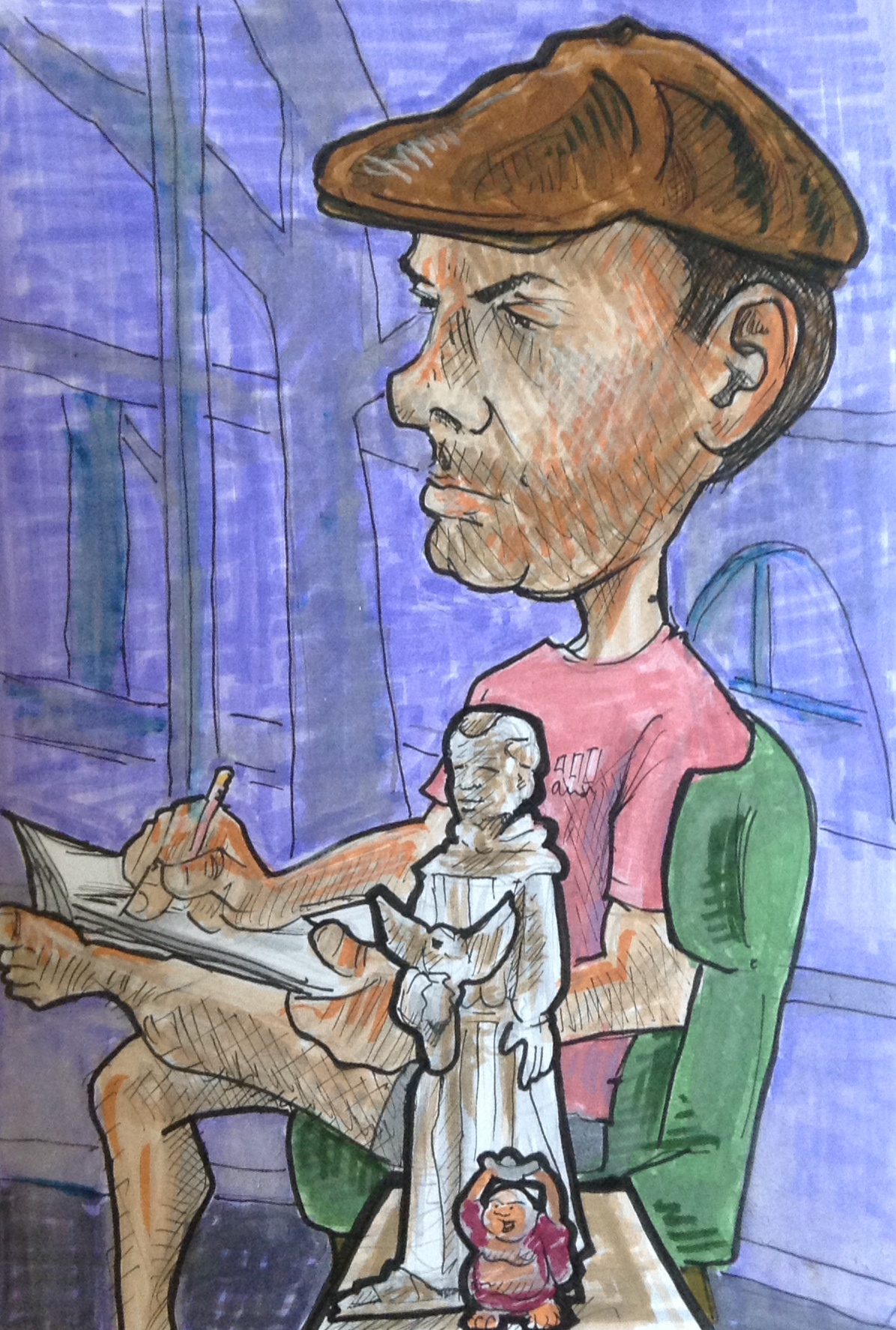
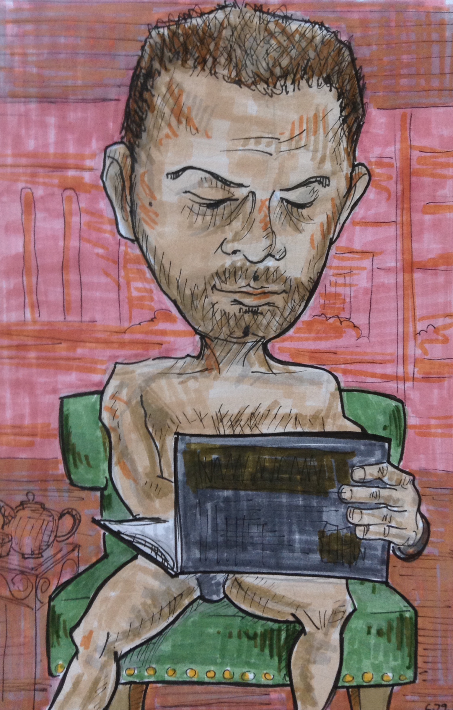
Meet Steve and Marcella, two of the actors from the reading.


I was real happy with how these two drawings came out, and I kinda agonized over whether or not to color them.

This was right around the time I was first starting to become an alcoholic.

On the one hand, I knew that I needed to continue pushing myself out of my comfort zone of black and white, and into the wonderful world of color. On the other hand, I liked them in B&W and was afraid I’d eff ’em up!

Then I remembered that you can’t move forward without taking risks, and you sure as hell shouldn’t be precious about your stuff. So I dove in.

(BTW, I realize that using the word risk in reference to coloring a little 4×6 inch drawing might be a stretch, but I can’t afford to go skydiving.)

Before going to town with markers I laid down some undertones with red, blue and yellow colored pencil. I learned how to do this on a great You Tube channel called Kiara’s Studio. Kiara calls this “color zoning.”

0902171700

The pencil undertones show through the marker layer and create a level of depth and richness that I think would be difficult to achieve with markers alone.

Since we were reading a play inspired by Van Gogh, I put a third grade quality version of Starry Night in Steve’s background.

(Third gradeness not intentional, just the best I could do.)

0903170813a-e1543766937709.jpg

For Marcella’s background I wanted to do a simple design with colors that would compliment the one’s I used on her face.

I have a pocket color wheel that I use all the time when figuring out color stuff. It’s a great tool. For this picture I chose a split complementary color scheme.

0903170812

The reddish orange area of Marcella’s cheek seemed to be the most eye catching area to me, so I used that as the base point. The complement of red-orange is blue-green. In a split complementary scheme you use the two colors one each side of the complement, hence the blue and green background.

split-complementary-colour-elegant-image-result-for-split-plementary-colors-color-wheel-of-split-complementary-colour-e1543839048839.jpg

In the end I was real happy with how these little portraits came out, and so so so glad I faced my fears and colored them.


I know that I still have a long ways to go when it comes to color and markers, and even when it comes to drawing. But I feel like I’ve made some big strides forward this past year or two — not just in art but in other areas as well — and that has everything to do with trying sh*t that feels kinda scary.

Pretty much 100% of what I know about using alcohol-based markers I learned on You Tube, mostly from Kiara’s studio. She specializes in portraits and is amazing with skin tones. She’s also on IG at kiarasstudio. Her work is lovely so go check it out.

*Happy side note: Ear went on to have a very successful production at Space 55, and was nominated for several awards! Way to go Ash!

h1

Special Features

November 30, 2018

I am crazy lucky that I just happen to be married to my favorite person to draw. And although one might assume that any artist’s favorite person to draw would be their spouse — because they love them so much or whatever — that’s not really true.

(Although I do love him so much or whatever.)

Richard would be my favorite even if I was married to someone else. He just has a really fun face. And he’s actually a life drawing model, so there are lots of artists and teachers around town that agree with me.

0403171413a.jpg

There are some types of faces that I find tough to draw. This has nothing to do with their level of attractiveness. I know tons of people that are super good-looking, but whose likeness I just can’t seem to recreate on the page.

The people I find the most challenging to draw are kids. I think this has something to do with the lack of special features: the things on your face OTHER than eyes, nose, and mouth. This could be things that are actually part of the face such as wrinkles, moles, facial hair and scars. Or it could be add ons, like glasses, braces, nose/lip/eyebrow ring, a cigarette, or a monocle.

(Sadly, I don’t get nearly enough opportunities to draw people with a monocle.)

Richard has a lot of special features. He usually has facial hair. He often wears glasses. He has 3 tiny moles that form a triangle on the upper left side of his face. He has another mole on his right cheek. He has a very distinct nose, and these mischievous eyebrows that sometimes make him look like an evil magician.

0615171010b

All that extra stuff helps break up the face, which makes it easier to translate a 3 dimensional human onto a 2 dimensional plane. I can get the size, shape, and angle of something more accurate by looking at it in relation to something else.

For example, whenever I do someone from a 3/4 angle I almost always draw their face too narrow the first time around, and I end up having to erase and adjust. I never seem to put enough distance between their nose and their ear. That’s because there usually isn’t much there. Cheeks are kinda like the desert of the face. Just a big open space with not much happening, which makes it hard to determine where things land.

In the drawing below I was able to use Richard’s glasses to figure out the distance between his eyes, nose and ear. And even though my style is way more caricature than realistic, the same rules still apply. Your baseline is still reality, you just choose which things to exaggerate and which things to simplify or exclude.

0606170901.jpg

In addition to the special features on his face, Richard is also a big fan of accessories. He loves watches, rings, wristbands, buttons, all kinds of hats, and fun T-shirts. He also likes to change up his look regularly. He’ll shave his head in different ways, reshape his goatee, paint his nails, or put on a tie and jacket for literally no reason.

All of this stuff makes a person more fun and interesting to draw. When I am out in the world trying to discreetly draw strangers, details like these will inform the story that I make up about the person in my head.

I did all of these drawings with pen and colored pencil. One of the challenges with using colored pencils is that because of the nature of the medium, a lot of paper shows through, even with with layering, so the drawing comes out looking kinda dull and muted.

The way to fix this is by blending. There are several methods you can use to blend. My favorite way lately is to use a Prismacolor colorless blender MARKER. This is basically the same as using rubbing alcohol solvent, but it’s contained in a handy dandy marker.

Afterwards I use a white gel pen to add some highlights. (Not too much!)

0406171357.jpg

One cool thing about being married to a life drawing model is that he is used to being stared at AND he’s great at sitting still. So whenever we go out to dinner he lets me sketch him while we’re waiting for our food. It’s way better than staring at our stupid phones.

h1

Bus People

August 25, 2018

A loooong time ago I posted about a trip I took to NYC where I did a bunch of little caricatures of people on the subway and it was really fun and definitely a lightbulb experience. It was sort of the kick off of a new style for me, drawing these little portraits of people with big heads.

Recently on our trip to San Francisco we took the Big Bus Tour where you can get a pass to ride these cool double decker buses and you can hop on and off whenever you want. It was the perfect opportunity to do little portraits of other riders.

First of all, shout out our tour guide, Sparkle, who was so damn funny she made the rides such a blast. We actually got a 2-day pass for the big bus, and on the second day when we were waiting at the stop Richard said, “Wouldn’t it be cool if Sparkle was the tour guide again?” And then got on and there she was! We were thrilled. With so many buses going around at once, the chances that we would get on her bus two days in a row seemed pretty low. We were so lucky! I’m pretty sure she moonlights as a stand up comedian because she was cracking us up constantly.

sparkle

The coolest thing about doing these little portraits is that it forces me to really look at  strangers. And when I do that I start noticing things.

0705171103

Like if the person has a nervous little tick, or fantastic eye make up, or a really methodical way that they take things out of their bag, or they are reading something really unusual, or they’re wearing shoes that look like they decorated them by hand.

0328170908a

I see all these little things that make them suddenly seem so vulnerable and beautiful and interesting, stuff I never would have seen that if I wasn’t paying so close attention to them. In those moments I feel lucky that I got to see them in that way.

0331171328.jpg

When I am drawing people out in public I try to be as discreet as possible because there is nothing more awkward than that moment when I get caught.

“Hey what are you doing? Are you.. drawing me?”

“Uh, yeah. Sorry. Please don’t be creeped out, I’m not obsessed with you or anything, this is just what I do. And you happened to be in my line of vision which made you the most convenient person to sketch, but as I was looking at you and noticed how beautiful and human you are and I really wanted to document it.”

“Okay, I’m leaving now.”

0321171448

I carry a small notebook that keep half hidden in my lap and I wear sunglasses so that people are less likely to notice me staring at them.

I only had a few minutes to draw each person on the bus. I started with pencil, quickly sketching their face and the most interesting details about their clothing and stuff.

0315171320.jpg

Then later, like back at the hotel, or on the plane ride home, I went back over the lines in ink. And sometimes I added a background. Since we were on a city tour, I threw in major San Francisco landmarks.

0730180909a.jpg

After that I colored them with colored pencil. I did most of these back in Phoenix, after the trip was over, which is sort of a nice way to extend a vacation. Working on the drawings allowed me to relive those moments on the tour.

0424171726

It was also a good chance to experiment with color theory. Since I didn’t make any notes on what colors people were wearing, I just made it up, and played around with combinations.

0607170755

I had so much fun doing these little portraits.

h1

Snapchat in the Garden of Good and Evil

September 25, 2016

Next up in the “big head people with different backgrounds” series…

(I need to find a shorter way to describe these things.)

This one is my brother. I won’t identify which one (I have three) because the bro in question was horrified by this representation of him. And to be fair, it truly is a horrible representation.

But hey, I’ve been saying all along that the person I’m looking at is merely a jumping off point. From there I blow up their head and distort their features. Sometimes it’s intentional. Sometimes it’s not.

When he saw the initial pencil sketch he said, “Where are my muscles?”

Then he said, “I guess I’d better shave.”

snapchat-in-the-garden-of-good-and-evil

Anyhow… I did the sketch one night while he and I (and some other fam) were having dinner outside. He’d been snapchatting all day, which is why he is staring at his phone.

SIDE NOTE: I am going to take this opportunity to rant about something that’s been getting on my nerves lately.

There are a lot of cranky old curmudgeons (aka COCs) who like to make stupid jokes about millennials (I’m looking at you WWDTM) and gripe about how they are a bunch of lazy entitled brats who just stare at their phones and take selfies all all day.

Well, I have three things to say to you COCs:

  1. Oh shut up! Do you realize that people have been making the old “this new generation is sooo lazy” complaint since BIBLICAL TIMES? Really, they have. Here is just one of many articles quoting angry old fuddy duddies who’ve been saying the same damn thing since 20 BC.
  2. I happen to think Millennials are pretty freaking impressive. Most of the ones I know are very smart and open-minded. And they’re doing a lot of cool, creative, ambitious work. Meanwhile, a big chunk of the Gen X-ers and Boomers I know seem to be spending quite a lot of their free time watching Netflix, posting selfies, and complaining about Millennials. (Contrary to popular opinion, oldsters post a lot of selfies too).
  3. As someone who likes to sketch strangers in public, I find it VERY convenient that so many of them are staring at their phones nowadays. Not only are they keeping still, they are completely unaware that I’m staring at them. The smartphone phenomenon has led to a huge reduction in awkward, “Are you drawing me?” encounters.

END OF SIDE NOTE/RANT

So back to the drawing. When coming up with ideas for the background, I tried to think of stuff that my bro was into. One of the first things that came to mind was Doctor Who.

And what is the best Doctor Who episode of all? The weeping angels, of course!

weepingangel

So I added a weeping angel type statue to the background.

Then that statue made me think about the book/movie Midnight in the Garden of Good and Evil, which I always thought was the best title ever. I saw that movie in the theater entirely because of the awesome title, and because I loved the creepy cool poster.

(BTW, the movie was disappointing. Very boring IMHO. Maybe the book is better.)

midnightinthegarden

The poster has this statue of a sad girl in the middle of a swampy overgrown graveyard. So I added in my own swampy background, with the same sort of alternating rays of dark and light cutting diagonally across.

My biggest regret here is that I jumped the gun and colored in my brother before figuring out what I was going to do with the background.

If I had known I was going to do the whole creepy-swampy-statue thing, I would not have used such bright colors in the foreground. I would have tried to integrate him into the setting more, like I did with the Frankenstein drawing.

Too bad I can’t hop into a TARDIS and go fix it.

Ah well. A not-so-great drawing is still a hundred times better than a non-existent one. Plus, I had a lot of fun coming up with the setting for this one.

Even though I have regrets about each of my drawings, I usually have things I am secretly proud of too. Whether it’s a happy accident, something I learned while working on it, or just a nice memory attached to it, I’m always glad I have the drawing in the end.

The thing I secretly like about this one is the smartphone in the statue’s hand. I know it’s corny, but when I came up with that idea I was pretty darn pleased with myself. It’s that one little detail that turns this picture into a story.

Failing forward!

h1

Monsters are Real

September 18, 2016

I like monsters. Especially the old Universal Monsters. The Boris Karloff, Lon Chaney, Vincent Price stuff from the 30’s and 40’s. I particularly love the posters. Like this and this. Whenever I see one of those old sci fi horror posters my heart kinda skips a beat.

I wish I enjoyed actually watching the movies. They’re fun, but (IMHO) they never quite live up to the promise of the poster. And yes I do realize that any movie made almost 100 years ago is not going to have the pacing a 2016 audience is used to, but still… in the Bride of Frankenstein the Bride doesn’t even show up until the last five minutes of the movie! If you call the movie BRIDE of Frankenstein then I think you owe it to the audience to give the bride a little more screen time.

Anyhow, when I see those old posters they get my imagination going. Pretty much every play I have ever written has a monster in it somewhere. Sometimes other people will suggest that I do this as a metaphor for how people can be monsters, but if that’s true it’s a subconscious thing. Metaphors are for people smarter than me.

Okay enough with the random ramble about monsters. I’ve posted recently about how I’ve been doing these distorted pencil sketches of people wherever I can, and then after a little time and brainstorming, I will ink it and add some kind of background setting. Here’s my latest drawing like that.

monsters-are-real

I sketched this guy at Space 55 one night, and then a few days later when looking back at it I realized that the shadows under his eyes, the hollowed out cheeks, and the long neck made him look a little mad scientisty.

So I decided to put him in a Frankenstein-type laboratory. I google image searched “Frankenstein comic strips” or something like that, to generate some ideas for simple things I could put in the background that would suggest a lab. The background that I came up with is a mishmash of about 3 or 4 of those.

That’s right, I’m a thief.

By the way, if you haven’t read the book Steal Like an Artist by Austin Kleon run–don’t zombie walk–to your local library and get it.

Initially I wanted to do a really limited palette on this. I was planning to go monochromatic blue. But then for some reason I didn’t think that would work, so I expanded the palette to cool colors. I’m glad I did. I like how that blue works against the green.

When I look at this drawing I notice that my ellipses are off, the shadow under Frankie’s operating table is going the wrong way, the machine on the right could have been drawn a lot cleaner, and the window ledge is at totally the wrong angle. That’s annoying because when I was inking it I consciously tried NOT to do these very things.

But after all these years, it might be time to embrace the fact that mistakes, flaws and deformities are just a part of my style. My drawings are clunky and awkward, kinda like me. Maybe I should go with it.

monsters-are-real-and-ghosts-are-real-too


h1

Persistence of Pikachu

July 24, 2016

So I’ve been doing this new thing lately where I sketch some rando while I am out and about. I make their heads big and distort their features, so by the time I’m done, it doesn’t really look like them, but whatever.

Usually this happens at Space 55 (a totally cool little black box theatre in downtown Phoenix that I help operate) because it’s a good place to find someone who is sitting relatively still. Generally it’s an audience member or a performer. Lately they’ve all been guys, but that’s been situational, not intentional.

I just do the initial pencil sketch at first. I don’t spend time on inking or coloring because I want to sketch as many different people as I can while I am out in the world.

Then later, at home or wherever, I will go over it with pen and add more detail.

Then I leave it alone for a while and just let it roll around in my subconsciousness.

After a few days I will add a background and colors and try to turn it into what someone who doesn’t draw would call “finished”. The background may or may not have anything to do with the person. It might have more to do with stuff I’ve been thinking about, things I’ve been interested in or learned about recently.

Or I might start with something I know about the person, which is often very little because usually it’s a stranger, and then use that detail as a jumping off point to get the ideas going. I try not to be too deep about it. I’m not into putting hidden meanings into my stuff, I just try to hit upon an idea that is interesting to me that I would be excited to work on.

Here’s one that I did recently.

photo

I did the original sketch a couple weeks ago. This fellow came to see a show at Space 55 and arrived early. After he bought his ticket I told him the house wasn’t open yet but that he was welcome to hang out in the lobby. He said that he would go outside and look for Pokemon until the show started. This was a day or two after PokemonGo came out and it was just starting to blow up.

Side note: I don’t play Pokemon, but I am totally PRO-kemon. As with anything that becomes super popular, there’s a mob of people jumping up to say that it’s nerdy, that it’s a waste of time, and to point out all the negative stories associated with it. And in the case of the negative stories, there are things we should definitely be aware of. Obviously you shouldn’t play it while driving, or go into dangerous places alone, or sacred spaces, or private property, and all that other stuff that should be common sense.

But I’ve also seen how it brings people together. People are going outside and getting exercise, and making new friends, and exploring their neighborhoods, and I think that’s great. I wish the positive stories were getting a little more attention.

One super cool thing that I have seen over and over is parents and kids playing it together and becoming closer because of it. When I was a kid my parents did not play video games with me. (My grandma did, but she is exceptionally cool.)

Okay, end of side note. Back to drawing. 

So later that night, during the show, I spotted the Pokemon guy in the audience. It was really hot that night, and the poor guy was clearly suffering. That’s when I did the sketch of him, complete with sweat drops.

Then I let a part of my brain chew on it for a while. I thought about Pokemon. I thought about how hot it was. I thought about how fucking hot it is in Phoenix and how the summer drags on and on and feels so goddamn endless and depressing. And then I thought about that painting Persistence of Memory by Dali, which always reminds me of the the Arizona desert, and the bleakness of Phoenix in the summer.

Dali

And that’s how I wound up with a Dali-inspired background, with melted Pokeballs instead of clocks, and a distorted Pikachu instead of whatever the hell that creature is in the Dali painting. I also went for a Monument Valley-esque landscape in the distance to make it more specifically AZ.

IMG_1162

So there you have it: Persistence of Pikachu.

Wherever that guy is, I hope he’s recovered from that night, and reached at least level 20.


h1

Hiking vs Drawing. HatMan vs the Elk

June 19, 2016

A couple weeks ago I went to Estes Park, Colorado with my husband and his awesome family. Estes Park—which is within minutes of the RMNP—is basically paradise. The place we stayed—a bunch of cabins at the edge of town called Idlewilde—is a paradise within paradise. The Big Thompson river raged right outside our porch. Snow covered mountains continually took my breath away. And beautiful wildlife roamed the town freely, undisturbed by dorky humans gawking at them.

The average high while we were there was 60 degrees, which happens to be one of my favorite degrees. (And half what we are experiencing right now in Phx).

A couple days before the trip, I hit up AZ Art Supply for some new pens. I probably didn’t need knew pens, I could have scavenged my art supply drawers and made due with what I have. But I guess it’s like buying a new dress for an upcoming wedding. I could wear one of my old ones and I probably wouldn’t look much different too everyone else. But in a new dress I would feel better and newer, and subconsciously I would be more excited to attend the event. With new pens I would be more excited to draw.

Or so I thought.

But as frequently happens, my soul’s desire to be creative went head-to-head with my body’s need to be active. This seems to be one of the major struggles of my life. And I admit, in the universe of struggles, this is NOT something to complain about. It’s definitely preferable to say, having to choose between feeding your family vs putting a roof over their head. Or going to work vs going to Urgent Care.

Hiking vs drawing is not exactly a Sophie’s Choice situation. It’s a wanting my cake and eating it too situation. But I will say that for me, being active and being creative are both necessary components to my mental health. I am at my best when I do both. I am in trouble when I do neither. And when I have to pick between either/or… well, I’ll be fine, but it’s just hard to know which way to go.

Anyhow, when I got to paradise and saw all that beautiful nature, I was torn between sitting down to capture it on paper, or walking in and becoming a part of it. In the end, the mountains called, and I had to go. I know that John Muir would understand. Michael Petry probably would not.  😉

the-mountains-are-calling-and-i-must-go-john-muir-vintage-guido-montanes-castillo

So here’s how a typical day went. Wake up, drink coffee, and head into the RMNP for a challenging hike. Return to cabin, scoop up Richard, and head back out for a shorter, more leisurely hike. Return to cabin to shower, nap, and read. Take lawn chairs out to sit by the Big Thompson river. Spend the evening hanging outside with the rest of the family, eating dinner, drinking beer, occasionally running back into the cabin to check basketball scores, and maybe taking a nighttime walk up the road to the YMCA of the Rockies to look for deer and elk.

Pretty damn great, right?

To quote my little brother at age nine: There IS such a thing as too much paradise.”

Anyhow, I did manage to do a little sketching here and there. Not as much as I wanted, but there was just so much effing paradise going on.

I did one pretty cool sketch of Richard as he was sitting on the couch in our cabin reading. Richard has a lot of unusual hats, and he was wearing one that night. That hat made for a fun sketch. I spent a lot of time on the inking, but I never got around to putting in the background or colors.

Another night, while we were in the cabin, winding down for bed, Richard suddenly shouted, “HOLY SHIT!!!”

I said, “What? Is there a bee?”

(He’d found a bee in our enclosed porch earlier and his frustration with it had been a little over dramatic, IMHO.)

“No! Antlers!”

“Huh?”

“Out the window!”

“Wha?”

“Just put down that drink and come outside!”

And so out we go, and right there in front of our cabin is the biggest most beautiful elk I had ever seen. We spent the next hour stalking the poor thing like paparazzi as it strolled the grounds, snacking on grass. To the elk’s credit he did not seem to mind us at all. In fact, sometimes he would stand a certain way, turning his head, as if posing for a picture.

elk by river

If Richard hadn’t spotted it, that elk would have walked circles around our cabin all night and I never would have known.

Yesterday I was looking at that unfinished drawing and trying to figure out what to do with the background. Then I remembered that cool experience with the elk. That’s it! Instead of adding the background that was actually behind him when I did the sketch – a boring old wall and TV – I drew a window with the grazing elk, and the river beside him. Then I colored it with colored pencils.

So here it is. My one and only completed drawing from Estes Park. But at least it captures my favorite moment from the trip. And that goofy hat.

HatMan vs the Elk

Happy Accident: In the drawing, Richard is holding a book, but he isn’t looking at the book. That was an error. I didn’t draw his eyes pointing in the right direction. I make that mistake a lot. The effect here is that it looks like Richard is distracted by a thought or something, which is preventing him from reading.

Now with the background added in, it looks like Richard is sensing the elk standing outside the window and he is about to turn his head. And that is pretty cool because he is always spotting things that I seem oblivious to. Like in our house, he has found dozens of scorpions, and I never find any. It’s almost as if he has a sixth sense for that kind of stuff.

Hey! Maybe that’s his super power! And if so, maybe his hats are what give him that power! Look out world. Here comes HatMan!


h1

Bad Buddhist

August 27, 2014

Here is a marker drawing I did of “Bad Buddhist” Dan Hull at his solo performance last June at Space 55. Dan is a stand up comedian, teacher, storyteller, DJ, and a buddhist. And I mean, a real buddhist. Not like that guy in your office who says he’s a buddhist because he learned about it in a world religions class back in college and thought it sounded easy. Dan has dedicated a huge part of his life to his buddhism. He went through training, attended conferences, made his own special robe, and even managed to piss off a hundred year old buddhist master.

badbuddhist


Dan is the Storytelling Master of Phoenix. He coordinates and frequently performs in Storyline, a monthly show created by a collective of diverse individuals who come together to craft the raw art of live storytelling. Storyline happens every third Friday at Space 55 at 10:30pm. He also coordinates Yarnball, a weekly storytelling open mic event at Lawn Gnome Books every Wednesday at 8pm. If you live in Phoenix go check out these events.

h1

Knockabouts, Whitey’s & Kai

July 20, 2014

Here are a few quick sketches from recent adventures. And by adventures I mean situations in which I was sitting down and other people were doing stuff.

This first one is of a fun celtic band that we happened upon at a bar in Flagstaff. Most of their songs were of the encouraging-the-crowd-to-drink variety, so naturally the whole room was pretty rowdy by the end of the night.

One guy – dressed in a cowboy hat, cowboy boots, and spandex shirt – got up and moved his body around in a way that I believe was meant to imitate an Irish jig, but ended up being more of a performance art piece reminding us all of why drunk middle-aged white men should get up at dance at every opportunity.

Then after the band ended their set he took the microphone and said, “Everyone has gifts and talents, and I created the Arizona baseball version of American Idol, but these guys are even better than me!

knockabouts


And here we have a dude in the lobby of Whitey’s Auto Repair. Arizonians rarely pass up an opportunity to wear ugly sandals, and I rarely pass up an opportunity to document it.

whiteys


And this here is Kai, the adorable son of my good friends Sharon and Jerome. Children and babies remain one of my biggest challenges. Kai is much cuter and sweeter than represented here.

kai

h1

Golf Hats, Monks, and Grey Undies

July 4, 2014

Here are a couple more drawings of Richard with a big old head. The reason he looks deep in thought here is because he is deep in thought. He is drawing stick figure cartoons in his sketchbook. I would post his cartoons, but they are not family friendly.

That statue of the monk randomly appeared on our dining room table a few days ago and I’ve been wanting to draw it ever since. So I set him up along with the little laughing Buddha figurine, and then made Richard put on that golf hat.

These big head drawings started out as funny little quick sketches and now they are becoming quite the production. I set up a lamp and everything. Richard now insists on setting a timer for one hour because otherwise it takes half the day.

golfhat richard

The monk statue is not nearly is friendly looking as I have made him appear here. I think the laughing buddha is rubbing off on him.

As for this drawing I would just like to say that Richard gave me permission to post it, even though he is only wearing his tighty whiteys. Or rather, his tighty greysies. I’ve taken to doing monochromatic backgrounds because they really make the figure pop. It also takes up less time.

cartoonist richard