Archive for the ‘Graphic Design’ Category

h1

Comic Strip Dots

June 29, 2014

Yesterday Richard and I went to the ASU Art Museum to see some new Andy Warhol prints that are on display there. They were okay, but R and I both agreed that Warhol the person is way more interesting than his work.

Luckily they had another exhibit going on called Funny Papers that was really cool. It included prints from many 19th century political cartoonists like Damuier and Nast (the guy who basically designed Santa as we know him).

There were also a ton of original early American comic strips such as “Blondie” and a bunch of others that I had never even heard of before. I loved looking at those because you could see where the artists had put white out over their mistakes, and you could also see where they had applied Ben-Day dots onto certain areas, such as a piece of clothing.

Looking at all the different comics displayed next to each other, I really noticed how much more realistic the figures look in the dramatic strips than they do in the funny ones. There was a panel in one particular strip that I couldn’t stop looking at, because the artist had done a really good job of capturing the posture of a boxer resting against the ropes in a boxing ring between matches.

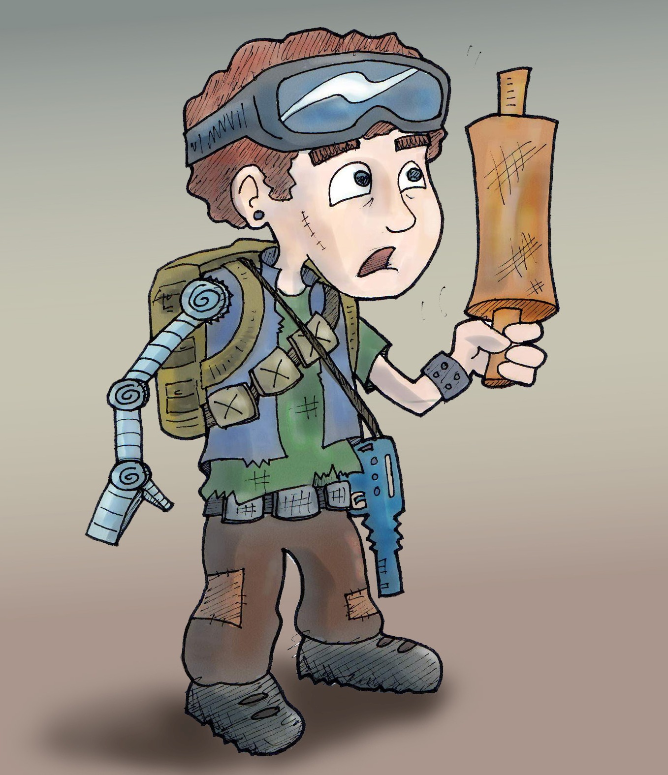
So while I was there I attempted to recreate that panel. Then when I got home, I remembered that I had a sheet of “Maxon Comic Strip Pattern” that an art store was giving out for free at a special event I attended last year. I had been saving that sheet for something special (translation: I was too lazy to try to figure out how to use it) and decided that now was the time.

comicboxer


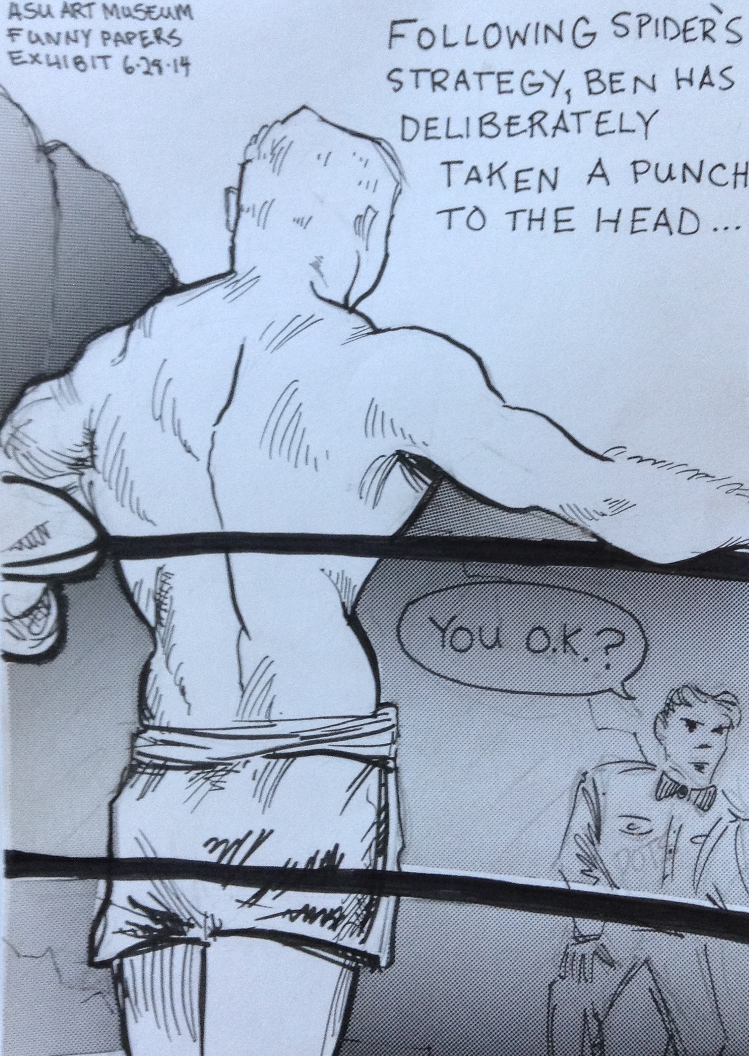
Basically this stuff is a sheet of adhesive paper with a halftone pattern printed on it. You cut out the shape that you want, peel off the back paper, and apply the pattern to the section you want to have the halftone. Then you scrub it with a burnisher. Or in my case, the handle of your scissors.

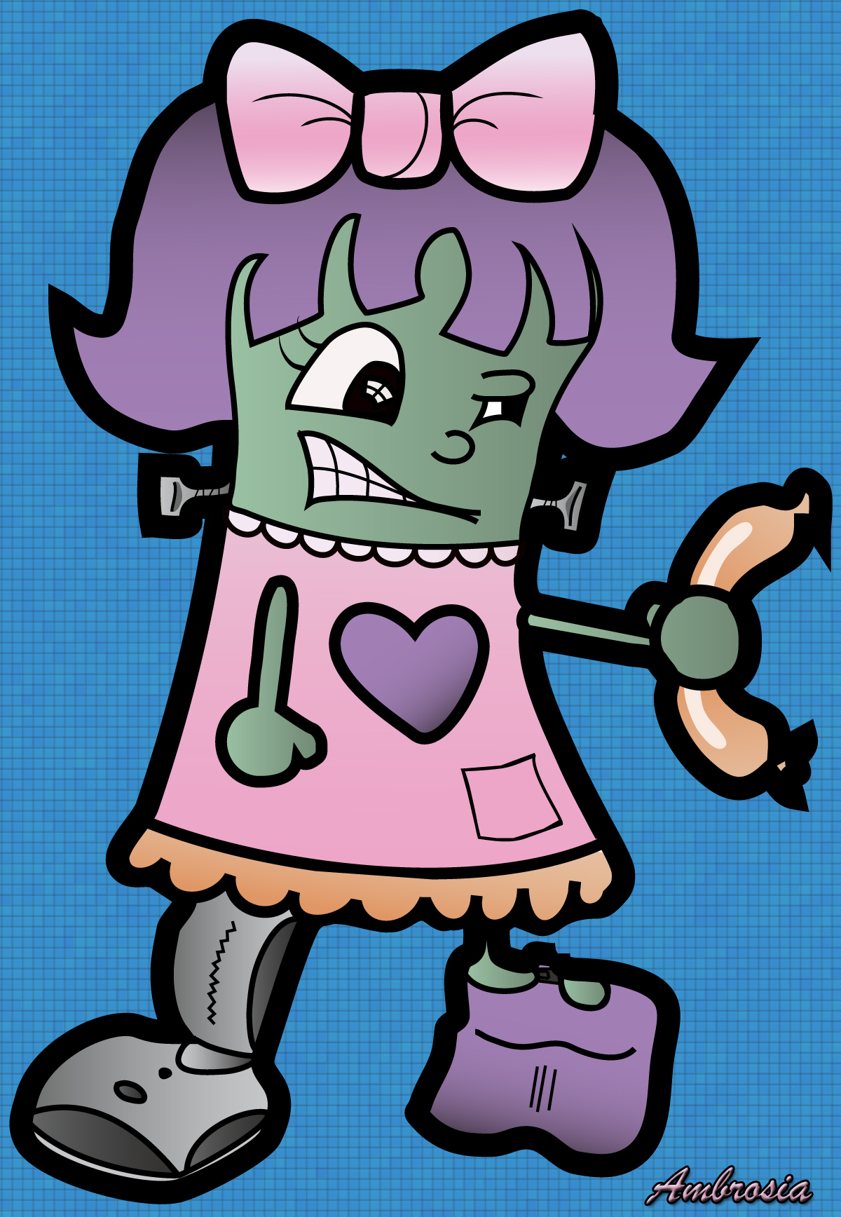
My halftone experiment was a little sloppy because I did it hastily on a cluttered desk with scissors too large to be precise. But I really like the effect, and I am glad that I finally gave it a try.

I am definitely going to incorporate this technique into more of my stuff, but next time I intend to execute good craftsmanship by taking the time to trace the area accurately, and cut out the pattern with an exacto knife rather than a clunky pair of scissors.

h1

Video Man

January 4, 2014

Here is a cartoon that I made of my friend Glen, the videographer for Space 55. He’s a lot of fun to draw because he has so much curly blonde hair. This drawing is a bit of an exaggeration because his camera isn’t nearly that big. His hair, on the other hand, is.

I drew this by hand with pen, then scanned and colorized it using photoshop.

glencartoon


Before I made the version above, I did a rough draft in my sketchbook with pen and markers.

glen

Check out Glen’s work on his Vimeo page here.  And to see the work he’s done for Space 55 go here.

h1

From Rough Sketch to Final Draft 3

February 7, 2013

Currently at Space 55 we are running a puppet show about recycling called Of Plastic Things and Butterfly Wings. I made the poster for the show. I started by reading the script and getting an idea of the main characters and their personalities and the setting of the story.

Then I sat down and made this rough sketch and sent it to the director, who sent me some notes on things to change and move around, etc.

orig sketch

Once I got the go ahead to move forward I drew a cleaned up version of the two characters, scanned them in, and worked with them in Illustrator. I also created the beach, background, fonts and sizes, and came up with this image.

PTposter early draft

From here I started showing the image to some friends, who gave a lot of great feedback on things to tweak. I got some really enlightening advice from my friend and children’s book illustrator Molly Idle.

I went back in and changed the title font to look more like it’s made of plastic, added in the butterfly, and also added the shadow of the birds over the pile of trash in the background to try to give a hint of something a bit sinister. I also roughed up the Space 55 logo and the tagline at the bottom so that they blended with the sandy beach a little more. Here is the final result.

PTpostcard

When I initially started working on this project I was a little worried that I would not find as much motivation to make this postcard as I do when I make the ones for my own plays. But I actually got really into it and had a blast making it. Thanks to everyone who took the time to look at it and give me their thoughts. All the advice I got really helped.

h1

Graphic Illustrations

January 20, 2013

I have been teaching myself to use Illustrator, Painter, and have been brushing up my Photoshop skillz. Here are some characters I’ve made recently.

“Rapacious” the evil bunny. This was one of the first things I made in illustrator. I found a tutorial on how to make a cute pink bunny, and changed it up a bit. Unlike most of my work (which I usually draw by hand, then scan and manipulate digitally) I made this completely in Illustrator by drawing shapes and connecting them. I have since discovered that this is a very slow way to work.
psycho bunny

Here is another Illustrator exercise. I found tutorial online for how to make a cartoony pirate guy, and basically followed those instructions to make “Ambrosia” a frankenstein-like character from one of my plays. Then I made the background in Photoshop. Ambrosia is crazy for sausages and diet Coke, and has a leg made of a vacuum.

ambrosia

This is Katrina, a character from some plays I wrote called The Phoenix 3.0 Trilogy. She’s a bad-ass chick that lives in a post-Apocalyptic world with her boyfriend ZJ. Her outfit is pretty steampunk inspired because I’m kind of into that these days. I drew this original sketch on paper, scanned, traced, and colored in Illustrator. 
KatColor

Here is a zombie that eventually became the central figure of the Monsters, Mutants, and Other Tales of Love poster. I drew this on paper, then scanned and traced in Illustrator using a wacom tablet, and then colored in Illustrator. This took FOREVER because I didn’t know what I was doing and just sort of fumbled through it. I am still not exactly sure how I did it.

ZombieAvatar

This is ZJ and Katrina, star-crossed lovers from the post-apocalypse. For this one I did the original sketch by hand, then scanned into Illustrator and colored using the Live Trace and Live Paint tools. These a great tools for doing a quick and dirty color illustration.

ZJ-and-Kat-

Here is ZJ, our favorite post-apocalyptic doofus. I drew this on paper, then scanned into Illustrator where I used the live trace and live paint tools for the base colors. Then I took it into Corel Painter and added some more shadows and highlights.

Z

h1

Rough Sketch to Final Draft 2

December 30, 2012

A while ago I wrote about how I created the poster for Night of the Chicken 2. A few months after doing that play I was fortunate enough to see another play I wrote get produced. Actually it was a series of short plays, all of which had monsters in them. I also made the poster for this play. And once again, it was a sometimes fun, sometimes frustrating experience. But I learned a lot, and I am proud of the finished product.

Here is my initial concept sketch, which I did with markers. Very sloppy. Very messy. Very crowded.

I was trying to go for that old B-movie horror/sci fi poster look. Corny, but cool.

Forbiddenplanetposter

Originally I planned to feature all the monsters from each play, with a big robot/cyborg in front. But the robot I came up with was just too cute.

I had this other sketch of a zombie that was more gross, and therefore more appropriate for the poster. So I traded the robot for him and dropped the other characters.

big zombie in marker

Once I had my concept narrowed down to one giant zombie stomping around in a post-apocalyptic world, I began to create the image digitally. I decided to make this poster in Adobe Illustrator, which I did not know how to use. But my awesome and patient friends Brad and Sharon gave me some lessons.

First I made the zombie by scanning in my original drawing, and then tracing it in Illustrator using a Wacom tablet. This process took a really long time, because I didn’t know what the heck I was doing.

Then for the burned out city in the background I took inspiration from a computer game called Canabalt, which Sharon told me about. This sounds stupid, but my initial sketch had only one layer of city silhouette. When I saw the two layers in the background of this game it BLEW MY MIND. Of course! Two layers of city silhouettes. Only an idiot would put in one layer. Total lightbulb moment.

canabalt

So I drew the city in Illustrator, slapped my zombie in front of it, added some text, and…

Well here is an early version of the poster. Not so hot, but at least I had something to work with.

MMOTL-poster-early-version-

From there I just kept tweaking the colors, the fonts, the wording, until I couldn’t tweak no more.

I got a TON of help from my friend Kim, who is really good at giving constructive criticism, whether it’s for writing plays or making posters. I also got a lot of help from my friend Brad, who is a bad ass graphic designer.

Here is the end product…

It’s no masterpiece. It doesn’t even resemble an old B-movie poster like I had originally planned. But if you had showed this image to me a year ago and told me I had made it – in Illustrator no less – I would have NEVER believed you.