Okay so I am a little late, but here is my fourth annual tannenbaum sketch!

(click on the picture for a larger version)
And as long as I am posting Christmas-themed sketches, here is one I did of Richard on Christmas morning.
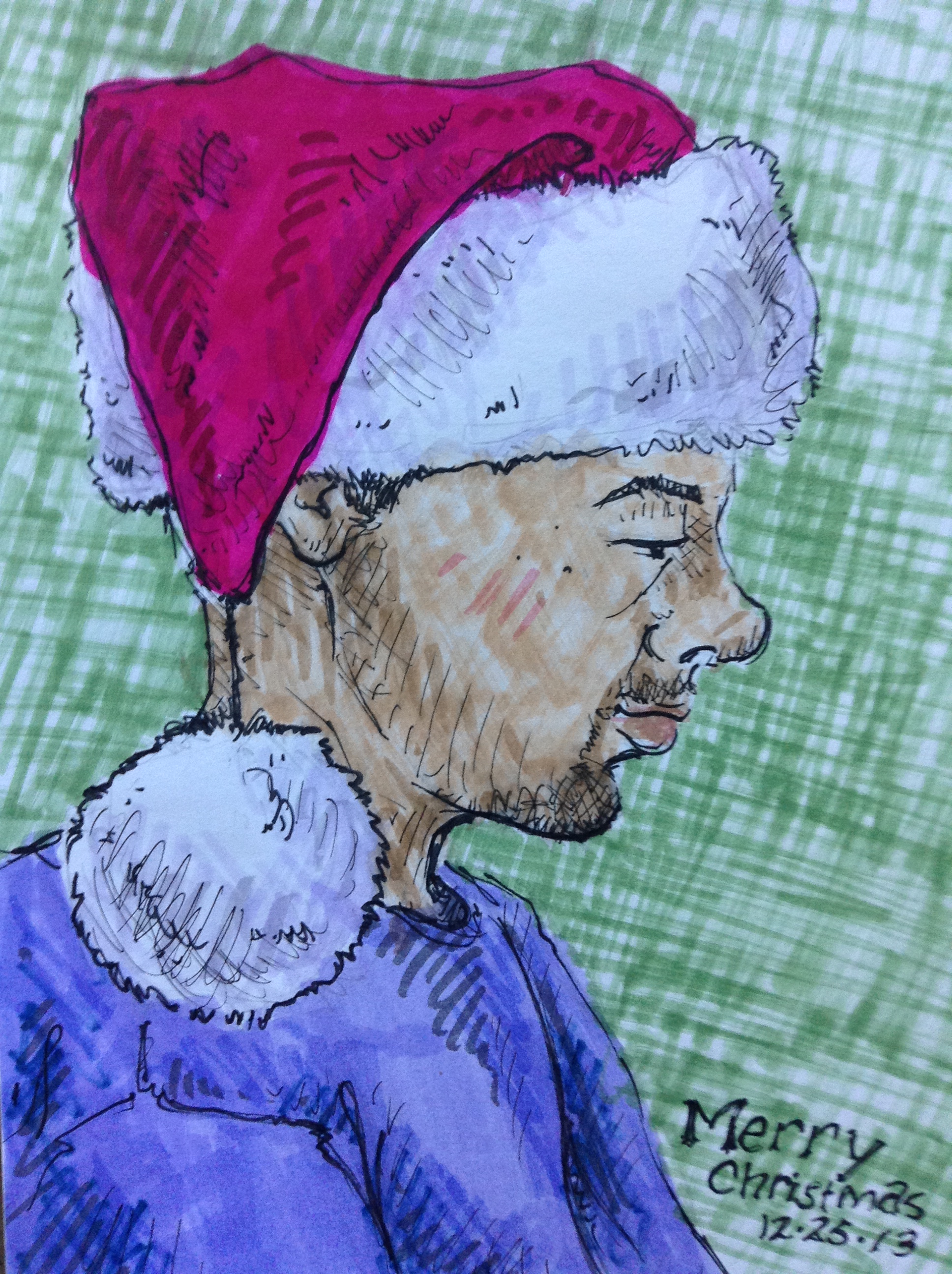
Markers and ink.

Okay so I am a little late, but here is my fourth annual tannenbaum sketch!
(click on the picture for a larger version)
And as long as I am posting Christmas-themed sketches, here is one I did of Richard on Christmas morning.
Markers and ink.
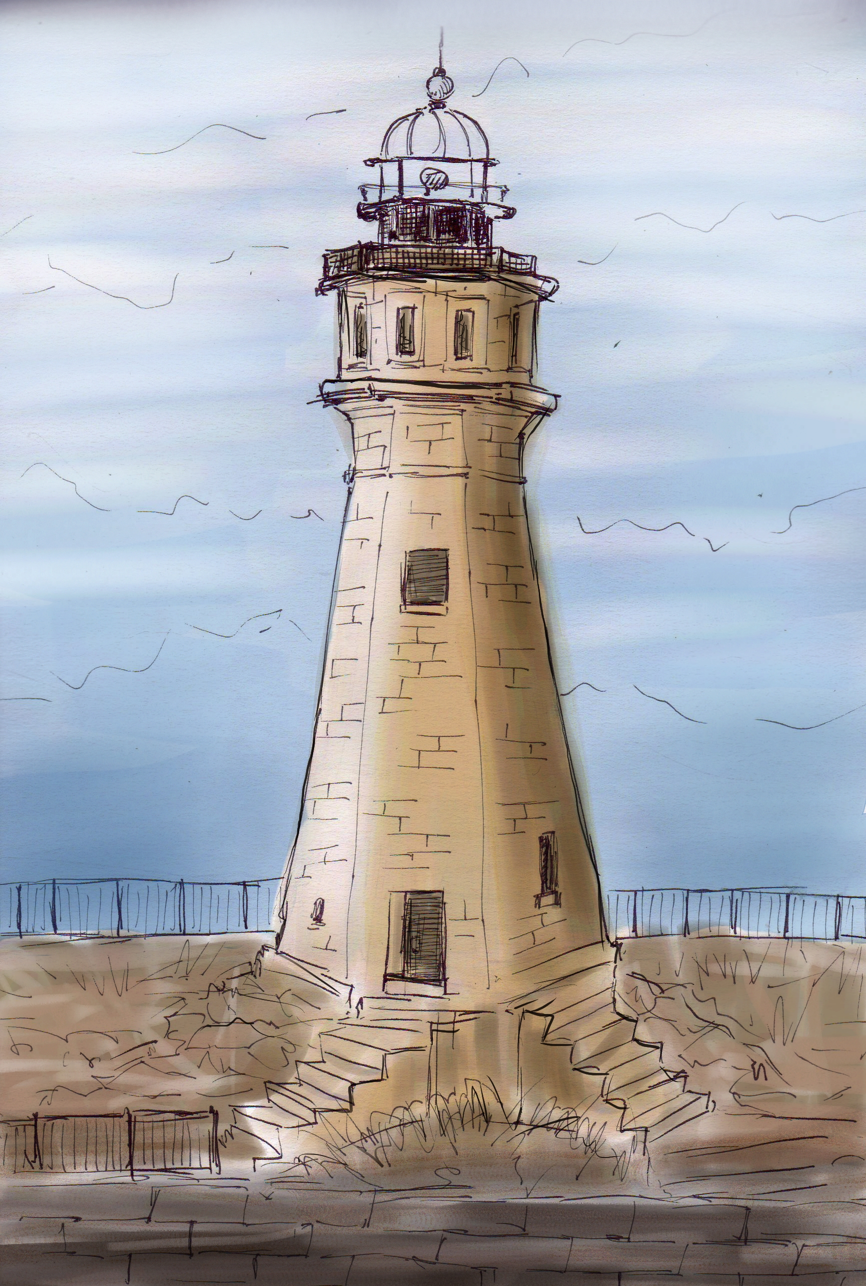
I did a quick sketch of this lighthouse in Buffalo, and then colored it digitally once we got back to AZ, thus fulfilling my lifelong dream of drawing a lighthouse.
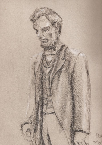
With that Lincoln movie up for an Oscar this year, it got me thinking about all the sketches I’ve done of Lincoln over the years. He was kind of an odd looking guy with that long gaunt face and weird beard, which makes him very fun to draw. Lucky for me, there seems to be more statues of him around than anyone else in history. So whenever I come across one, I sketch it.
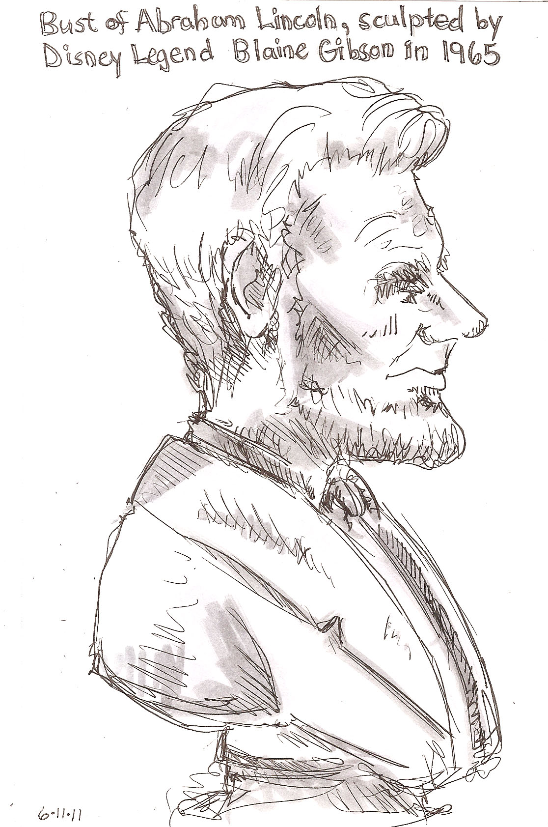
Disneyland art gallery, 2011

Mount Rushmore, 2003

Lincoln Memorial, 2009
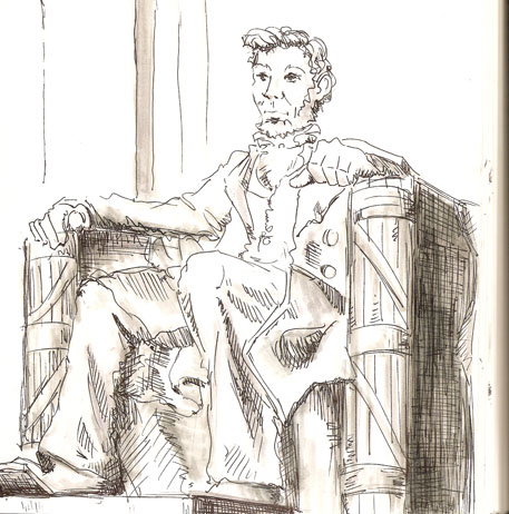
Lincoln Memorial, 2nd attempt, 2009
Mount Rushmore, 2012
A park in Portland, 2004
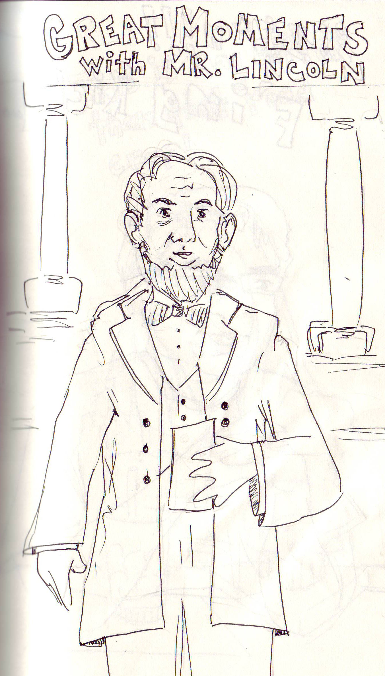
Great Moments with Mr. Lincoln, Disneyland, 2012 (I did this one in the dark)
I have been teaching myself to use Illustrator, Painter, and have been brushing up my Photoshop skillz. Here are some characters I’ve made recently.
“Rapacious” the evil bunny. This was one of the first things I made in illustrator. I found a tutorial on how to make a cute pink bunny, and changed it up a bit. Unlike most of my work (which I usually draw by hand, then scan and manipulate digitally) I made this completely in Illustrator by drawing shapes and connecting them. I have since discovered that this is a very slow way to work.

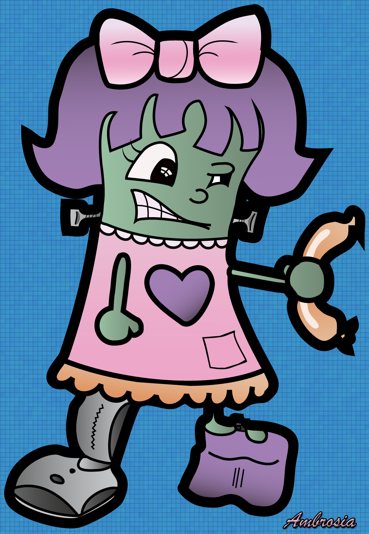
Here is another Illustrator exercise. I found tutorial online for how to make a cartoony pirate guy, and basically followed those instructions to make “Ambrosia” a frankenstein-like character from one of my plays. Then I made the background in Photoshop. Ambrosia is crazy for sausages and diet Coke, and has a leg made of a vacuum.
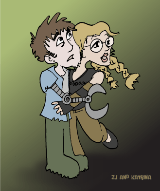
This is Katrina, a character from some plays I wrote called The Phoenix 3.0 Trilogy. She’s a bad-ass chick that lives in a post-Apocalyptic world with her boyfriend ZJ. Her outfit is pretty steampunk inspired because I’m kind of into that these days. I drew this original sketch on paper, scanned, traced, and colored in Illustrator.

Here is a zombie that eventually became the central figure of the Monsters, Mutants, and Other Tales of Love poster. I drew this on paper, then scanned and traced in Illustrator using a wacom tablet, and then colored in Illustrator. This took FOREVER because I didn’t know what I was doing and just sort of fumbled through it. I am still not exactly sure how I did it.
![]()
This is ZJ and Katrina, star-crossed lovers from the post-apocalypse. For this one I did the original sketch by hand, then scanned into Illustrator and colored using the Live Trace and Live Paint tools. These a great tools for doing a quick and dirty color illustration.
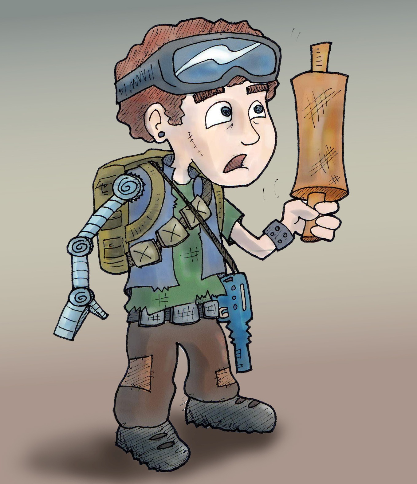
Here is ZJ, our favorite post-apocalyptic doofus. I drew this on paper, then scanned into Illustrator where I used the live trace and live paint tools for the base colors. Then I took it into Corel Painter and added some more shadows and highlights.
A while ago I wrote about how I created the poster for Night of the Chicken 2. A few months after doing that play I was fortunate enough to see another play I wrote get produced. Actually it was a series of short plays, all of which had monsters in them. I also made the poster for this play. And once again, it was a sometimes fun, sometimes frustrating experience. But I learned a lot, and I am proud of the finished product.
Here is my initial concept sketch, which I did with markers. Very sloppy. Very messy. Very crowded.

I was trying to go for that old B-movie horror/sci fi poster look. Corny, but cool.
Originally I planned to feature all the monsters from each play, with a big robot/cyborg in front. But the robot I came up with was just too cute.

I had this other sketch of a zombie that was more gross, and therefore more appropriate for the poster. So I traded the robot for him and dropped the other characters.

Once I had my concept narrowed down to one giant zombie stomping around in a post-apocalyptic world, I began to create the image digitally. I decided to make this poster in Adobe Illustrator, which I did not know how to use. But my awesome and patient friends Brad and Sharon gave me some lessons.
First I made the zombie by scanning in my original drawing, and then tracing it in Illustrator using a Wacom tablet. This process took a really long time, because I didn’t know what the heck I was doing.
Then for the burned out city in the background I took inspiration from a computer game called Canabalt, which Sharon told me about. This sounds stupid, but my initial sketch had only one layer of city silhouette. When I saw the two layers in the background of this game it BLEW MY MIND. Of course! Two layers of city silhouettes. Only an idiot would put in one layer. Total lightbulb moment.

So I drew the city in Illustrator, slapped my zombie in front of it, added some text, and…
Well here is an early version of the poster. Not so hot, but at least I had something to work with.

From there I just kept tweaking the colors, the fonts, the wording, until I couldn’t tweak no more.
I got a TON of help from my friend Kim, who is really good at giving constructive criticism, whether it’s for writing plays or making posters. I also got a lot of help from my friend Brad, who is a bad ass graphic designer.
Here is the end product…

It’s no masterpiece. It doesn’t even resemble an old B-movie poster like I had originally planned. But if you had showed this image to me a year ago and told me I had made it – in Illustrator no less – I would have NEVER believed you.
Here is this year’s tannenbaum. This one was done in marker and pen.

And just to see the progression (or regression) here are the last two trees…
 2011 – Colored pencil and ink.
 2010 – Watercolor and Ink
I just came across these old pictures from 2008. When I first started my current job I inherited this ginormous desk calendar, which I never used. (I’m an Outlook Express kind of girl.) So I mostly just scribbled on it and drew random pictures. Until we got to October.

It started with one grinning jack on the October 31st square. Then it grew into a little pumpkin patch.

Then I added a graveyard and a haunted house, and the next thing I knew I had this whole Halloween scene.

It was a pretty fun challenge because I didn’t have my normal markers or colored pencils at my disposal. I was limited to whatever highlighters and colored pens I could scrounge up from the office.

For some real cool haunted house paintings check out The Haunted Studio. Local artist Lew Lehrman takes pictures of people’s homes and turns them into these spookishly cool haunted house scenes.
I went back to my home state of SoDak in early September. I brought along this new sketchbook that came free with a package of colored pencils. Both the sketchbook and the pencils were of cheap quality so it really wasn’t that much of a deal. But the sketchbook has this little pocket in the back, and a band that wraps around the outside, AND this built in ribbon thing to mark your page. So with all those accessories I keep thinking I love the book, but actually I don’t because the paper is too slick and makes for not so brilliant drawings. But whatever. Here they are…
We begin on the plane. No sleeper is safe around me.

Next we have the view from my gramma’s backyard. A random crane.

Now we head west to the Black Hills where me and my dad did some hiking and camping. One day I climbed up to Harney Peak, the highest mountain in SoDak, and did this sketch of the tower.

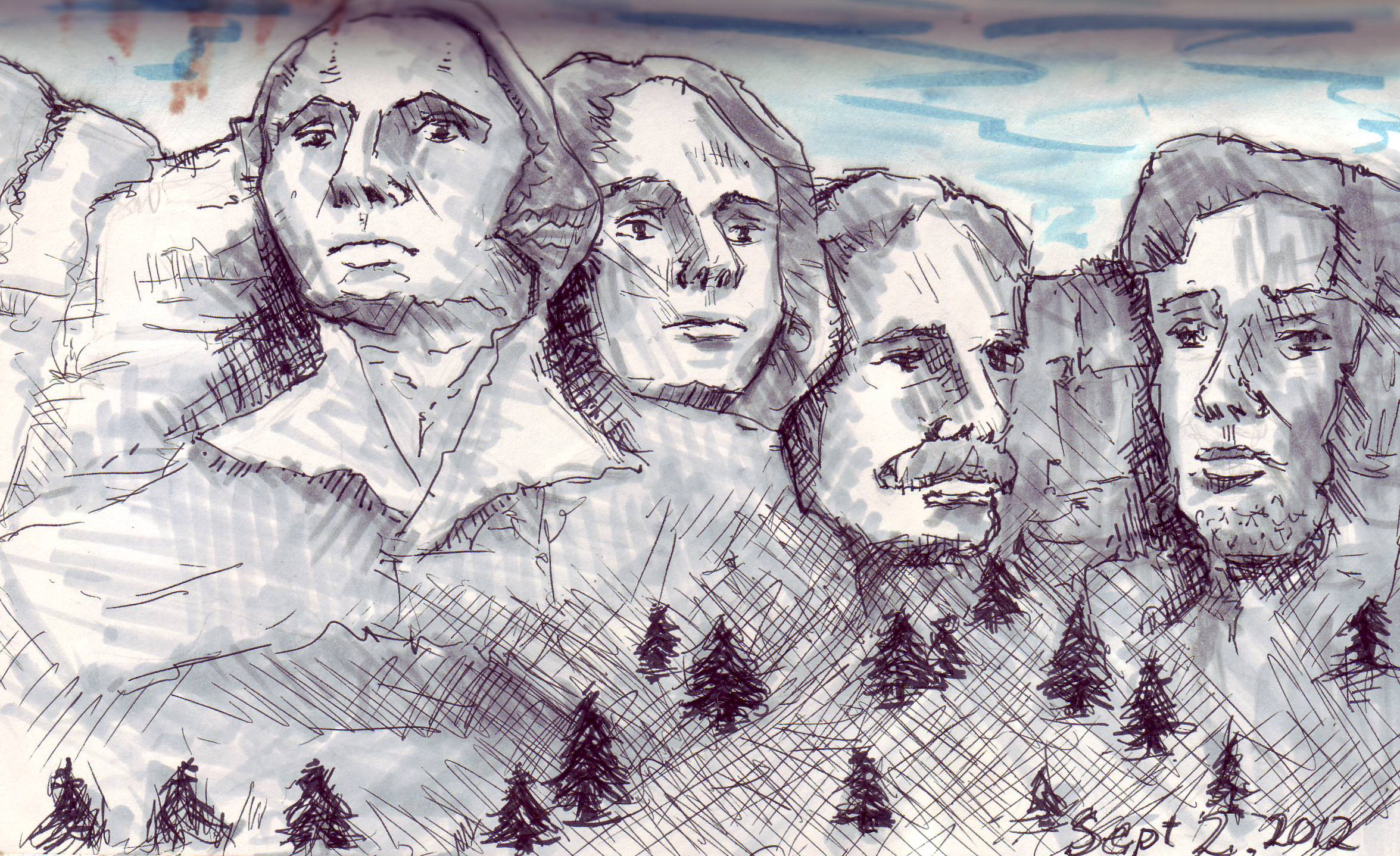
Moving along to Mt. Rushmore. I did this sketch in the evening as the sun was setting, causing me to keep making the shadows darker and darker. I remember being at Mt. Rushmore in 2003 and the exact same thing happened then too. Those brown markings in the upper left corner are the result of me experimenting with combining a waterbrush with markers. Didn’t really work out as I had hoped.

And here is one that I did of my dad as we drove from the Black Hills back to Sioux Falls. This is probably my favorite drawing that I have ever done of him.

I write a live radio play series called Night of the Chicken. Last year I made a poster for the show that I was quite proud of. To be honest, I didn’t think I had the drawing ability, nor the graphic skills to make such an awesome poster. Luckily I got a TON of help from some of my friends and they helped me stumble through the process.
Anyway, I thought it might be interesting to see how it developed from the initial sketch to the final product.
I made this first sketch back when I was writing the first episode. I kind of did this drawing just for fun. Back then I never dreamed that Night of the Chicken would actually see an audience. Let alone have a sequel.

Sometime later my good friend, and kick-ass artist, Jessica Hickman did this drawing for me as a gift. It’s pretty common for artists to draw pictures of their friends’ characters in their own style and give them as a present.

Sometime after that Night of the Chicken (ep. 1) found it’s way to Space 55 in Phoenix. And it was great. I didn’t make the poster for that show. They already had one made before I had a chance to take a crack at it, but I didn’t mind because the poster they made was actually pretty cool. Here it is.

Okay so fast forward some time after that. Night of the Chicken (ep. 2) was ready to take the stage and I was ready to take on the challenge of making the poster myself. Using the drawing that Jess did as inspiration, I came up with this line drawing of my character.

Then I scanned her into Photoshop and added some color, as well as a background and title.
Jess gave me a lot of guidance (via email) about how to use Photoshop to add shadow and color your characters. I also got a lot of technical advice from Brad, the graphic designer at work. I made several attempts to draw my own set of lockers, but was never happy with them. Then like a miracle I found some free clip art of this perfect locker, which I messed around with until it became a wall of receding lockers.

Once this initial post card image was done, I had to turn it into a poster with all the showtimes and stuff on it. That’s when my friend Kim came in. Kim has zero skill with photoshop, but tons of experience with telling her husband how to make the posters for her shows. So she came over one night and we worked on it together. Actually she did most of the creative thinking, while I sat in front of the computer and carried out her bidding in a somewhat Igor-like manner.
In the end, we came up with this little gem. I have no shame in bragging about it, because even though I technically performed all the physical actions to create this image–it was the advice I got from Jess, Brad, and Kim that made it so awesome.


