Archive for the ‘Color’ Category

h1

Golf Hats, Monks, and Grey Undies

July 4, 2014

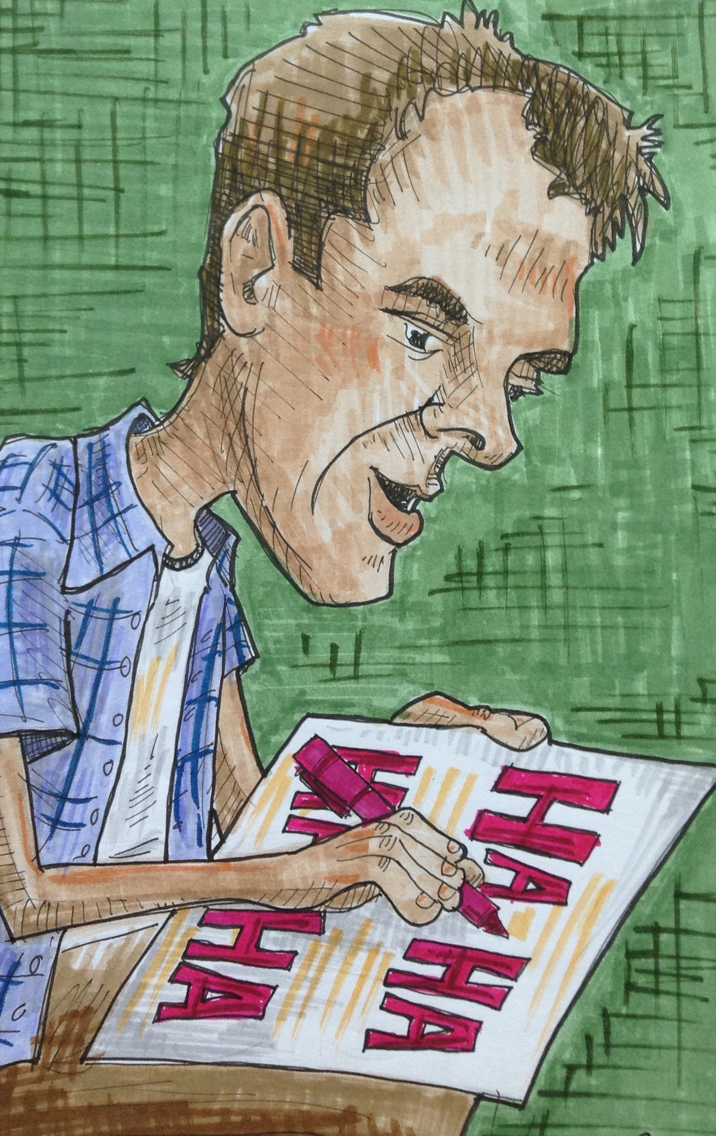
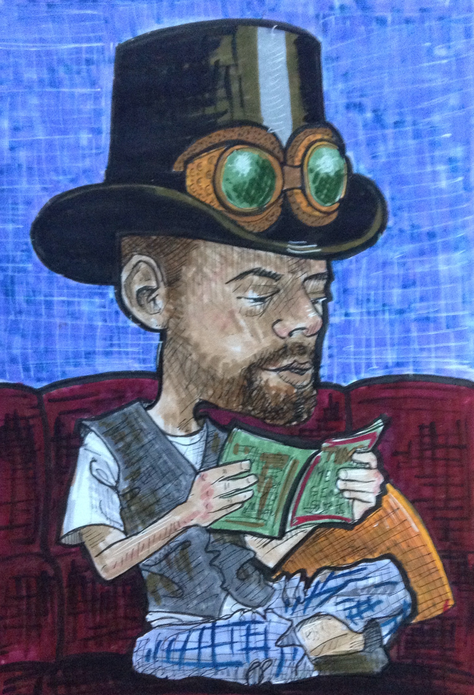
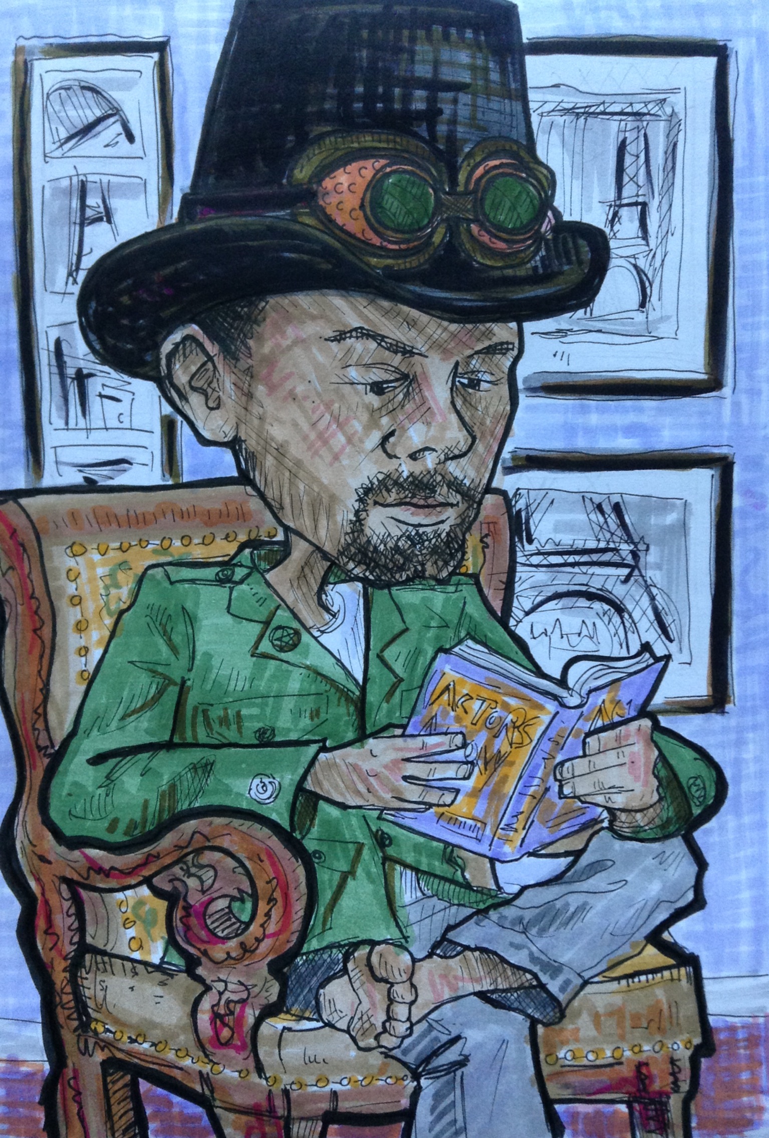
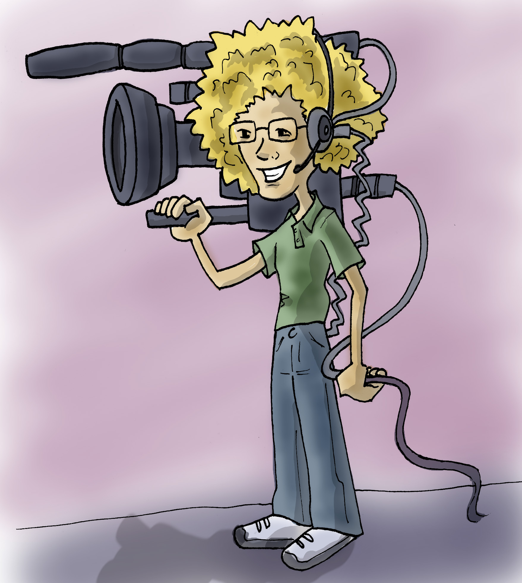
Here are a couple more drawings of Richard with a big old head. The reason he looks deep in thought here is because he is deep in thought. He is drawing stick figure cartoons in his sketchbook. I would post his cartoons, but they are not family friendly.

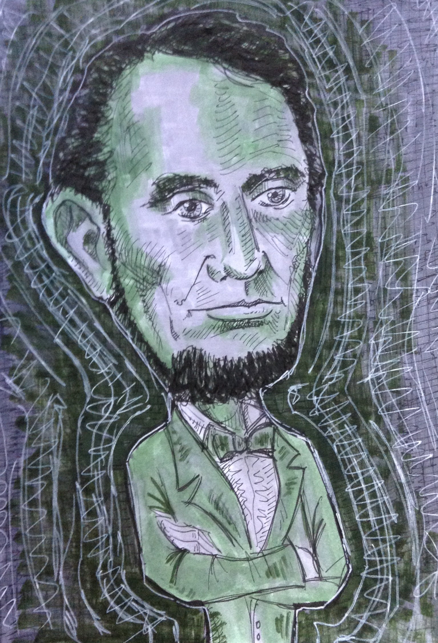
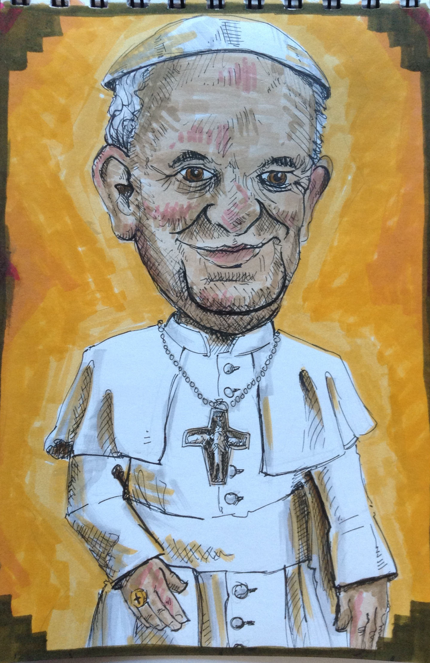
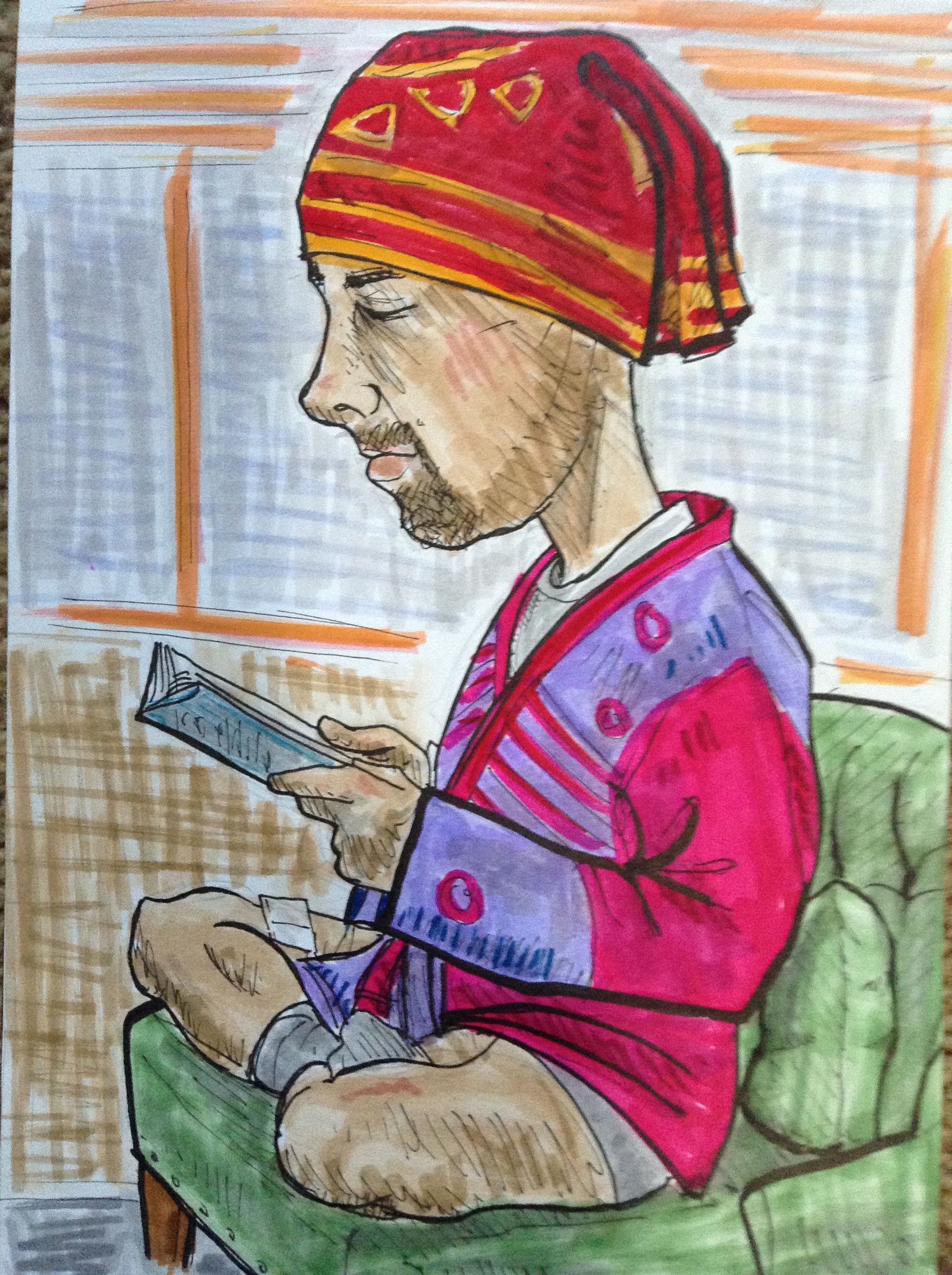
That statue of the monk randomly appeared on our dining room table a few days ago and I’ve been wanting to draw it ever since. So I set him up along with the little laughing Buddha figurine, and then made Richard put on that golf hat.

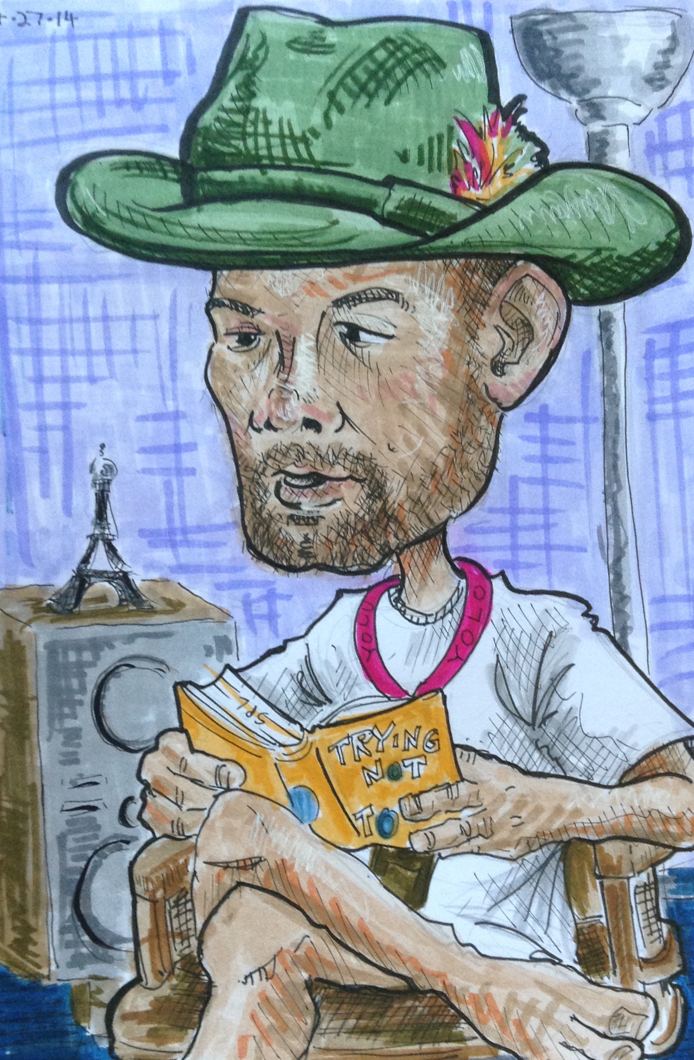
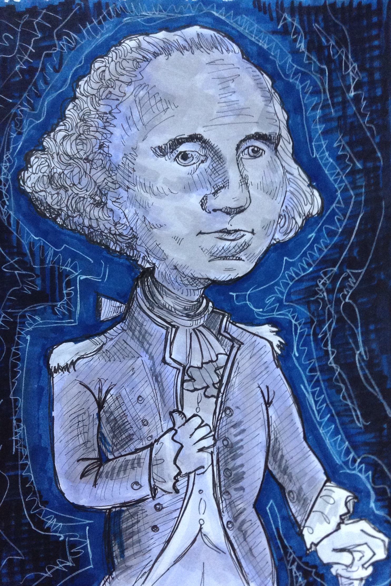
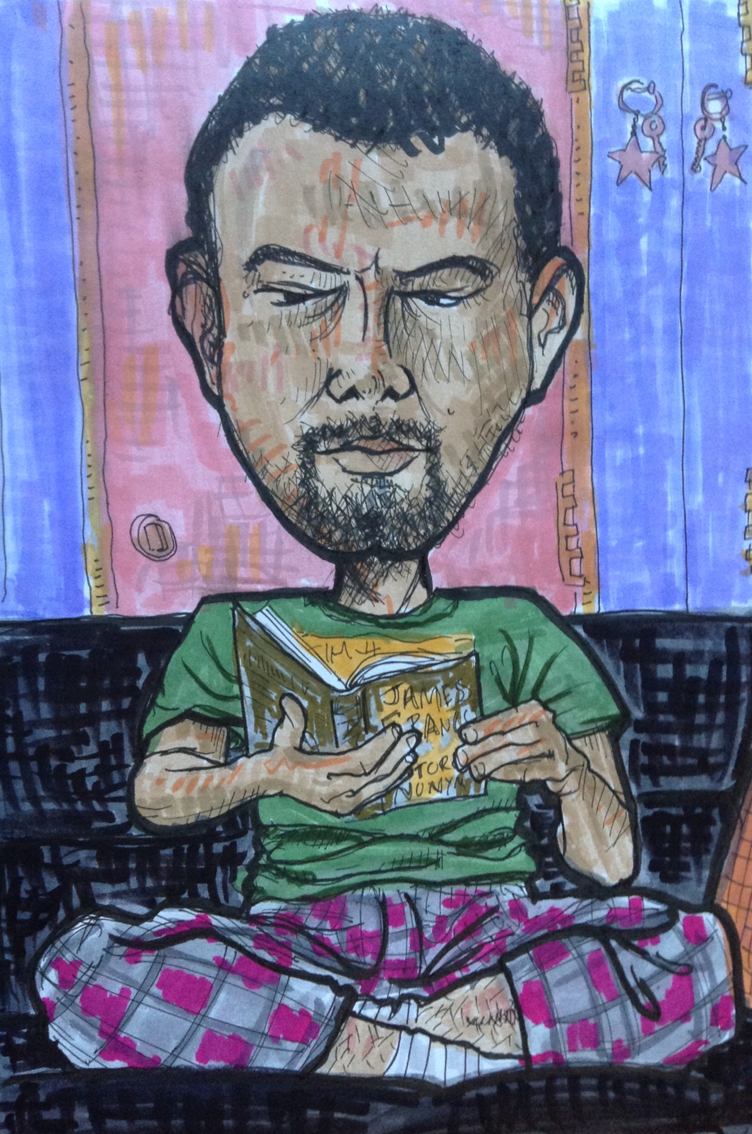
These big head drawings started out as funny little quick sketches and now they are becoming quite the production. I set up a lamp and everything. Richard now insists on setting a timer for one hour because otherwise it takes half the day.

golfhat richard

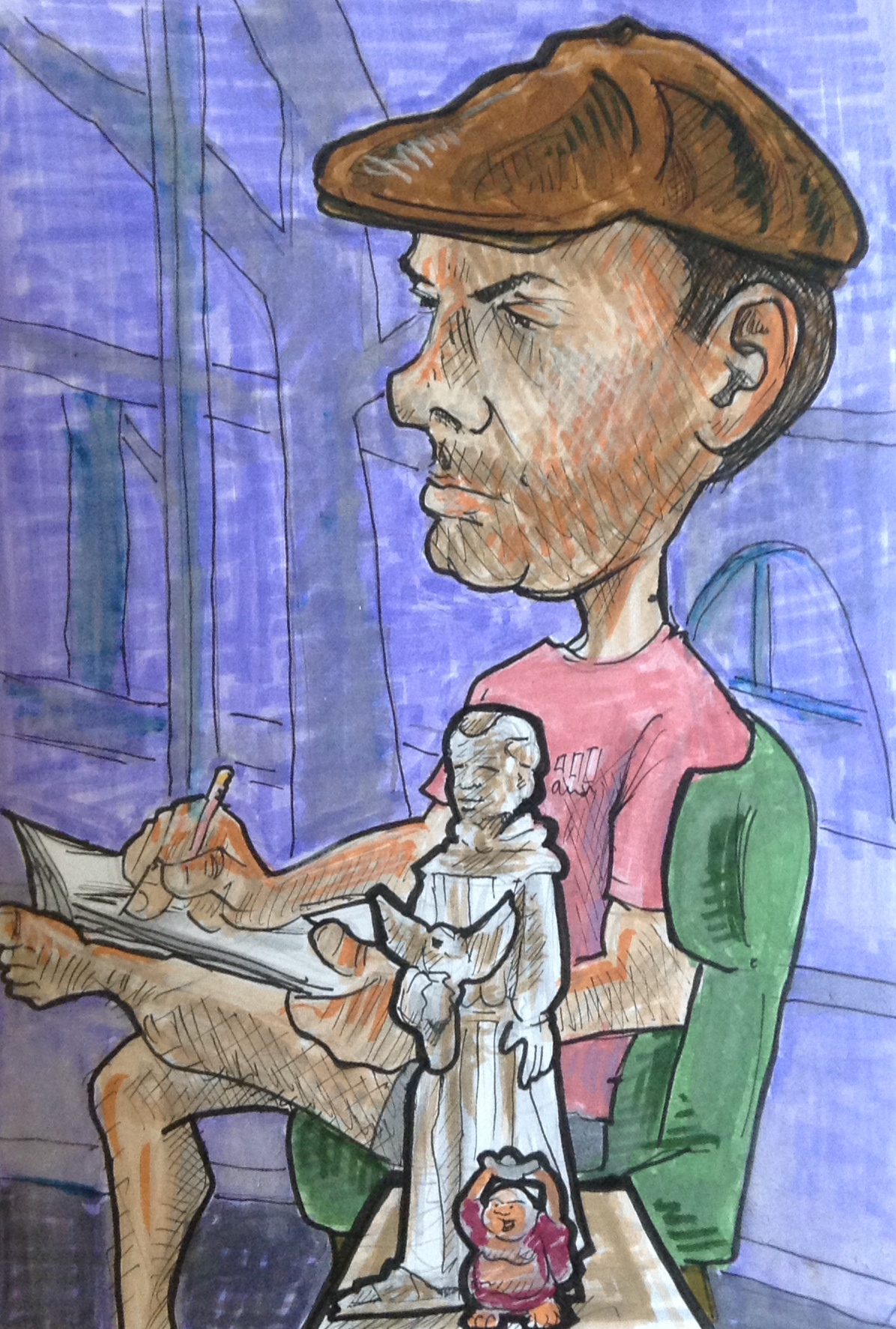
The monk statue is not nearly is friendly looking as I have made him appear here. I think the laughing buddha is rubbing off on him.

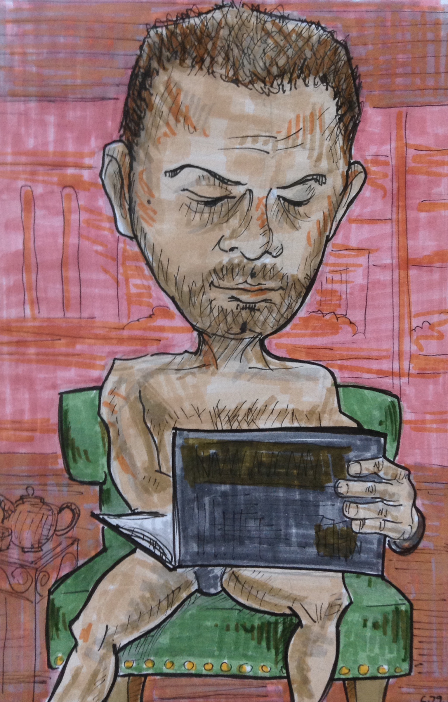
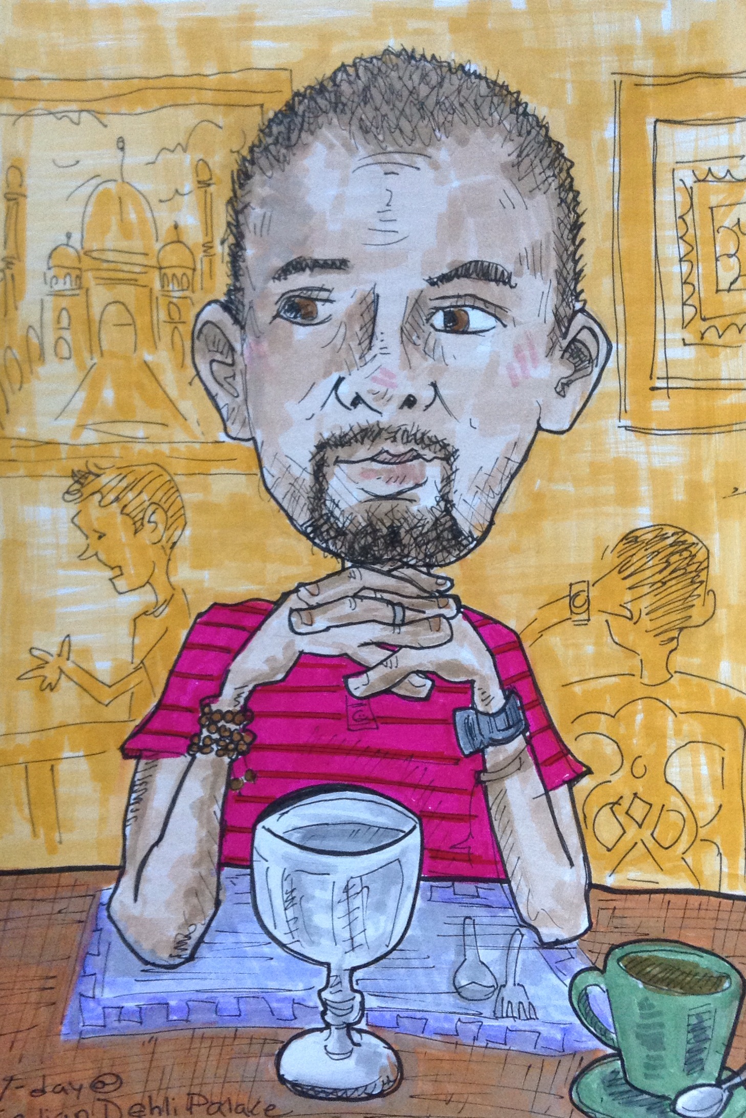
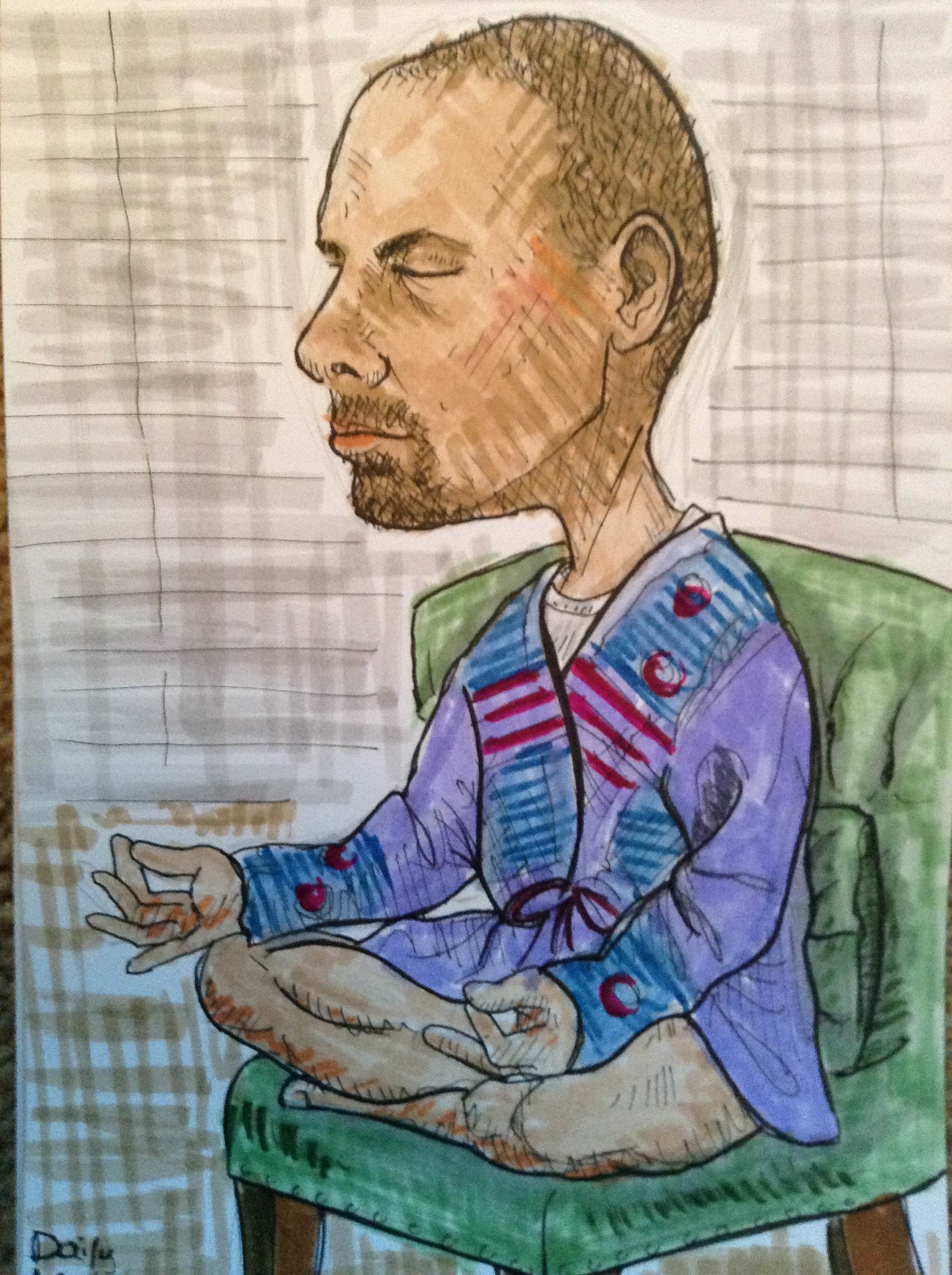
As for this drawing I would just like to say that Richard gave me permission to post it, even though he is only wearing his tighty whiteys. Or rather, his tighty greysies. I’ve taken to doing monochromatic backgrounds because they really make the figure pop. It also takes up less time.

cartoonist richard


h1

Loosely Based

June 1, 2014

I was looking at my friend Charlie when I drew this, although I was intentionally distorting the features and playing around with the shape of his head. So it’s kinda Charlie, kinda not.

Big Head Charlie

This ended up being one of my favorite things I have drawn lately, but when I showed it to Charlie he said, “Do I really look that bad?” Which is another reminder of why you should never ever show the person your drawing – a rule I keep breaking over and over.

Also, I wish I had never made that line around his mouth so thick.

Ah well.

h1

Featherhat

May 12, 2014

Another big head Richard drawing. The hat is actually black, like most of his hats. I made it green because it’s just too hard to draw a black hat. I wish I had gone with a different color.

featherhat

h1

Prezzies!

February 17, 2014

In honor of President’s Day I drew a couple of our Founding Fathers. It was the least I could do, since we get a paid holiday in their honor. Plus, I will take every opportunity to draw Abe Lincoln. (He’s just so odd looking!)

I would like to thank our American currency for providing reference photos.

(I had to borrow a fiver to do this one because I just don’t roll with that kind of cash.)

Abe

Remember in the last blog post when I said I have to be careful when using the white pen or else I overdo it? Well that there is a perfect example.

For GW I didn’t have to borrow any money, as I was able to supply my own single. This time I didn’t go quite so crazy on the white pen, and I like it better here.

GW

Making this drawing gave me flashbacks to my cherished Garbage Pail Kids collection. Back when I was about 10 or 11 years old (circa 1988) I frequently copied GPKs in an attempt to learn to draw. In fact, the first drawing that I ever remember taking seriously, and where I actually managed to stay focused for more than a couple of minutes, was when I made a copy of “Well Done Sheldon.”

welldone

But my very favorite GPK was Gorgeous George (and his twin Dollar Bill).

GPK

h1

Goggles and Naan

February 16, 2014

Here’s a couple more Big Head Richards. I took another shot at him in the steampunk hat because I didn’t like the first one. I think I did a better job on the goggles this time, but I still don’t like them all that much.

I found an opaque white gel pen which I used to add highlights on the lenses. I have to be careful when using the white, because it’s tempting to go nuts and put highlights everywhere, thus diminishing it’s effect.

Streamhead 2

I did this one at Indian Delhi Palace, where we went for Valentine’s Day. I did the initial sketch at the restaurant and then colored it with markers later at home. I had fun drawing his hands on this one.

V-day India

Also, in an attempt not to complicate this drawing with too many different colors, I just splashed the entire background with yellow, and then used a darker yellow to suggest a bit of depth. I like how the red shirt plays against the yellow background, but I wish I had added a bit of shadow to the shirt, cuz it’s looking a little flat compared to the rest.

When Richard saw this one he said, “Wow, that’s really good. It almost looks like someone else did it.” Then he winced and said, “I meant that as a compliment.”

h1

A New Pope

February 8, 2014

Sometimes, for reasons unknown, you gotta draw the pope. Like when you see him on the cover of Time Magazine and think to yourself, “Now that’s a chin.”

pope2

My drawings of late have generally been very colorful with lots of contrasts, so a guy with white hair in a white outfit was a good exercise in holding back.

When I did the yellow background I guess I was thinking about heaven and halos and the light of God or something. When I showed it to Richard he said, “It’s like those icons.”

To which I replied, “Say what?”

Then he went into his office and came out with these two religious icon things that he got in Romania. Both have yellow backgrounds. 

idols

So maybe it was the religious art from the days of yore floating around in my subconscious that inspired the yellow background.

h1

Steamhead

February 2, 2014

Here is the newest edition to the big head Richard drawings. We went for a steampunk look today with a top hat, goggles, and this old military style jacket that I found at a garage sale a couple years back.

steampunk richard2

He was originally wearing socks but I asked him to take them off because that would have been boring. I am glad I did, cuz I think that foot is my favorite part of this drawing. He is sitting in our “fancy chair” which is always fun, but challenging to draw. Someday I will figure out a way to simplify it and still retain it’s character.

And dang it, I really wish I had done a better job on those damn goggles. Those goggles are killing me. I’ll just have to try again next week.

h1

Big Head Richard

January 26, 2014

So here is the first drawing I did in the Big Head Richard series. It’s always convenient to draw someone when they are meditating. And if they are wearing a funky robe thing, that’s an added bonus.

zenrich

Here is the second. Same robe, and now he’s added a funny head sock thing to the ensemble. I have added more detail to the background here. And by more detail I mean, 4 orange lines.

stockinghatrich

Here is the one from last week, which is my favorite so far, for reasons mentioned in the last blog post. Also, there were like three more baskets of dirty laundry in the background. I only drew one of them because I am lazy, which is why we had so much dirty laundry in the first place. Richard ipad

This one is from today. Not so crazy about it. Once again I should clarify that our door is not actually pink. Initially I had left it white, with a few grey marks, but there was so much weight at the bottom with the dark blacks and thick lines, that I felt like maybe some warm color on the top would help balance it out, which maybe  helped a little, but it’s still not working for me.

Afterward I asked Richard if he was in a darker mood here than when I did the previous drawings, and he said yes. I think it definitely shows.

darkrich

This is the first in this series where I’ve gone for the front instead of profile. I’m not as good at this angle, so I will need to keep at it. At some point I accidentally grabbed the “2” instead of the “1” pen, which the reason for the thick black outline. I kind of like it, kind of don’t. I think the thing that is bothering me the most here is the back couch and the colors in the background.

All of these were done with Tombow markers and various pens.

h1

Creative Cafe

January 24, 2014

Sometime last year my husband and I decided to make a point of hanging out on the couch together for a couple hours every Sunday morning. We drink (the good) coffee and either read to each other, work on a project together, or just hang out near each other while working on our own projects separately. We call it Creative Cafe, and yeah it sounds kinda dorky but deep down you know it’s cool.

For the past few weeks my Creative Cafe project has been to do these funny caricatures of Richard in pen and Tombow markers. Here is the one I did last Sunday.

Richard ipad

This one is my favorite so far because of how the hands turned out. I was having a real hard time at first getting them right — partly because I was sitting so close to him that it distorted the angle, and also because I couldn’t decide whether to make the size of his hands match his little body, or his giant head. Anyway, after a few do-overs and lots of erasing I finally came up with something I liked.

By the way, our back wall is not actually pink. I just colored it that way to make his face pop.

By the way, part 2, I used that very iPad to take the photo of the sketch posted here. I am pretty much done with scanners. The iPad takes better pictures than any scanner or digital camera I ever had.

h1

Video Man

January 4, 2014

Here is a cartoon that I made of my friend Glen, the videographer for Space 55. He’s a lot of fun to draw because he has so much curly blonde hair. This drawing is a bit of an exaggeration because his camera isn’t nearly that big. His hair, on the other hand, is.

I drew this by hand with pen, then scanned and colorized it using photoshop.

glencartoon


Before I made the version above, I did a rough draft in my sketchbook with pen and markers.

glen

Check out Glen’s work on his Vimeo page here.  And to see the work he’s done for Space 55 go here.