Whenever I need to get my hair cut, the period of time between when I’ve decide it’s time and the actual cut becomes absolutely unbearable. This was of course 10000x worse these past 7 months.
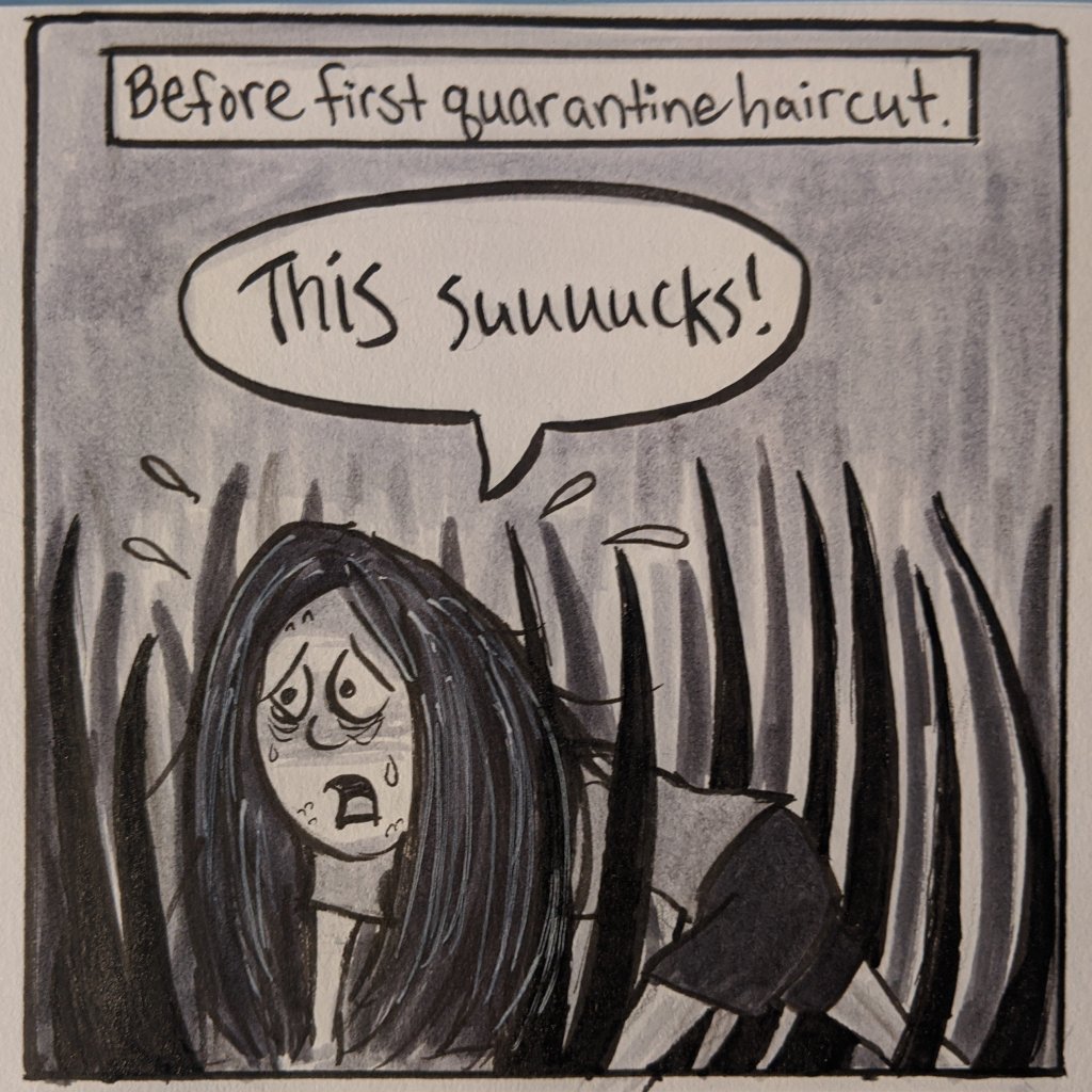
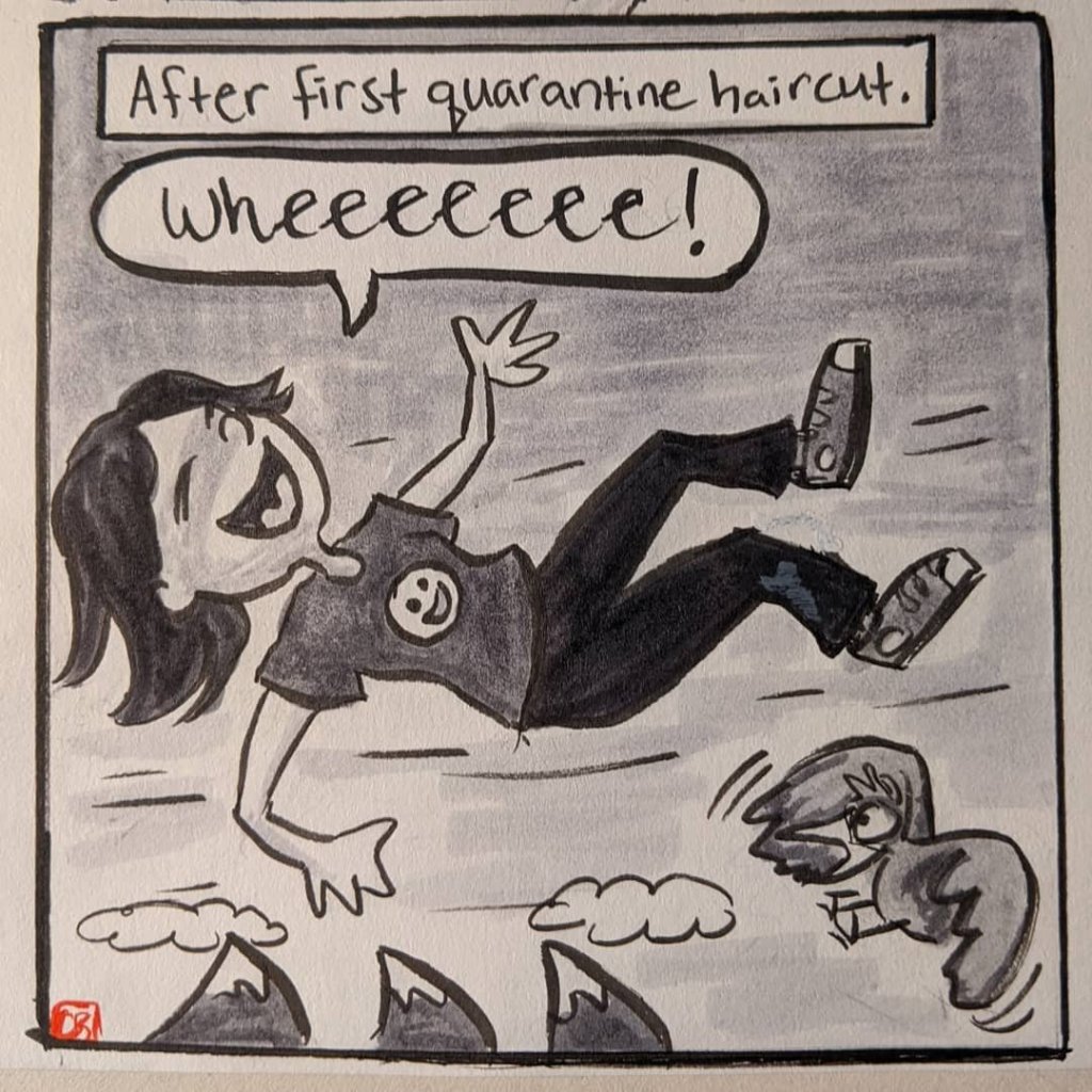

Whenever I need to get my hair cut, the period of time between when I’ve decide it’s time and the actual cut becomes absolutely unbearable. This was of course 10000x worse these past 7 months.
When it comes to drawing people in public I always run into two big challenges:
1) People rarely sit still.
2) I don’t want to get caught staring at them.
That’s why I love going to play readings.
If you aren’t familiar with the theatre world, a reading is part of a playwright’s development process. Once they have finished a draft of their play, they invite actors to come read the script aloud for a small audience of trusted friends and creatives, who then give feedback about their experience. The playwright uses that feedback to help inform their rewrites.
Play readings provide a great opportunity to draw people because the actors sit in relatively the same position for the duration of the play, and as an audience member I am supposed to look at them. So I get to hear a play for free, be part of a playwright’s creative process, AND get some good sketching in. Triple win!
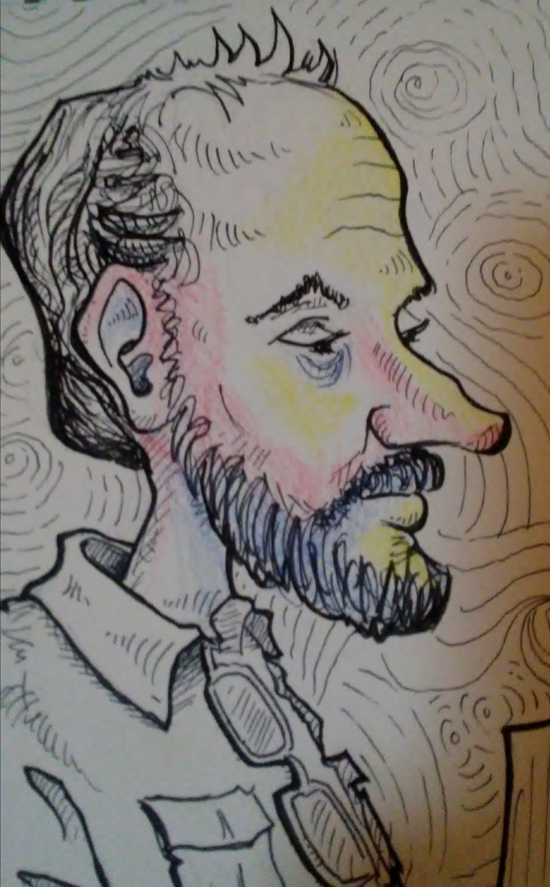
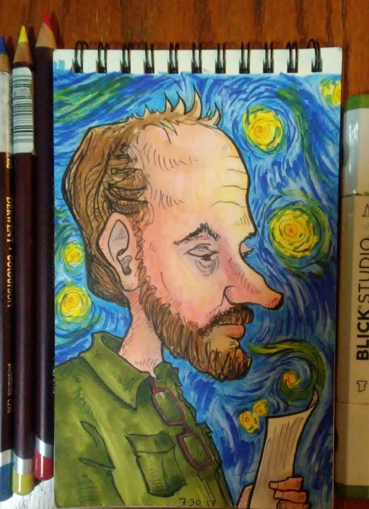
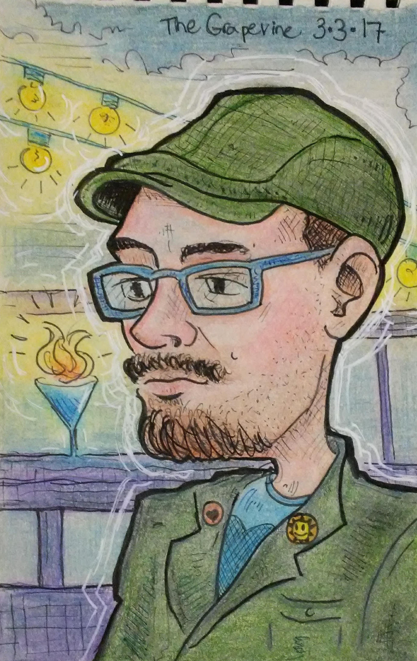
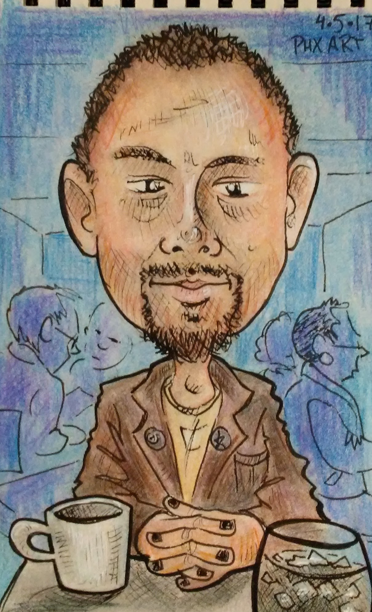
Some time ago I attended a reading of a play called Ear*, written by my brilliant friend, Ashley Naftule. Ear is a f’cking great script, loosely inspired by my man Vincent Van Gogh.
Meet Steve and Marcella, two of the actors from the reading.


I was real happy with how these two drawings came out, and I kinda agonized over whether or not to color them.
This was right around the time I was first starting to become an alcoholic.
On the one hand, I knew that I needed to continue pushing myself out of my comfort zone of black and white, and into the wonderful world of color. On the other hand, I liked them in B&W and was afraid I’d eff ’em up!
Then I remembered that you can’t move forward without taking risks, and you sure as hell shouldn’t be precious about your stuff. So I dove in.
(BTW, I realize that using the word risk in reference to coloring a little 4×6 inch drawing might be a stretch, but I can’t afford to go skydiving.)
Before going to town with markers I laid down some undertones with red, blue and yellow colored pencil. I learned how to do this on a great You Tube channel called Kiara’s Studio. Kiara calls this “color zoning.”
The pencil undertones show through the marker layer and create a level of depth and richness that I think would be difficult to achieve with markers alone.
Since we were reading a play inspired by Van Gogh, I put a third grade quality version of Starry Night in Steve’s background.
(Third gradeness not intentional, just the best I could do.)
For Marcella’s background I wanted to do a simple design with colors that would compliment the one’s I used on her face.
I have a pocket color wheel that I use all the time when figuring out color stuff. It’s a great tool. For this picture I chose a split complementary color scheme.
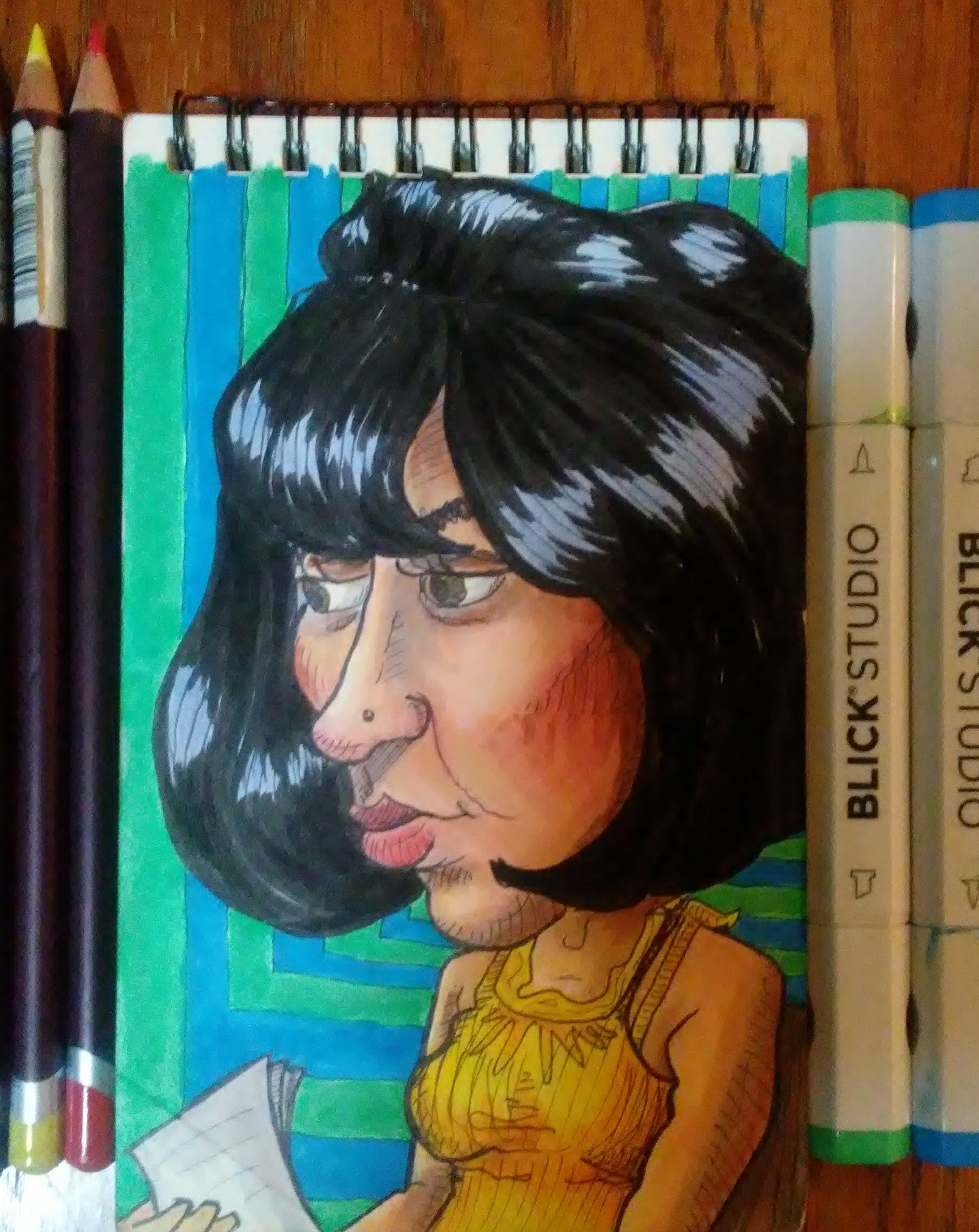
The reddish orange area of Marcella’s cheek seemed to be the most eye catching area to me, so I used that as the base point. The complement of red-orange is blue-green. In a split complementary scheme you use the two colors one each side of the complement, hence the blue and green background.
In the end I was real happy with how these little portraits came out, and so so so glad I faced my fears and colored them.


I know that I still have a long ways to go when it comes to color and markers, and even when it comes to drawing. But I feel like I’ve made some big strides forward this past year or two — not just in art but in other areas as well — and that has everything to do with trying sh*t that feels kinda scary.
Pretty much 100% of what I know about using alcohol-based markers I learned on You Tube, mostly from Kiara’s studio. She specializes in portraits and is amazing with skin tones. She’s also on IG at kiarasstudio. Her work is lovely so go check it out.
*Happy side note: Ear went on to have a very successful production at Space 55, and was nominated for several awards! Way to go Ash!
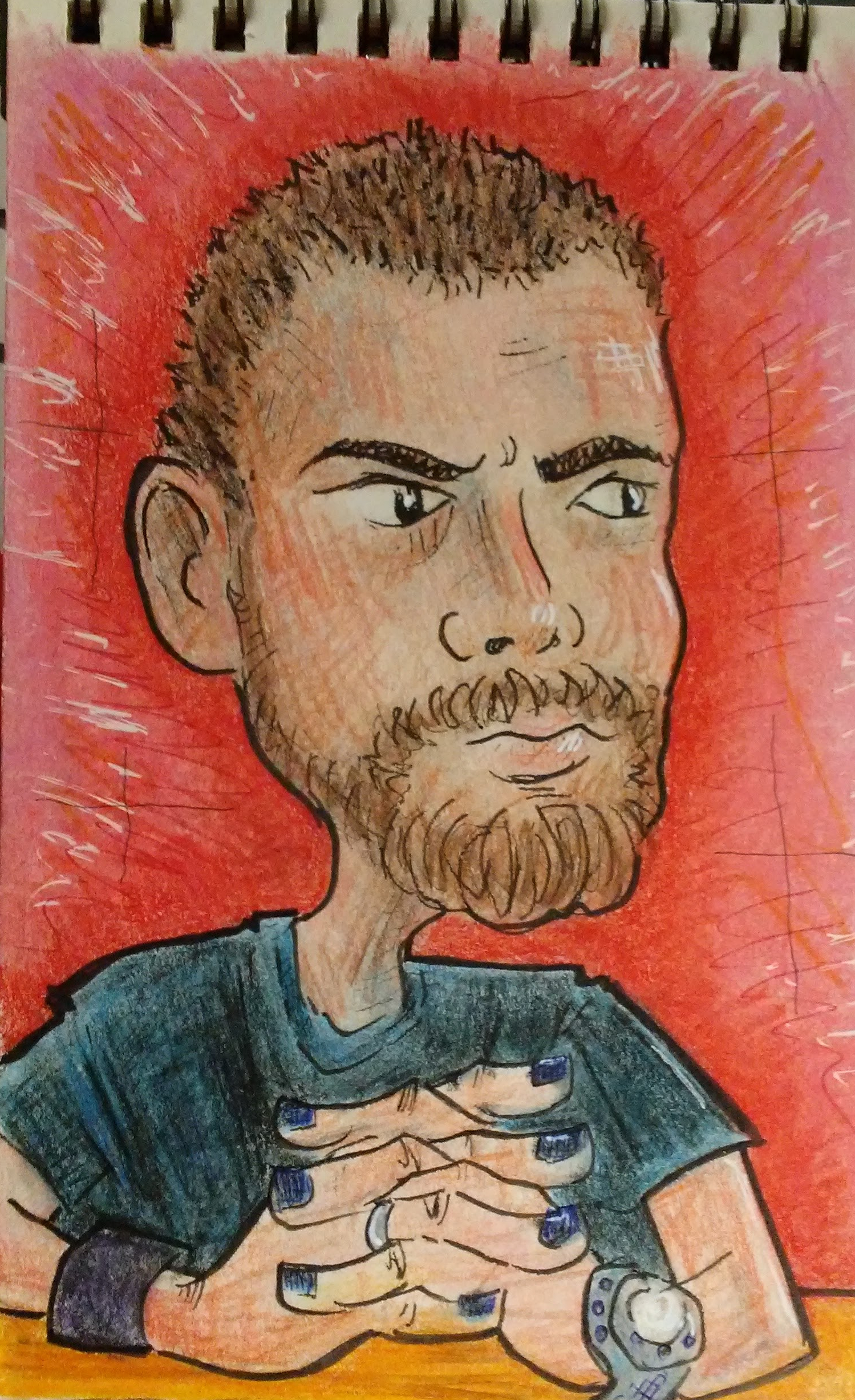
I am crazy lucky that I just happen to be married to my favorite person to draw. And although one might assume that any artist’s favorite person to draw would be their spouse — because they love them so much or whatever — that’s not really true.
(Although I do love him so much or whatever.)
Richard would be my favorite even if I was married to someone else. He just has a really fun face. And he’s actually a life drawing model, so there are lots of artists and teachers around town that agree with me.
There are some types of faces that I find tough to draw. This has nothing to do with their level of attractiveness. I know tons of people that are super good-looking, but whose likeness I just can’t seem to recreate on the page.
The people I find the most challenging to draw are kids. I think this has something to do with the lack of special features: the things on your face OTHER than eyes, nose, and mouth. This could be things that are actually part of the face such as wrinkles, moles, facial hair and scars. Or it could be add ons, like glasses, braces, nose/lip/eyebrow ring, a cigarette, or a monocle.
(Sadly, I don’t get nearly enough opportunities to draw people with a monocle.)
Richard has a lot of special features. He usually has facial hair. He often wears glasses. He has 3 tiny moles that form a triangle on the upper left side of his face. He has another mole on his right cheek. He has a very distinct nose, and these mischievous eyebrows that sometimes make him look like an evil magician.
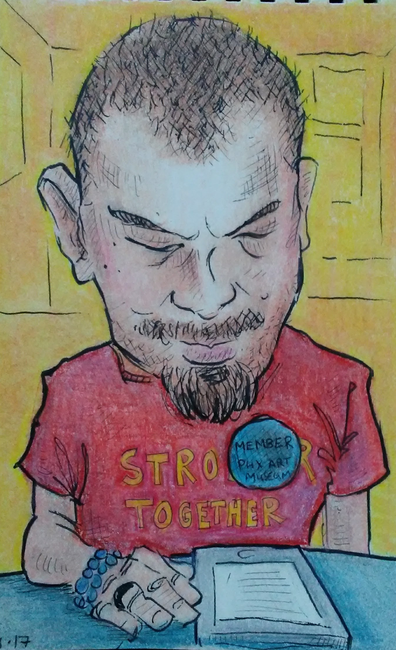
All that extra stuff helps break up the face, which makes it easier to translate a 3 dimensional human onto a 2 dimensional plane. I can get the size, shape, and angle of something more accurate by looking at it in relation to something else.
For example, whenever I do someone from a 3/4 angle I almost always draw their face too narrow the first time around, and I end up having to erase and adjust. I never seem to put enough distance between their nose and their ear. That’s because there usually isn’t much there. Cheeks are kinda like the desert of the face. Just a big open space with not much happening, which makes it hard to determine where things land.
In the drawing below I was able to use Richard’s glasses to figure out the distance between his eyes, nose and ear. And even though my style is way more caricature than realistic, the same rules still apply. Your baseline is still reality, you just choose which things to exaggerate and which things to simplify or exclude.
In addition to the special features on his face, Richard is also a big fan of accessories. He loves watches, rings, wristbands, buttons, all kinds of hats, and fun T-shirts. He also likes to change up his look regularly. He’ll shave his head in different ways, reshape his goatee, paint his nails, or put on a tie and jacket for literally no reason.
All of this stuff makes a person more fun and interesting to draw. When I am out in the world trying to discreetly draw strangers, details like these will inform the story that I make up about the person in my head.
I did all of these drawings with pen and colored pencil. One of the challenges with using colored pencils is that because of the nature of the medium, a lot of paper shows through, even with with layering, so the drawing comes out looking kinda dull and muted.
The way to fix this is by blending. There are several methods you can use to blend. My favorite way lately is to use a Prismacolor colorless blender MARKER. This is basically the same as using rubbing alcohol solvent, but it’s contained in a handy dandy marker.
Afterwards I use a white gel pen to add some highlights. (Not too much!)
One cool thing about being married to a life drawing model is that he is used to being stared at AND he’s great at sitting still. So whenever we go out to dinner he lets me sketch him while we’re waiting for our food. It’s way better than staring at our stupid phones.
I don’t normally do fan art of Supreme Court Justices, but Ruth Bader Ginsburg is a damn superhero. I did this one after seeing the RBG documentary with my mom.
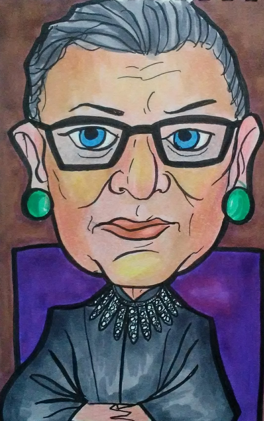
No matter how hard I try, anytime I draw a person from a photo it comes out way flat. I don’t know why that is. I mean, obviously, the photo is flat. But I don’t understand what it is about the line choices I make when drawing from a photo versus real life that causes the photo drawing to look so flat.
Happy Halloween!
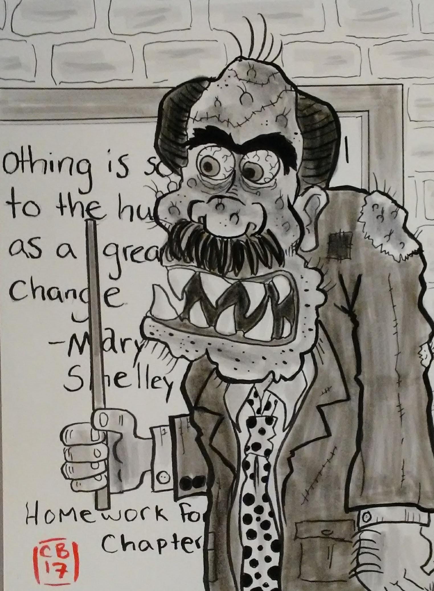
Last year the gallery at my local library put on a rad Frankenstein exhibit.

Local artists created Frankenstein-inspired works. I loooooove Frankenstein. To me, that character is the epitome of Halloween. So I was totally psyched when this exhibit came in.
Even more so when I saw this painting was done by Dain Q. Gore, an acquaintance of mine. His style is very distinct and I recognized it right away.
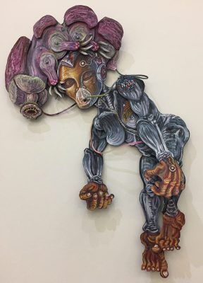
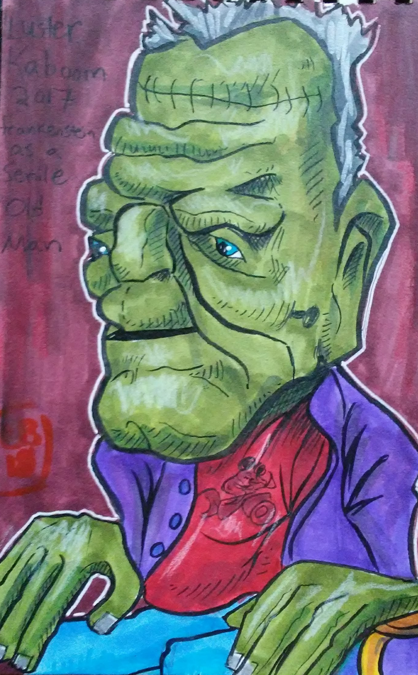
Another one I liked was this 3-dimensional piece by Luster Kaboom that imagined the Frankenstein monster as an old man.
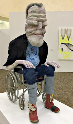
I liked it so much (especially his Mickey Mouse t-shirt, nice touch) that I did a little sketch of it. Then about eight months later I came back to it and colored it with alcohol markers.
Eight months later!
I have been doing that a lot lately. Going back to things I drew a while ago, things that I had already considered “finished,” and coloring them in and sometimes adding a background. It’s been fun, making old things better with my newly acquired passion for color.
Same thing with my writing. I’ve been taking plays I wrote years ago, plays that have already been produced, and rewriting them using new skills and techniques that I have learned since I wrote them the first time.
A part of me feels like I should be focusing on making new things with these new powers, rather than messing with old stuff. But it’s really fun and challenging to go back to something I already put a lot of time and energy into, something I’m already attached to, and improve upon it.
My good friend Kevin has cockatiels as pets — Pitiful and Shemp — and I had the pleasure of bird-sitting them a couple of times. I fell in love right away. Especially with Pitiful, who made me late for work one morning when he jumped on my shoulder and I couldn’t get him off. As you can see from this picture, I wasn’t that mad about it.

I liked Shemp too, but he wasn’t as friendly with me, this rando human that he didn’t know. But Pitiful would eagerly hop onto my hand and whistle songs.
The only other experience I had with birds was when I was five and my mom got two parakeets. The day she got them we were sitting on our porch with their cage and I thought it would be a great idea to let them stretch their wings. So I opened up the cage and away they flew. Forever. We’d had them for like 2 hours. If memory serves, Mom was way cool about it.
Luckily I learned from that experience, and 30+ years later when Kevin let me take care of his cockatiels I managed to keep them in the house.

Pitiful earned his name years ago when Kevin found him in a dry canal and he looked so…well, pitiful.
The last time I bird-sat I got this great photo of him. He seemed to know that I was trying to take a picture and cocked his head in the most flirty adorable pose.
He could look at you like he wanted to know all about you.

Sadly, he passed away just a few weeks after this picture was taken. Kevin was obviously heartbroken. Pitiful had been a wonderful pet to him for 24 years.
I was also very sad, and wanted to do something to commemorate this sweet little bird, so I decided to make Kevin a picture to remember him by.
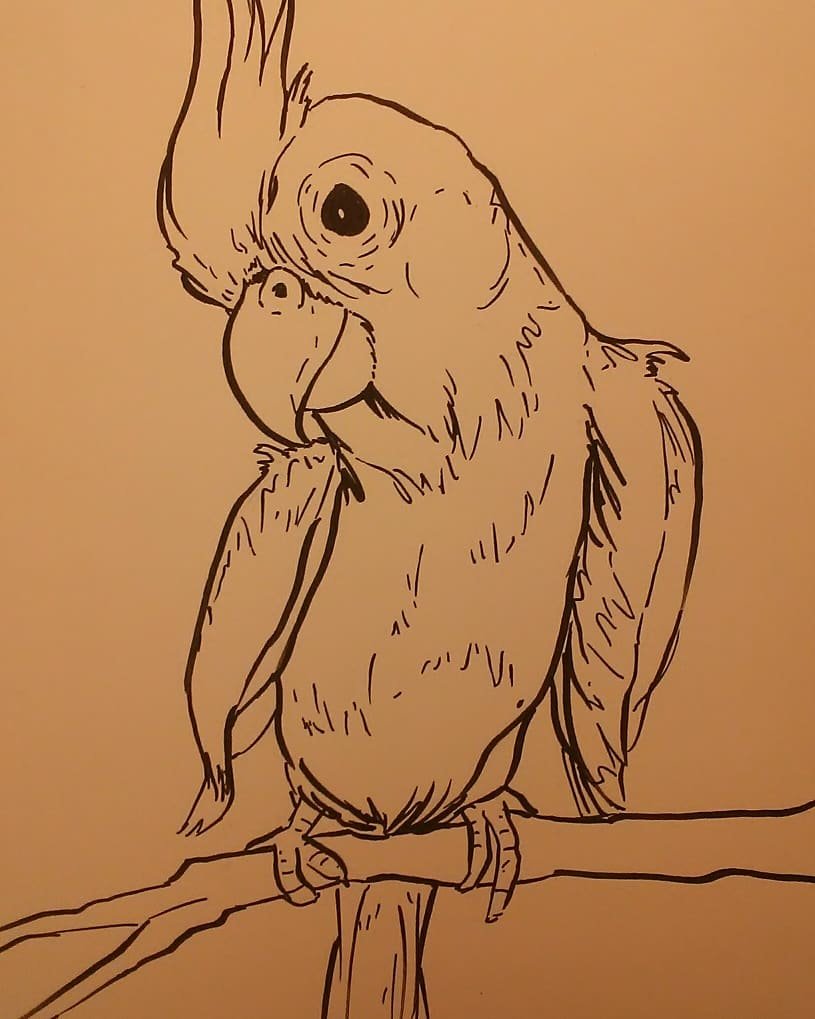
I used the photo I took for reference, but I guess all those big head caricatures I’ve been doing lately sort of seeped into my subconscious cuz Pity’s head and beak ended up a bit out of proportion. I kinda like that though. It shows how smiley he was. 🙂
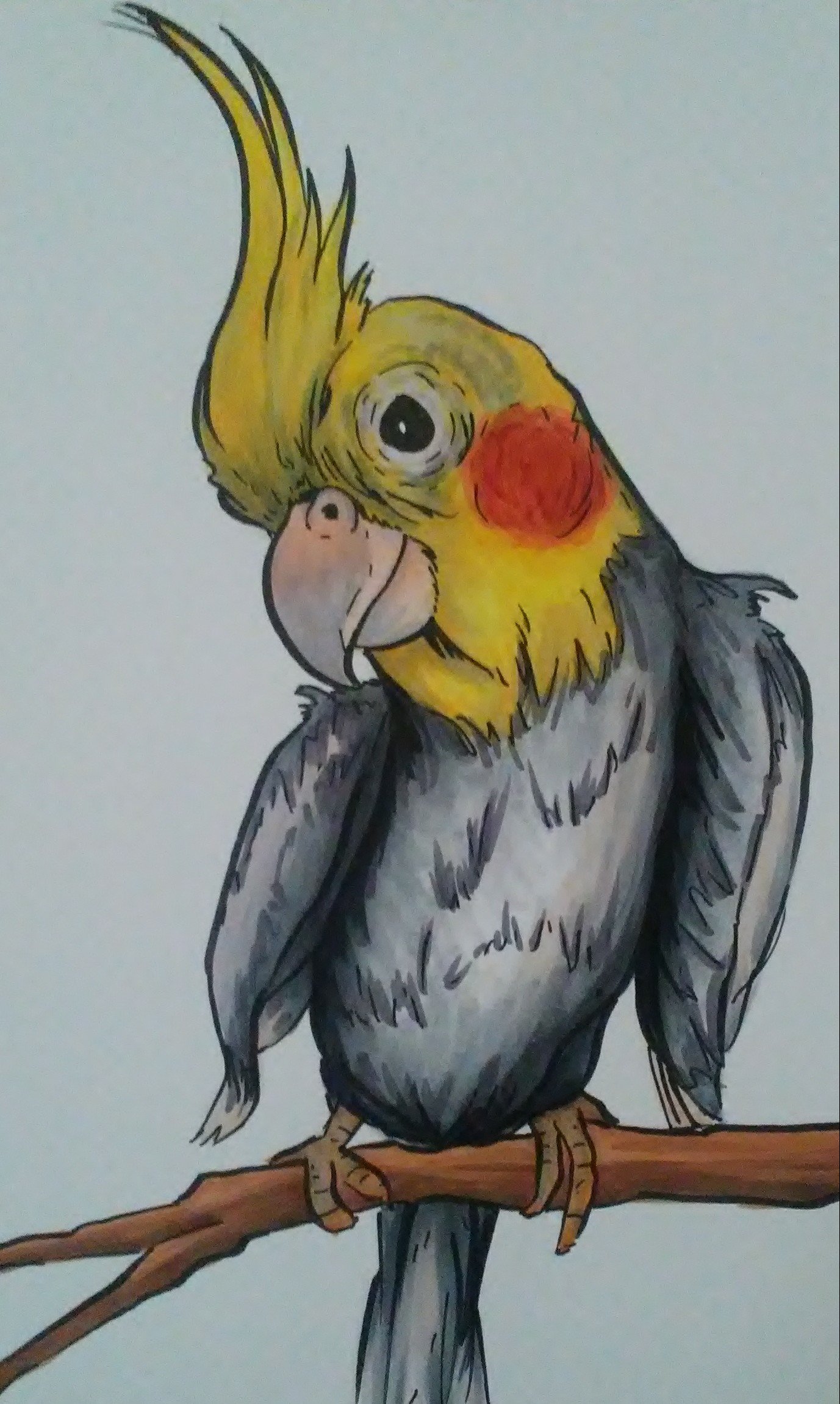
I used alcohol-based studio brush markers to color him in. I have a tendency to go too dark too soon when I use these markers, and I was afraid that would happen here. Pitiful’s upper torso is actually a darker grey, but I held back a bit out of fear of ruining it.
For the background I wanted to do something kinda abstract so I made some rays of cerulean shooting out from behind him. Then I used some bottle cap stamps that I had made to add some random purplish shapes.
I like how the shape right above his head sort of looks like a bird in flight.

I found a really cool metal frame at Michael’s that sort of looked like a birdcage. I put the drawing in it and I gave it to Kevin on his birthday.
I was a little worried that he might think it was a drawing of Shemp, his other cockatiel. (Not to be bird-racist, but they do look a lot alike.) But he didn’t. When Kevin unwrapped the picture he looked at it for a little while and then quietly said, “I miss him.”
I do too.
I have been drawing my whole life, but I’ve never been very comfortable using color, so I avoided it and secretly felt some shame that I was supposedly an artist but couldn’t paint.
In the rare instances when I did use color, I usually went with colored pencil or water-based Tombow markers. I enjoy working in both of those mediums, but I’ve never been totally satisfied with the results. The markers don’t blend well, and I can’t get much vibrance out of colored pencils.
Then one day last year I bought a small set of alcohol-based markers. I wasn’t really paying attention and kinda bought them by accident. To be honest I didn’t know the difference between alcohol and water-based markers. But I used those markers to make some photo-booth props for a party I was helping to plan, and I was thrilled with the results. They blended so well, and the colors really popped.
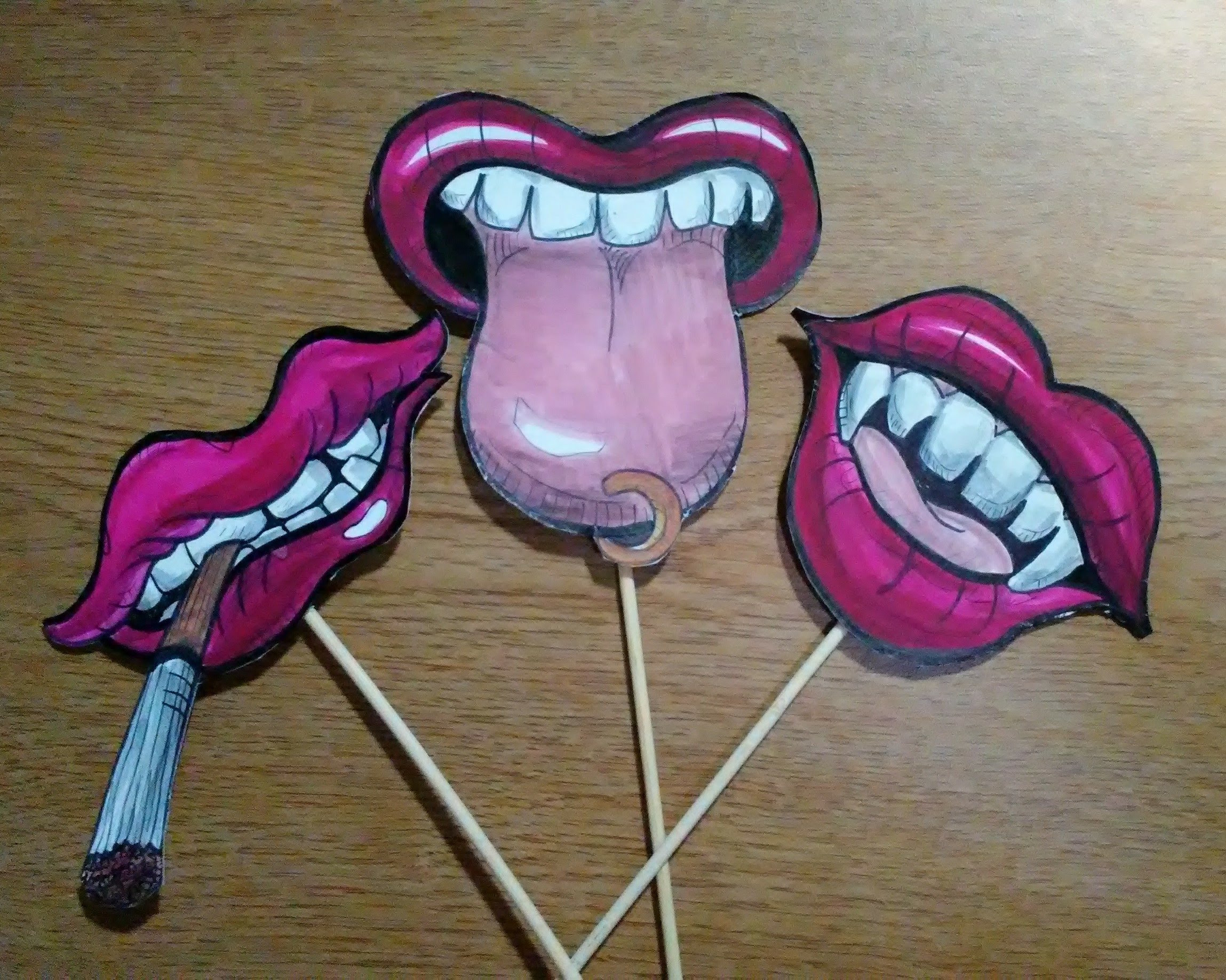
I had long been toying with the idea of doing big head caricatures of old master portraits, and these rad new markers seemed like the perfect medium.
Right around that same time the Phoenix Art Museum opened a new exhibition called the Schorr Collection which had a bunch of old master portraits. So I did some pencil sketches of a portrait on location at the museum, and then went home, very excited to complete it in ink and color.
My set of alcohol markers only had six colors, so I attempted to add in some of my Tombow markers in order to have a wider palette. And that’s when I learned that water-based markers and alcohol markers do not mix…


My first attempt at an old master caricature was a total bust.
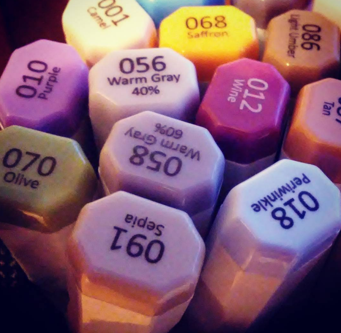
I returned to the store with the intention of buying four or five more colors to add to the mix, but ended up buying eighteen!
Then I went back to the museum, did more sketches of portraits, brought them home and markered the s#¿+ out of them.


I was really pleased with how some of them turned out.


Others not so much.


But I watched some tutorials online and learned some tricks on how to use alcohol markers.


It was by far the most success I’d ever had using color. Whenever I completed one I felt excited to do another.


I lost my photos of the original portraits on these two. 😦


After I’d done a bunch of these things I decided to take another shot at that first Lorenzo Lotto portrait using my newly acquired skills. Here are some WIP pics…


I was much happier with the result this time around.
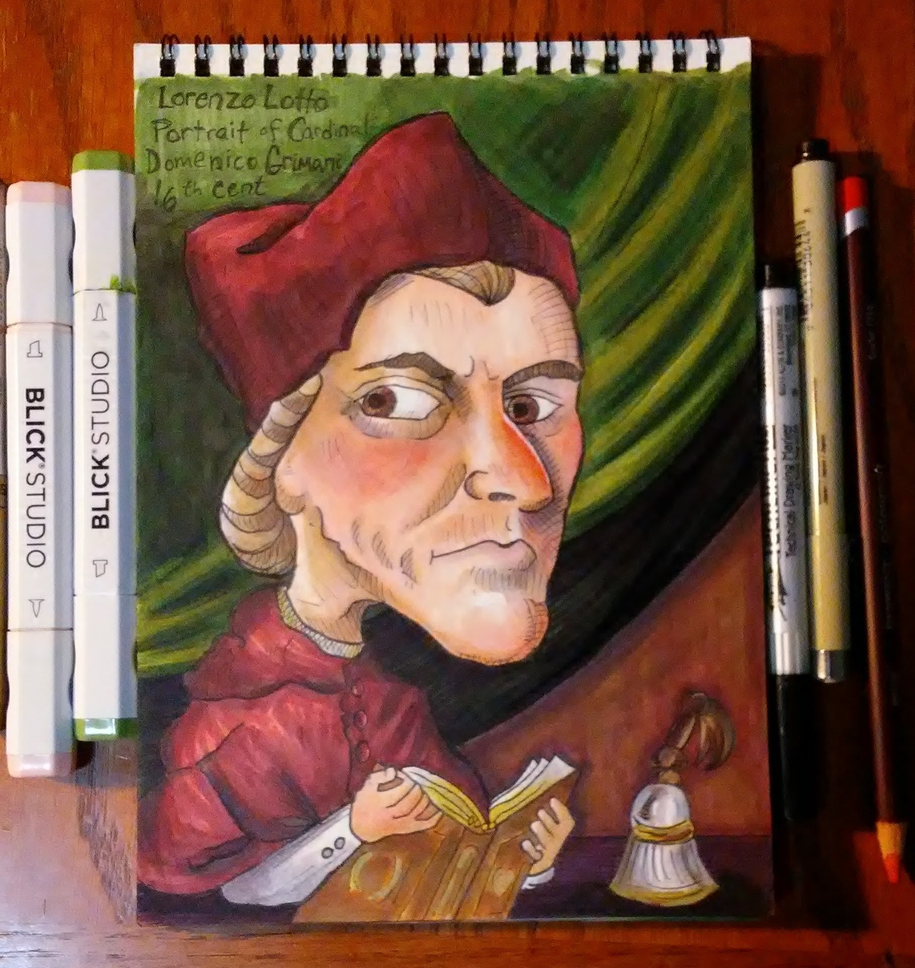
And when comparing it to my first attempt I could really see the progress that I had made. It felt good. This was the biggest leap forward I had taken with my art in years. All because of alcohol markers.
I hate to admit that I had to buy myself some new toys in order to become a better artist, but that is kinda what happened.
Here’s a before and after to show how much difference a few weeks of practice (and 18 more markers) can make. 🙂


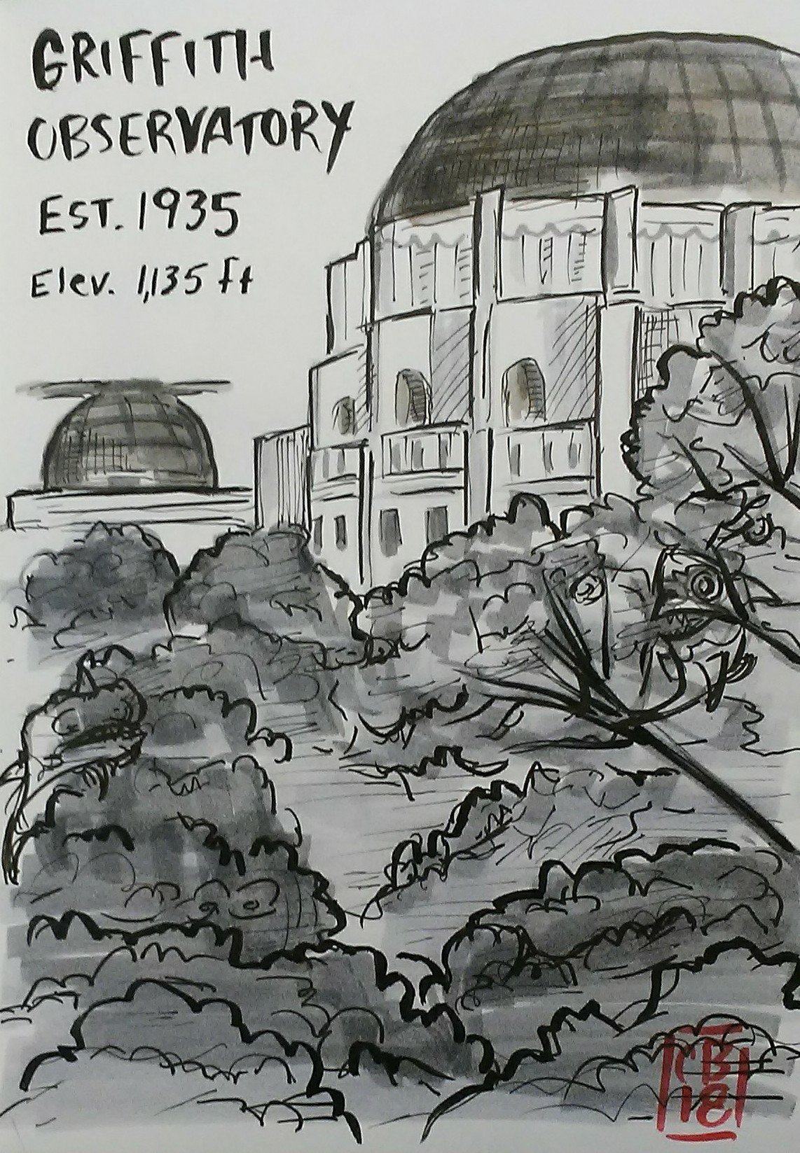
Last weekend I visited my little brother in LA. Turns out he lives within walking distance to the Griffith Observatory, which is a place that I have been wanting to visit for many years. It’s a steep little hike to get up there, but totally worth it.

Unfortunately the observatory didn’t open until noon and I was there at about 10AM, so I didn’t get to see inside. But while I was up there I did some pencil sketches.
After I got back from the trip I inked and shaded.
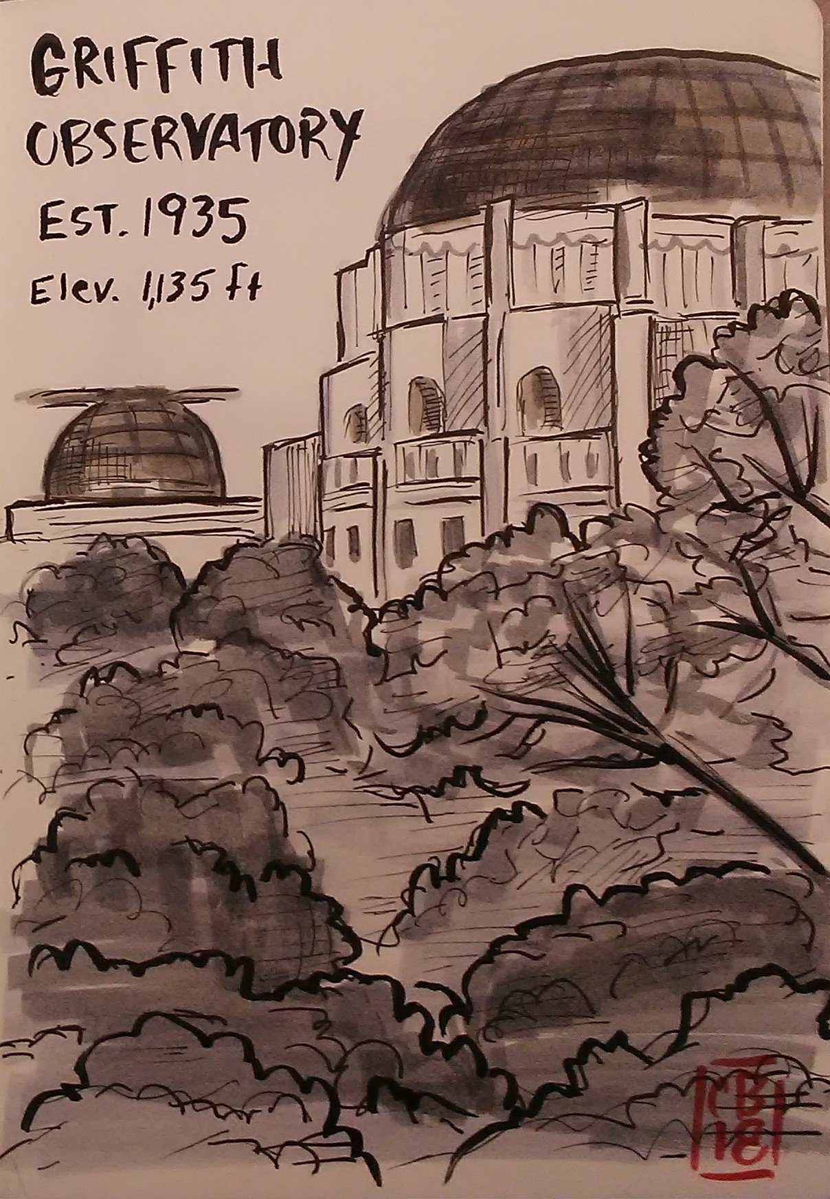
This is a bit out of my comfort zone. I mostly draw people, and I get really impatient when it comes to architecture and nature. I did kind of a sloppy hasty job here, but I still had a lot of fun.
I recently bought some brush pens and I have enjoyed experimenting with line quality. I think the brush pen is a great tool for drawing foliage and stuff, but I am definitely going to need more practice.
After I finished I remembered that my pal — rad artist, and lover of sharks– Jessica Hickman proclaimed September to be Sharktember, a drawing challenge where you draw a shark everyday. So I decided to put a hidden shark or two into everything I draw this month.
Here is the new and improved Sharktember version. See if you can find the sharks.
Every year during the month of October many artists participate in a drawing challenge called Inktober, which was invented by an artist named Jake Parker as a way to improve his inking and to develop daily drawing habits. I learned about this because many of the artists I follow on Instagram participate in it.
The rules are simple. Draw something in ink every day and post it online. Lots of artists create and share their own list of prompts to use as inspiration each day.
When I learned of this I became really excited because A) I love October and Halloween and B) I love finding ways to motivate myself to do creative work.
I wanted to create my own list of prompts and invite people to participate. The only thing was that I did not want to limit the requirements to ink only. I just wanted to do something that inspired people to make art, whether it was in pencil, crayon, photoshop or whatever they want.
So I decided to make my own challenge called Sketchtober, and I invited my pal Jessica Hickman to help me create a list of fun Halloween-inspired prompts.
I have attempted to do nanowrimo many times but I never get far. Partly because nanowrimo is effing hard, but also because I put too much pressure on myself to write something “good”, or even “not horrible”, which is not the point of it at all. Nanowrimo is all about getting your ass in the chair everyday and hitting a word count goal, even if what you come up with is just gibberish.
That’s what I wanted to do with Sketchtober. Just draw something– ANYTHING– everyday. October was already a really busy month for me, as I was frantically writing a play that had a looming deadline, so I didn’t really have any extra time for other projects. I just wanted to do a quick little sketch every night to end the day on a creative note.
That shouldn’t be too hard, right?
On October 1st I did my first Sketchtober, which turned out to be a little cartoon. Even though the drawing is pretty crude, I already set a dangerous precedent by making a joke.
Uh oh! Now they all have to have jokes!
1) HORROR MOVIES

On day two I upped the expectations by adding shading.
2) CEMETERY LARRY

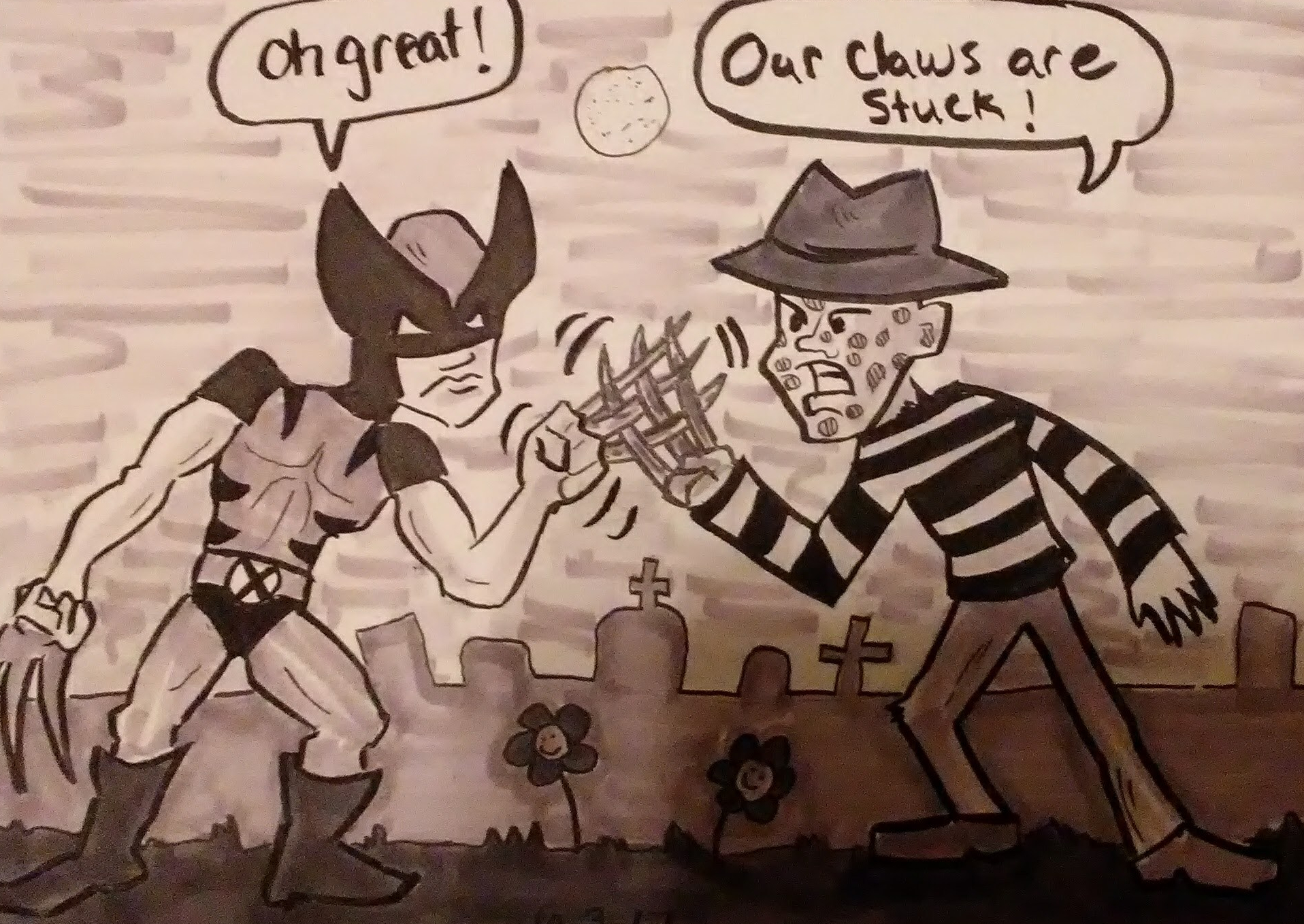
On day three I used alcohol-based copic markers for the shading, instead of the water-based tombow markers I used on day two. I LOVE alcohol-based markers when doing full color, but I realized here that I don’t really like them so much for black and white work. The tombow markers just look a little cleaner or something.
I spent a little more time than I wanted coming up with a joke here. And then I had to look up pictures of Wolverine and Freddy for reference. Damn it! It was only day three I was already spending more time on these than I intended.
3) NIGHTMARE
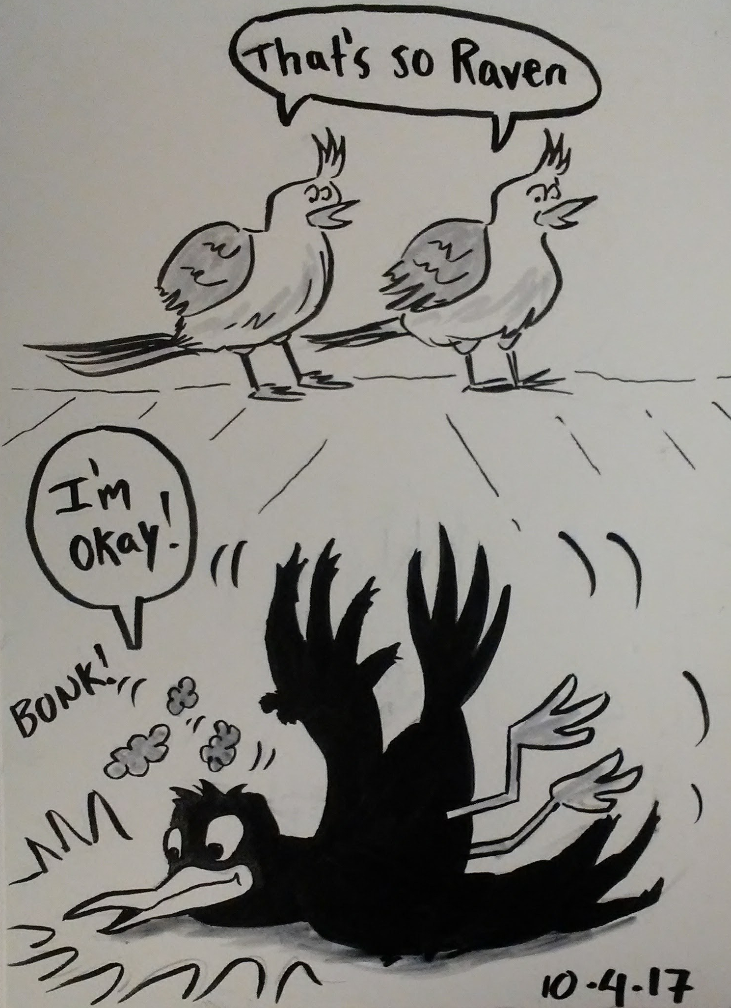
By day four I started brainstorming ideas for what I would draw as soon as I got to work in the morning. I’ve never seen That’s So Raven, but I went down a rabbit hole reading the wikipedia page so I could learn enough about the show to make a joke.
4) QUOTH THE RAVEN
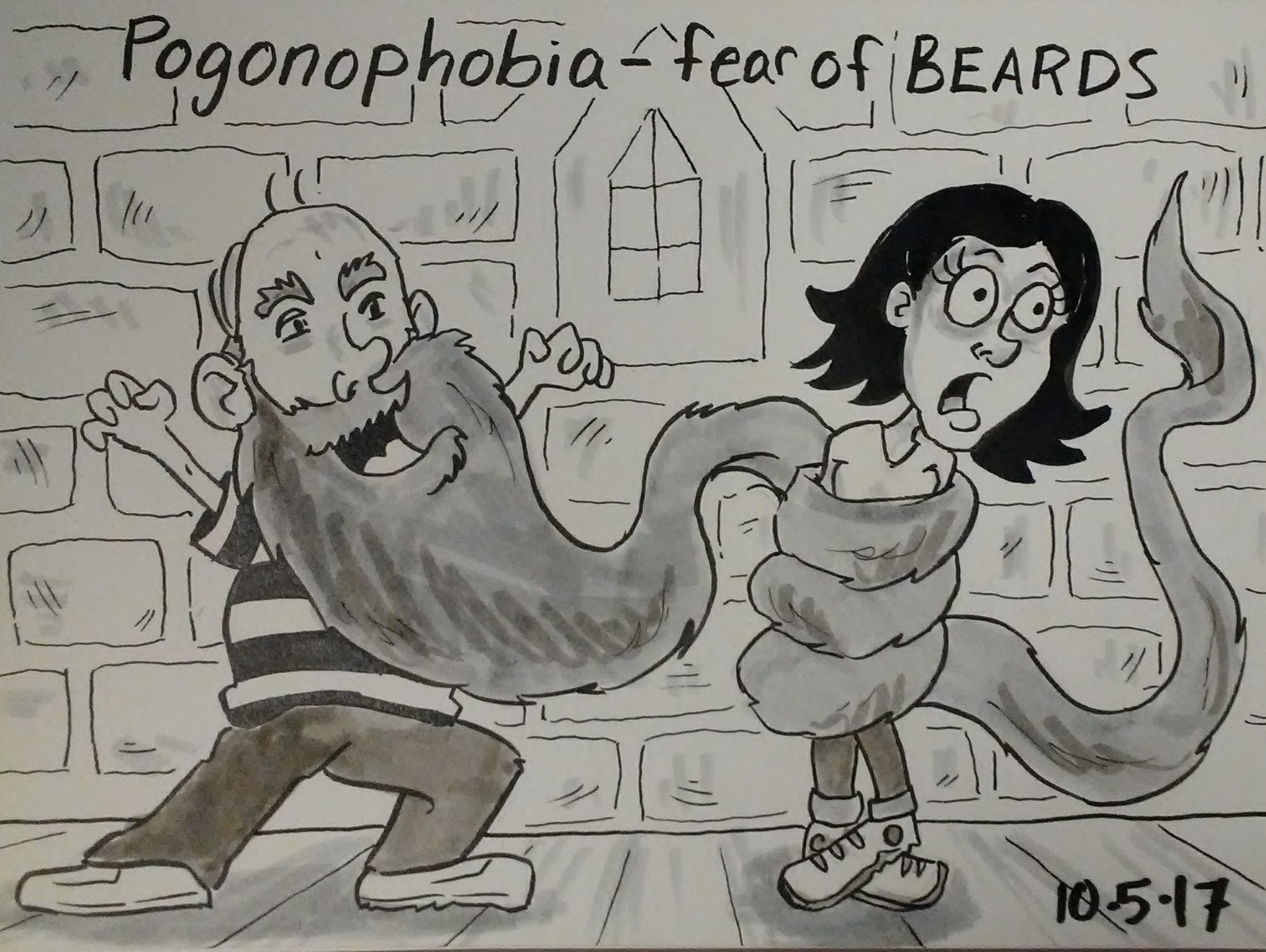
According to the baby book my mom kept, I was afraid of men with beards when I was a baby. So this one is a little autobiographical.
5) PHOBIA
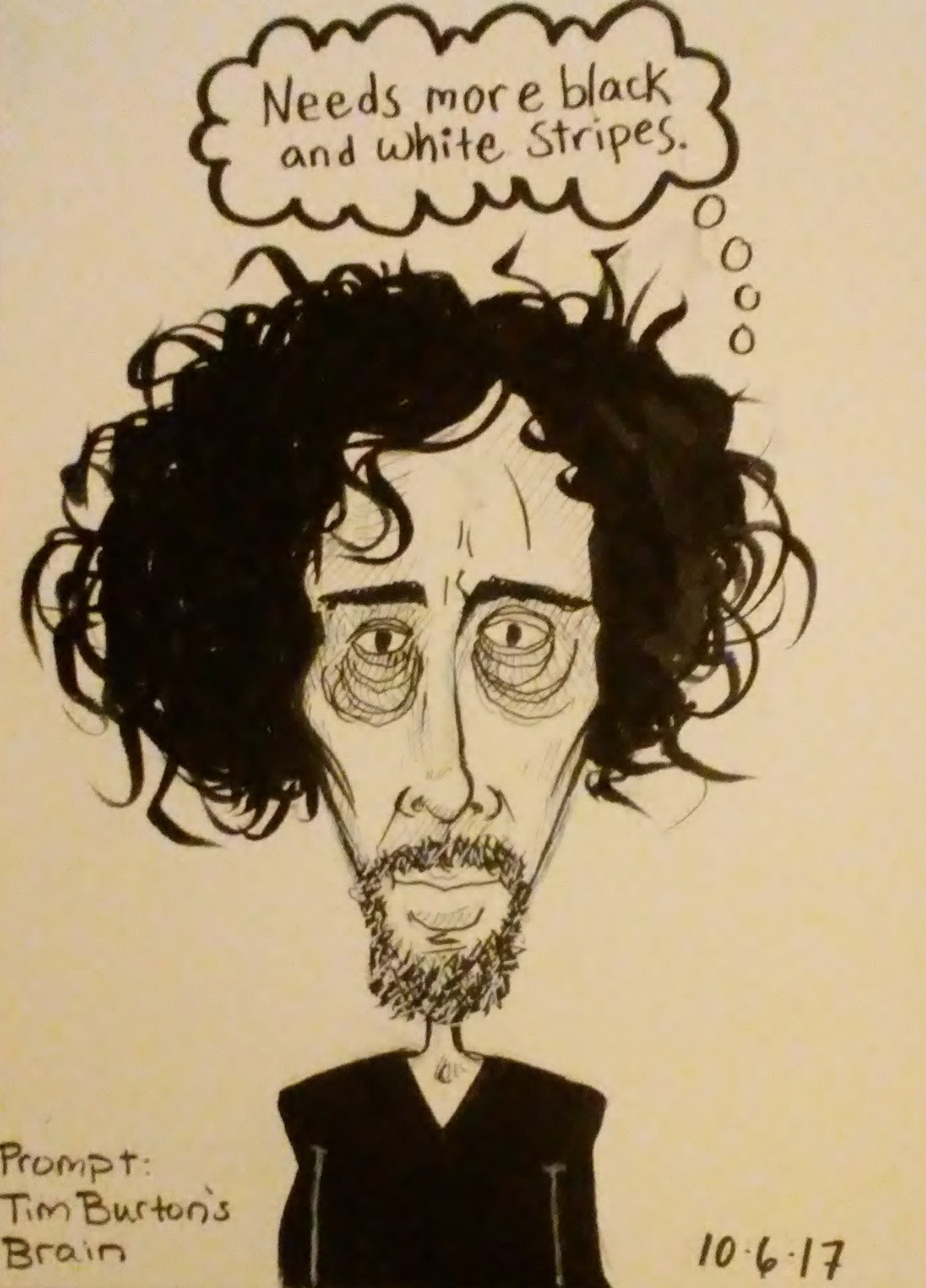
By day six I realized that it’s better to get the drawing done earlier in the day, because if I photograph it at night it looks yellow due to the lack of natural light.
6) TIM BURTON’S BRAIN
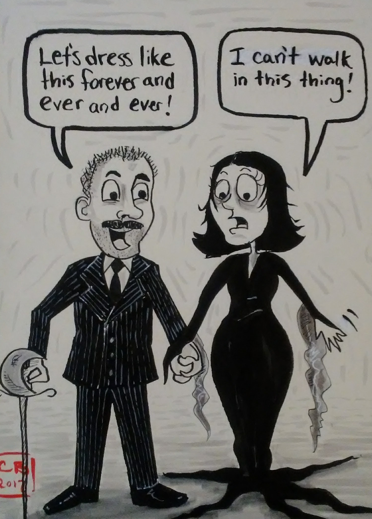
For day seven I drew myself and my husband dressed as Gomez and Morticia. Richard is a huge Addams Family fan says every year that we should be them for Halloween, but we never do because we are lazy.
7) COSTUME
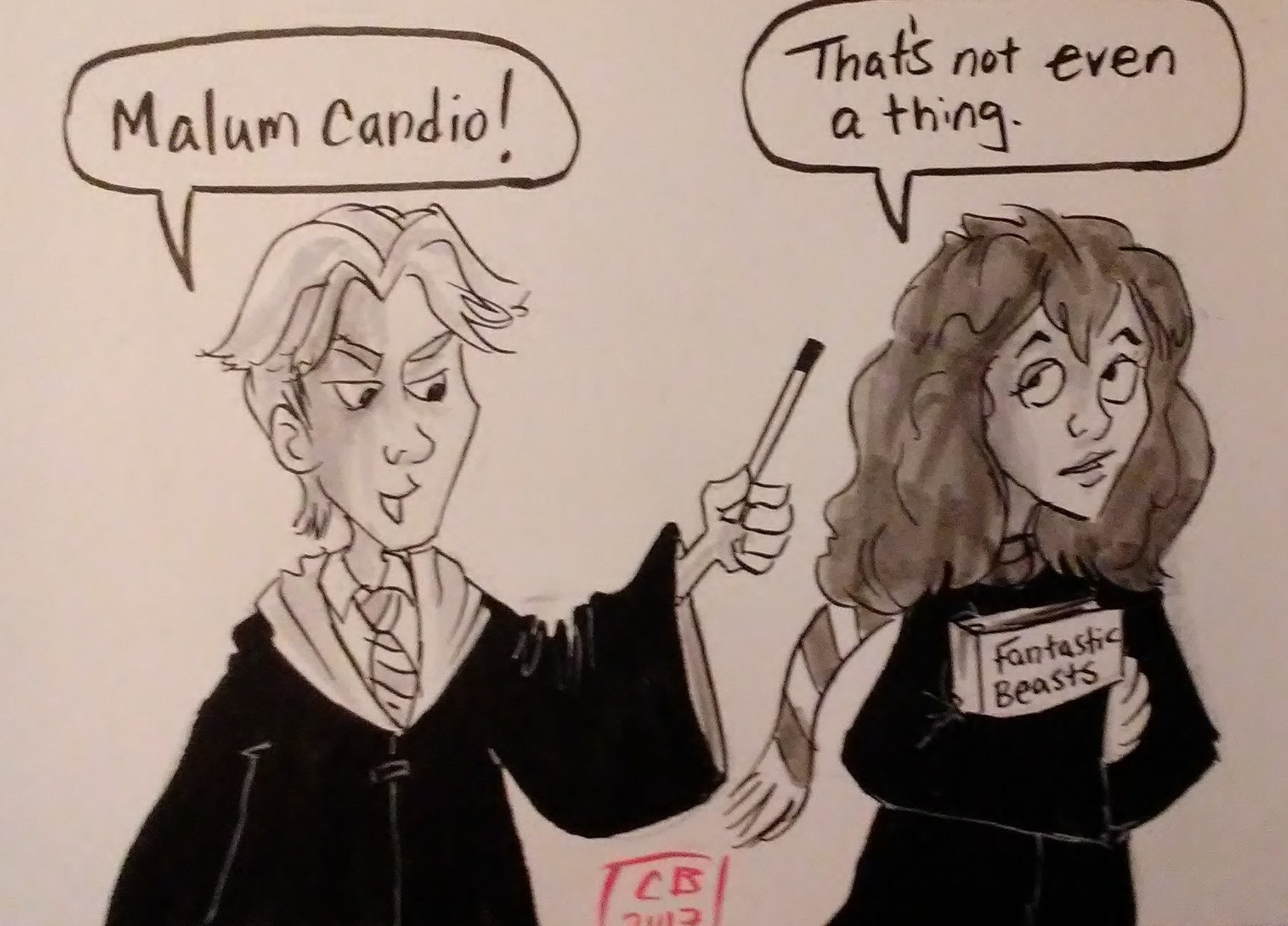
On day eight I made a Harry Potter reference. I can’t believe it took 8 days.
8) CURSE OF THE CANDY APPLE
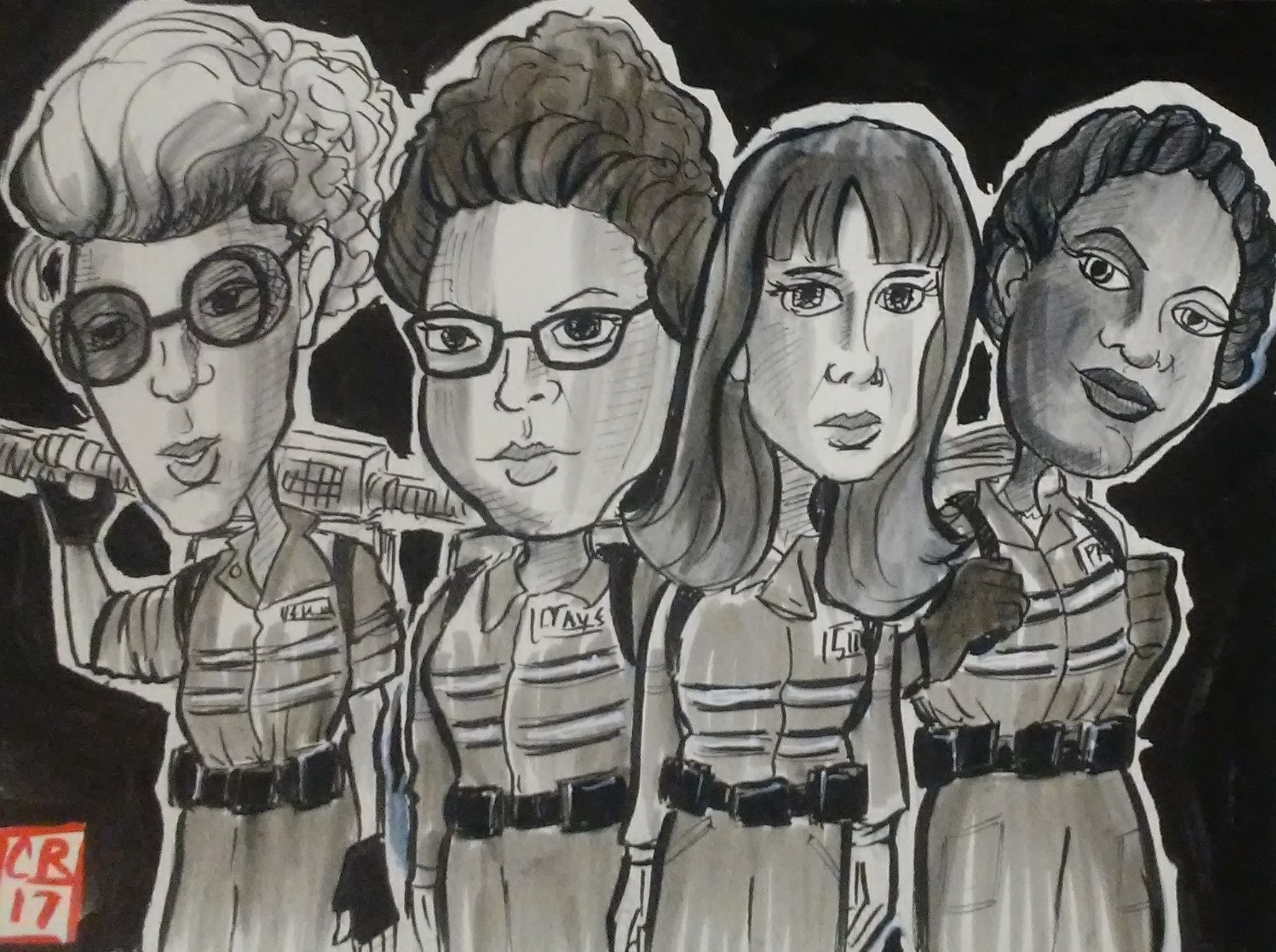
On day nine I just wanted an excuse to draw the lady Ghostbusters. This one took 2 or 3 hours to do, but I did it while watching Ghostbusters so it was fun.
9) GHOST
On day ten I found a way to put Sho Nuff and the Frankenstein monster into the same cartoon. This required looking up reference pics for both characters as well as the background. Again this took 2-3 hours total and it looked like there was no going back now.
10) YESSSSS MASSSTER

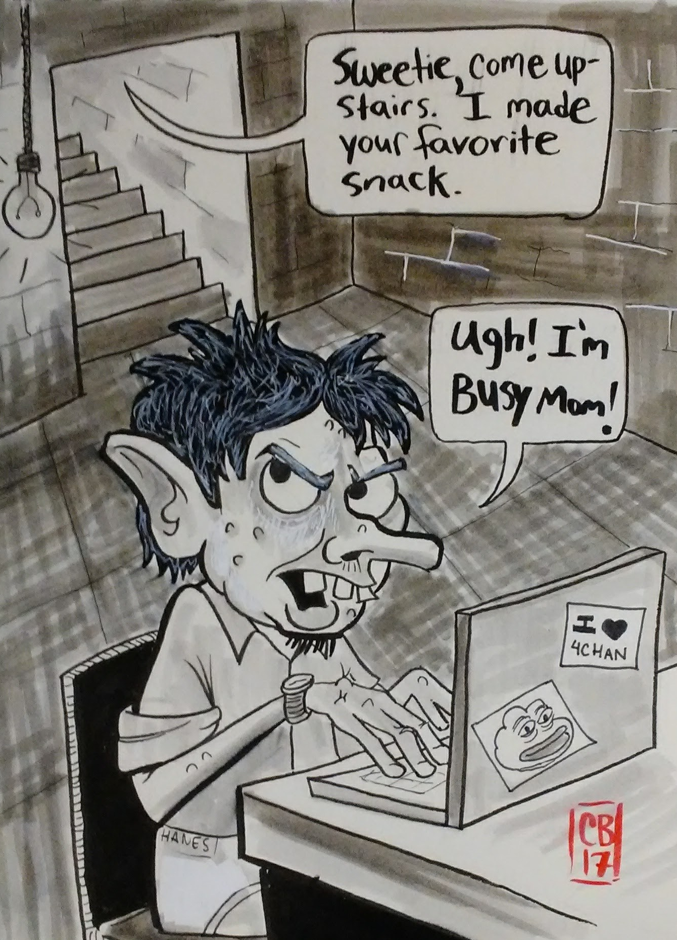
On day eleven I took a shot at internet trolls, the scum of the earth.
11) BASEMENT
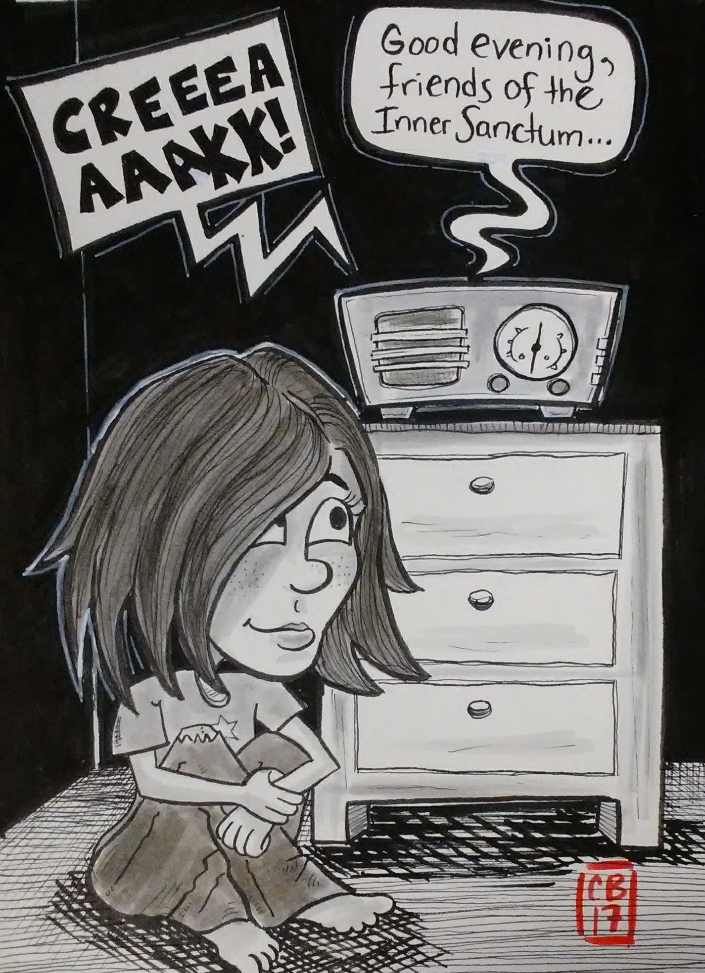
Day twelve was basically an homage to my love of old time radio. This ended up being one of my favorite drawings from this series.
12) INNER SANCTUM
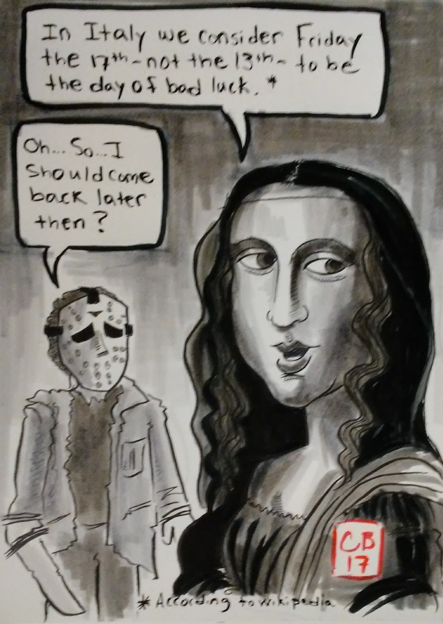
On day thirteen I spent way too much time making an underwhelming joke.
13) FRIDAY THE 13TH
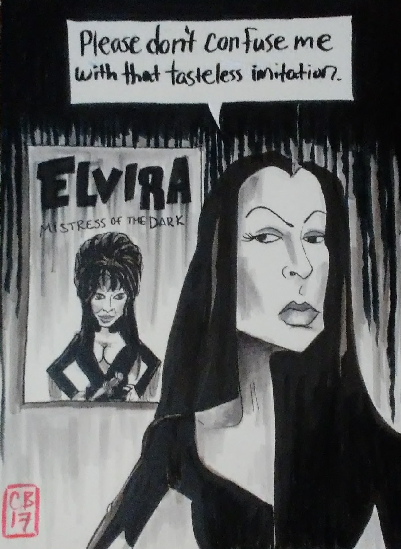
I used to think that Vampira and Elvira were the same person until I saw that movie Ed Wood. Then I fell down an internet rabbit hole and learned all about Vampira and how Elvira kinda stole her persona. So that’s what day fourteen is about.
14) VAMPIRA SAID SO
On day fifteen I referenced Orphan Black, which is a super cool show. Well the first two seasons are super cool. After that the plot kinda goes off the rails. But the characters are fantastic, and they are all played by the same actress, Tatiana Maslany, who is rad AF.
Anyhow, drawing anthropomorphized cat versions of the clones was way harder than I thought it would be.
15) BLACK CAT

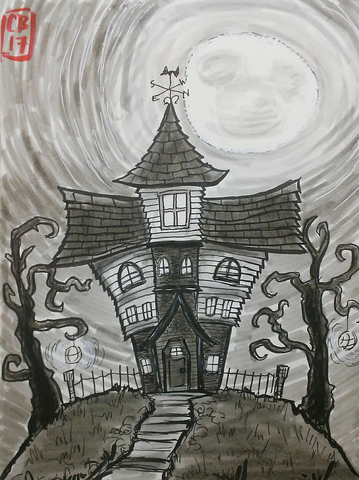
On day sixteen I did a haunted house because I looooove haunted houses. This one has a hidden Mickey. Speaking of haunted houses, check out the work of AZ painter Lew Lehrman. He takes commissions to paint people’s houses, but he makes them look like a haunted house. So cool.
16) MOUSE ON HAUNTED HILL
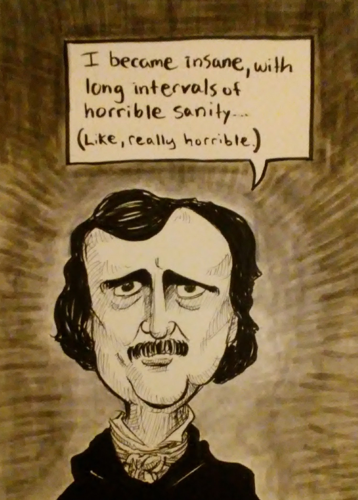
We have a magnet on our fridge with a picture of Edgar Allen Poe, which I used as reference when I drew this one.
17) EDGAR ALLEN POE
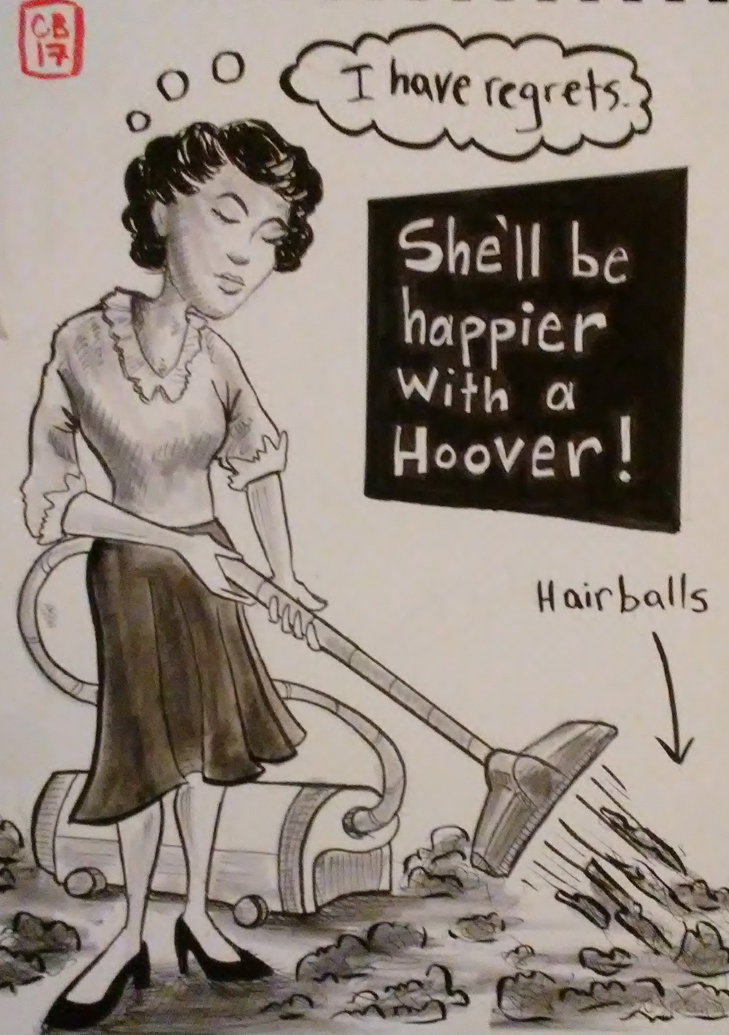
On day eighteen I did my other favorite drawing from this batch. The prompt was “Lon Chaney’s mom” so all I could think about was how she would be having to clean up the hairballs from her werewolf child. That made me think of vacuum cleaners, and then the next thing I knew I was looking up sexist magazine ads from the 1950’s for reference. This is such a weird joke, but I really liked how the drawing came out. This took 3-4 hours.
18) LON CHANEY’S MOM
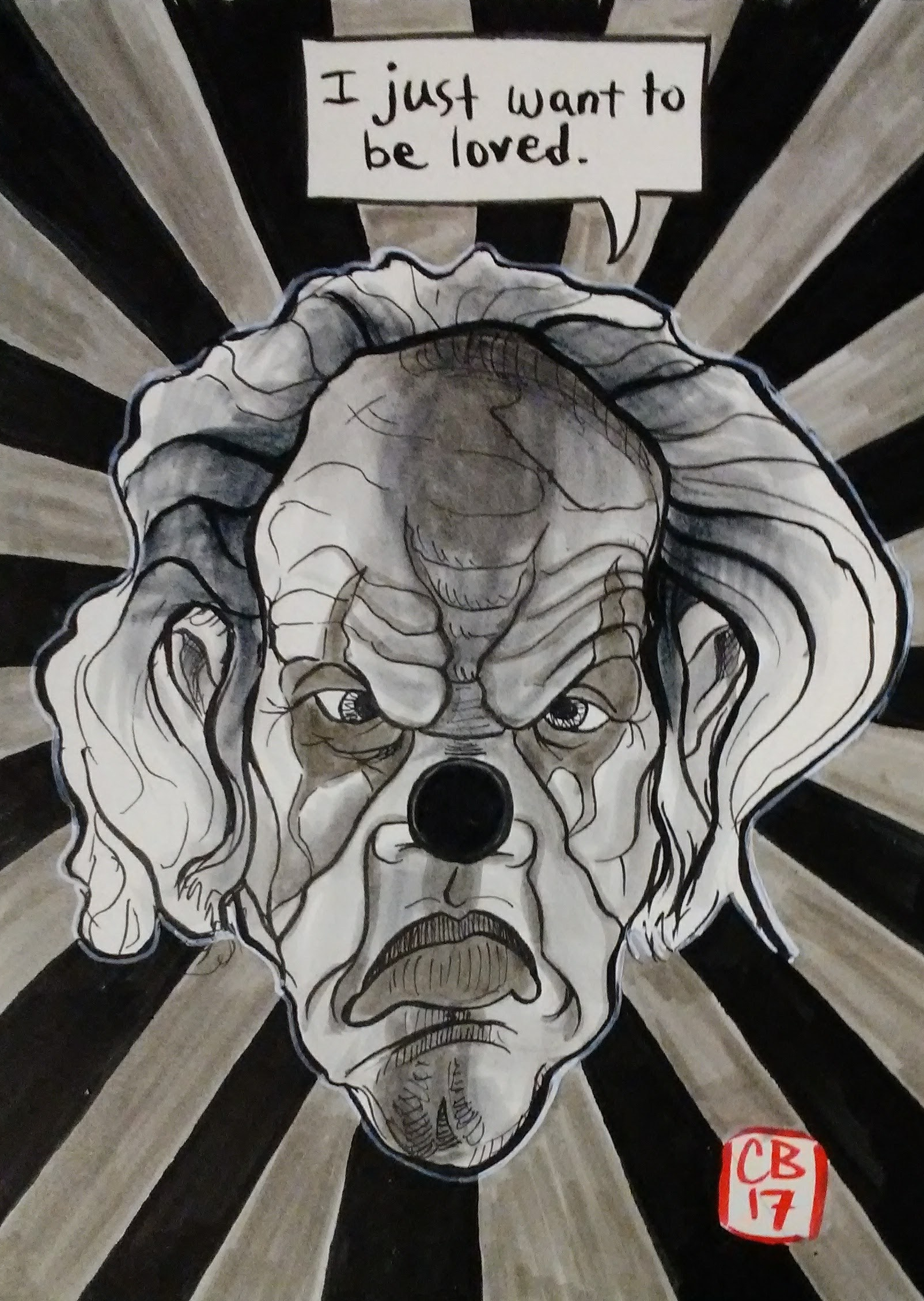
On day nineteen I came across a coupon for a haunted house that had a picture of this scary clown on it, which I used for reference for this one. It was really fun to draw.
19) CLOWN
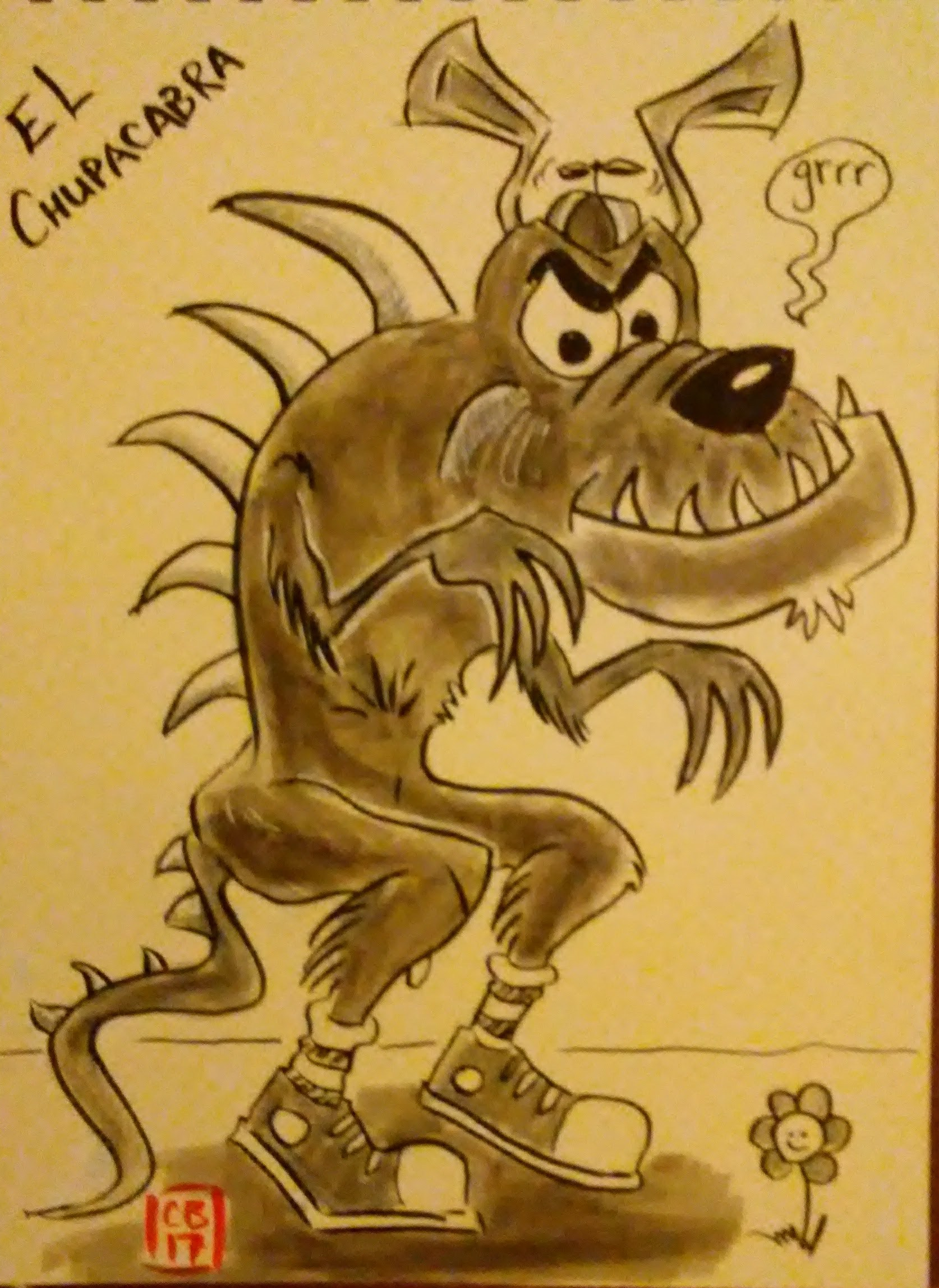
On day twenty I put up a poll on social media listing several urban legends and asked friends to vote. El Chupacabra was the winner, so that’s what I drew. Every time I try to draw some sort of monster they just come out looking cute and not the least bit scary.
20) URBAN LEGEND
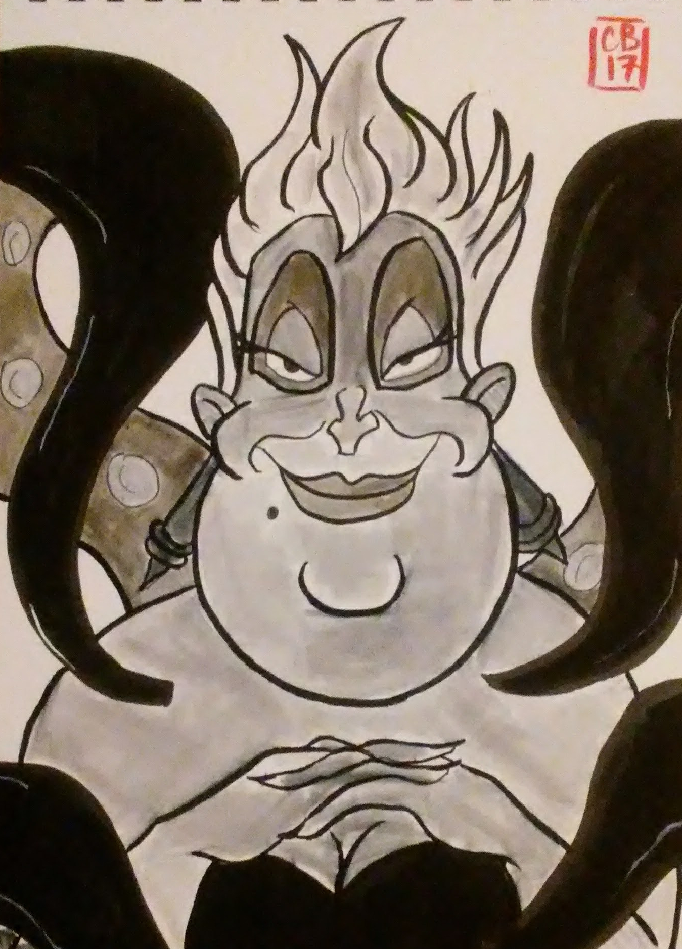
The word wicked made me think of Disney villain, so on day twenty-one I drew Ursula.
21) SOMETHING WICKED THIS WAY COMES
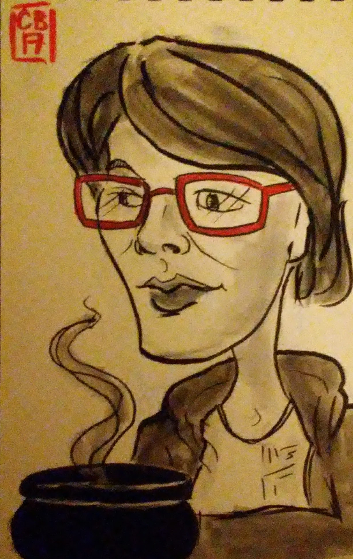
On day twenty-two I was really freaking busy and could not carve out any time for a Sketchtober drawing, but I did have lunch with my mom that day where I did a quick sketch of her. Later I added a cauldron and called it Sketchtober.
22) BUBBLE BUBBLE TOIL & TROUBLE
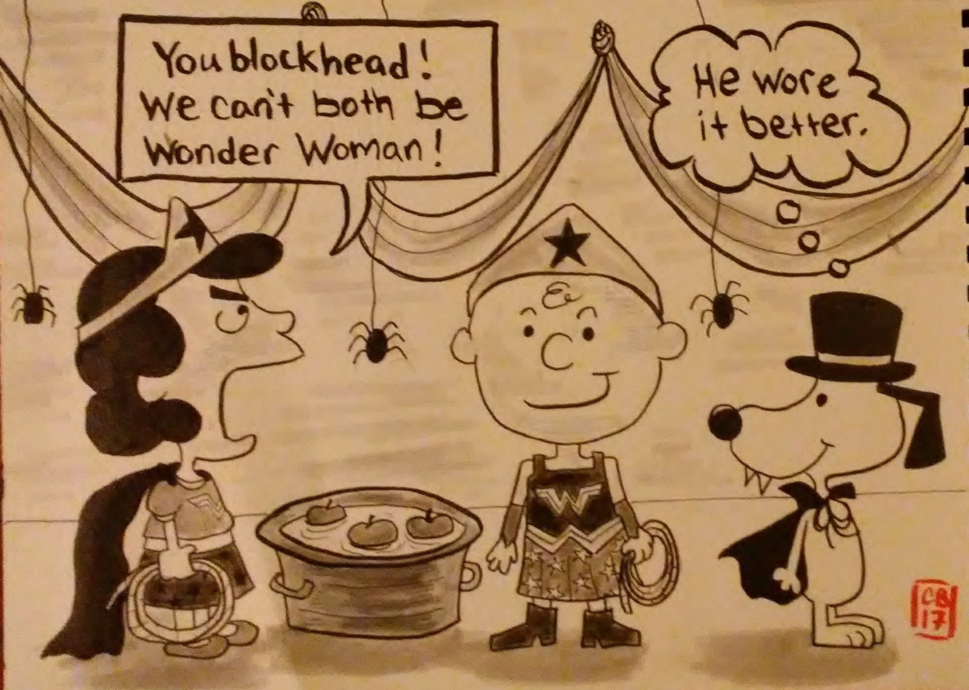
On day twenty-three I managed to put the peanuts gang, Wonder Woman, and a pro transgender message all in the same picture.
23) HALLOWEEN PARTY
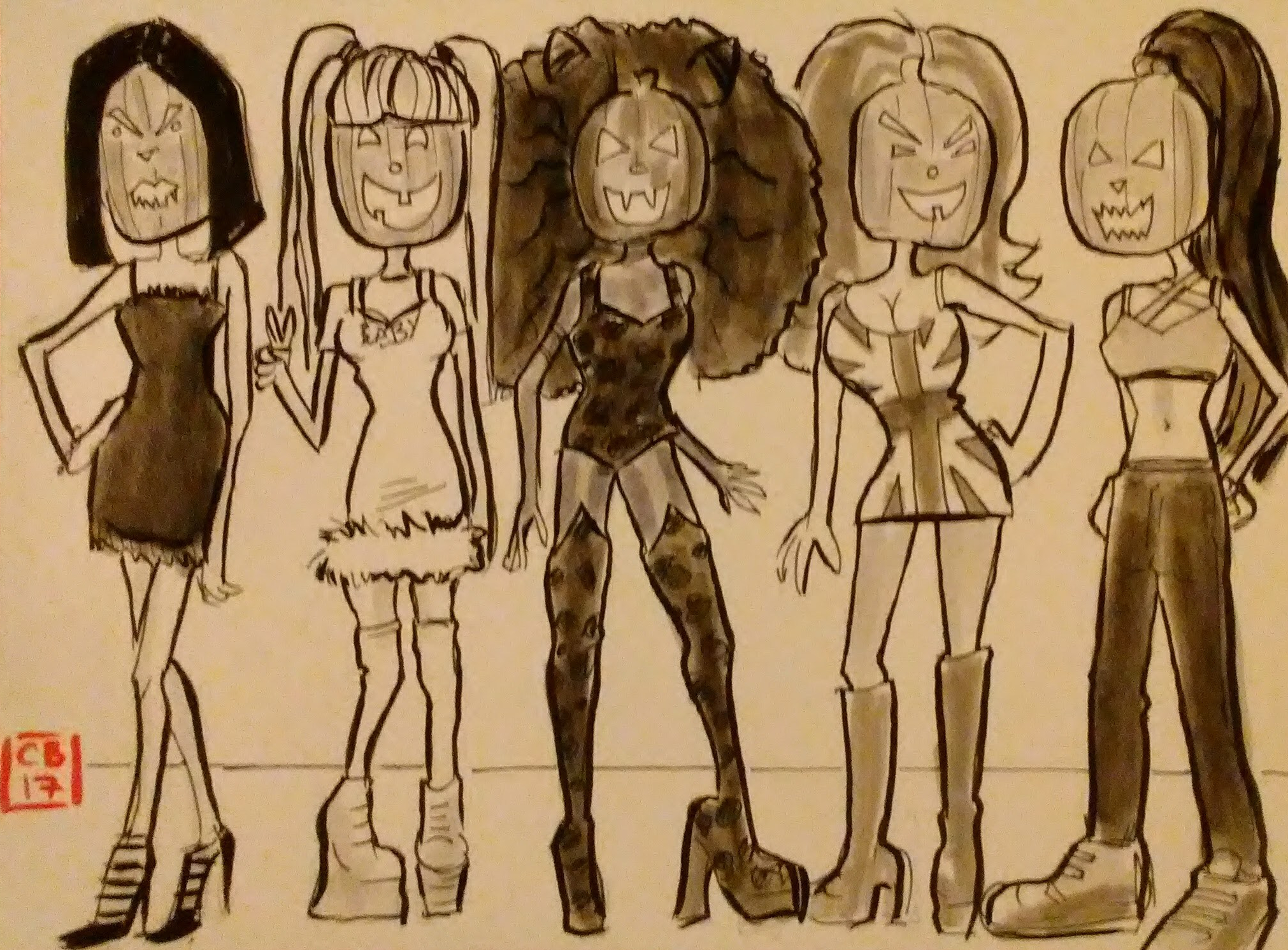
On day twenty-four I had a blast drawing the spice girls with pumpkin heads.
24) PUMPKIN SPICE GIRLS
And then here is where it all fell apart. I knew from the beginning that I didn’t have a lot of time to put into these drawings, but I kept doing it anyway because I was having so much fun. But I had other projects going that month that were more important and I really had to focus on them.
I could have just done quick little five minute sketches each day, like I had intended from the beginning, but because the drawings had grown more and more carefully crafted I felt like I had to keep up that level, and I just didn’t have time.
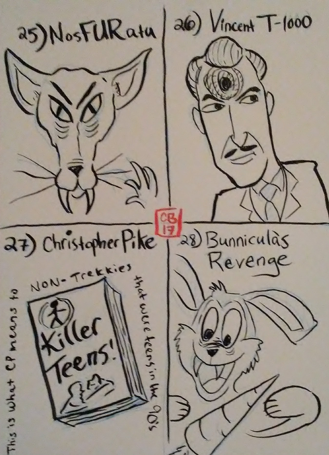
So I let four days go by without doing any Sketchtober drawings at all. And then I felt completely overwhelmed by the idea of having to four drawings to catch up. But I also had been doing so well up until that point, that really I didn’t want to just stop when I was so close to the end of the month.
So finally broke down and did four dumb little sketches on the same page. The exact kind of sketches that I had intended to do when I started this project. Whew. Now I was caught up.
25 THROUGH 28
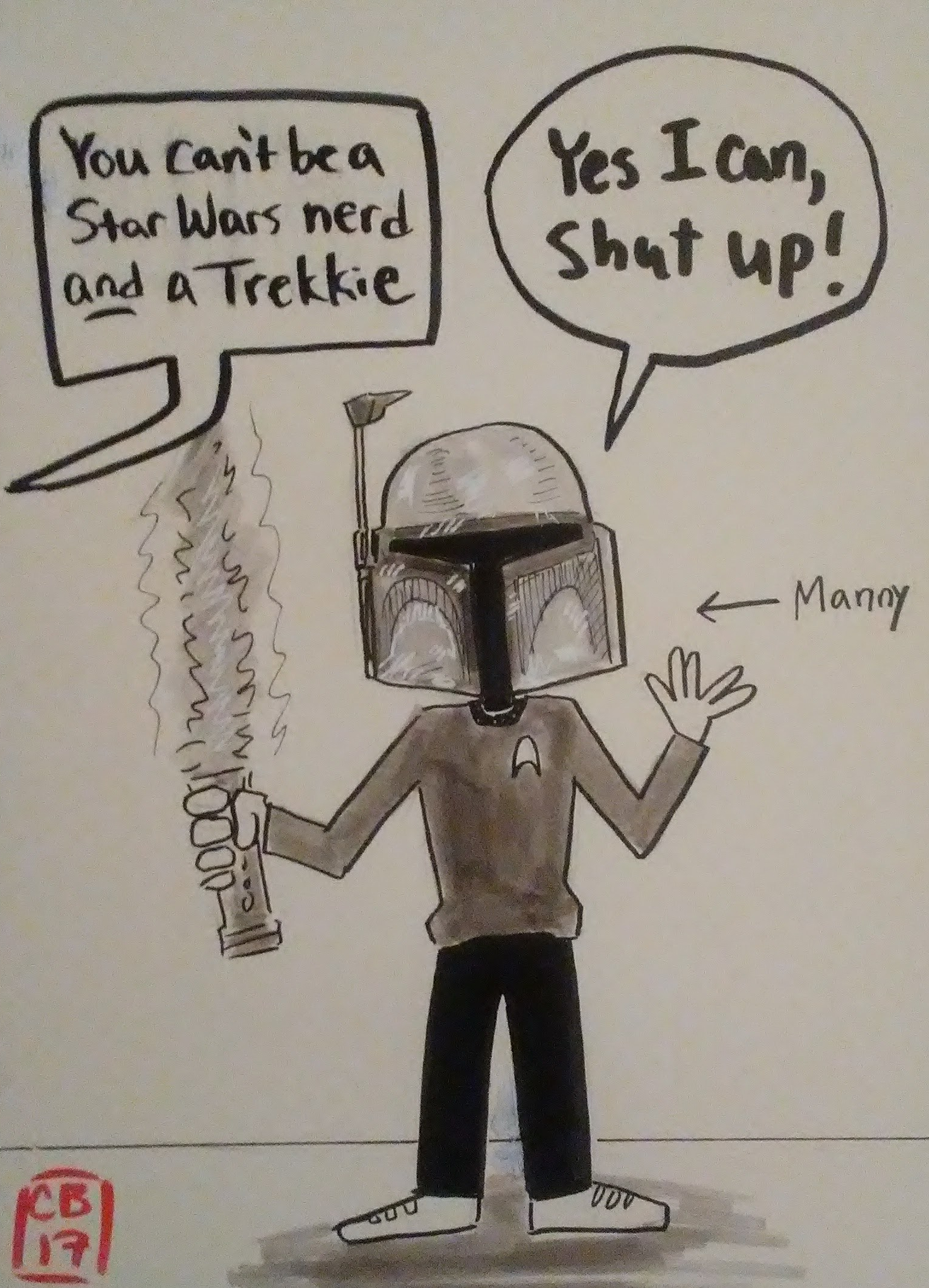
Throughout this whole time, my artist friend Manny Burruel, had also been doing daily Sketchtober drawings with me. Manny is a lover of sci-fi, especially Star Wars and Star Trek, so on day twenty-nine I made a cartoon about him.
29) SCI-FI
Most people are familiar with Garbage Pail Kids, the insanely popular collector cards from the 80’s that depicted Cabbage Patch-looking kids doing weird and gross stuff.
But guess what? There was a whole other set of cards out at the same time called Grossville High, which depicted high school kids (and staff) doing even weirder and grosser stuff. I preferred Grossville High to GPK because I thought the artwork was better. So on day thirty I attempted to do my own Grossville High character.
30) CREATURE TEACHER
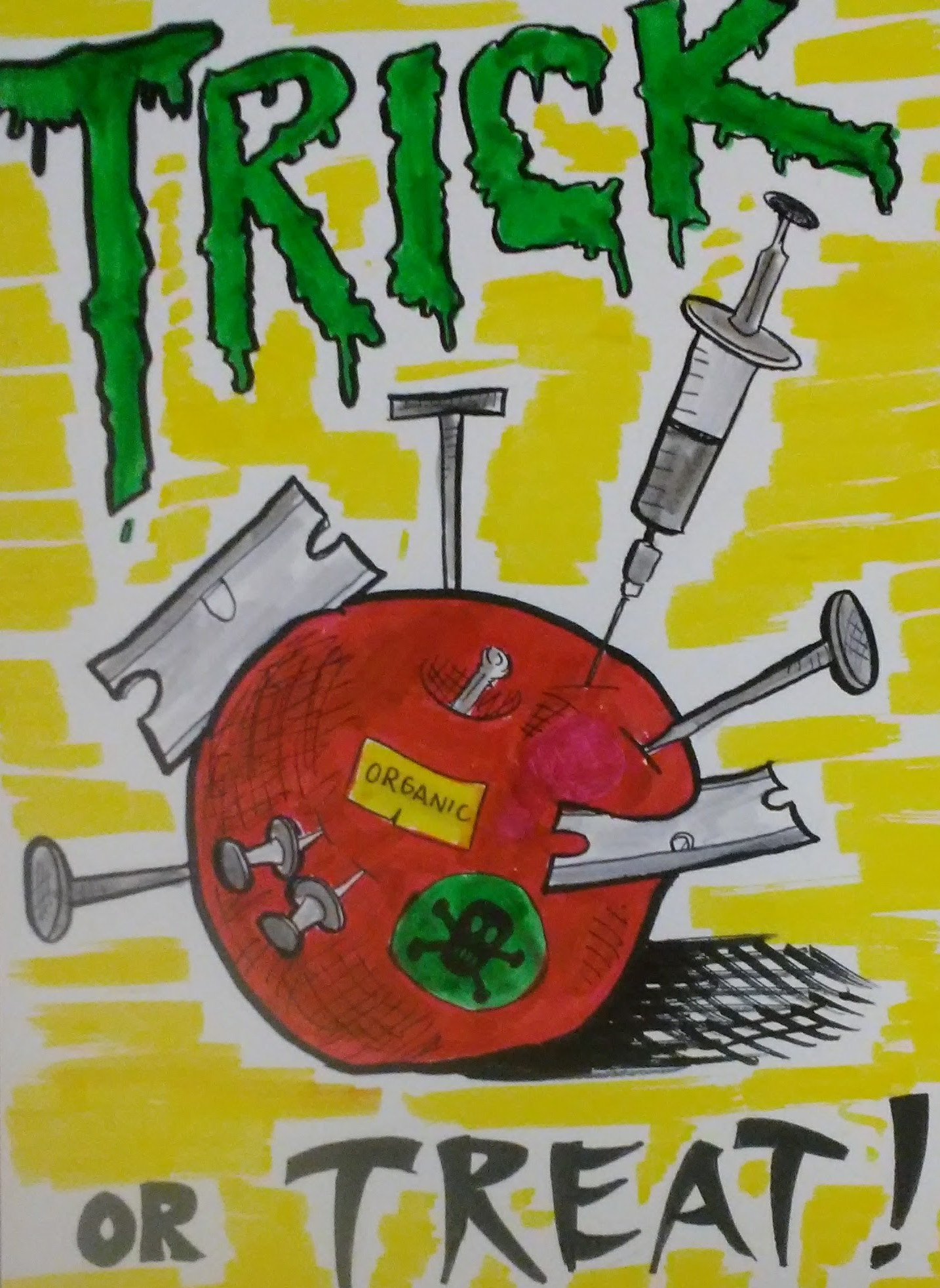
On day 30 I thought about all the stories from when I was a kid that people would put razor blades and poison inside trick or treat candy. It was a real scare back in the 80’s, right up there with satanic cults. Apparently, both the jacked up candy and the cults were greatly exaggerated rumors.
Anyhow, it made for a fun idea for my last drawing. After I finished inking it I felt like it was missing a little something, so I grabbed some nearby markers and did a very hasty job of adding some color, which I regretted immediately.
31) TRICK OR TREAT!
So there it is! Thirty-one completed drawings for Sketchtober! The whole thing ended up being waaaaay more complicated and stressful than it was supposed to be…
BUT I definitely achieved my goal of drawing regularly and staying creative. I learned a lot and I am really proud of a couple of those drawings.
When it was all over I was pretty relieved, but also kinda sad. One of the best side effects of this project was that a few of my friends on social media joined in and did daily drawings too! Creating that little community of sharing art and encouraging each other was super neat-o.
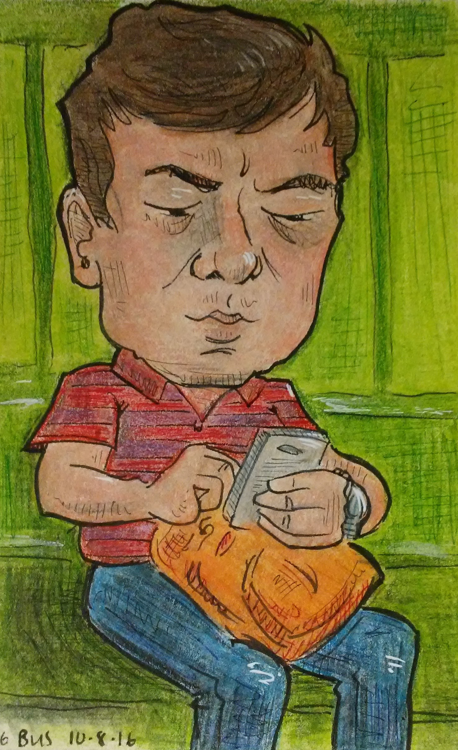
A loooong time ago I posted about a trip I took to NYC where I did a bunch of little caricatures of people on the subway and it was really fun and definitely a lightbulb experience. It was sort of the kick off of a new style for me, drawing these little portraits of people with big heads.
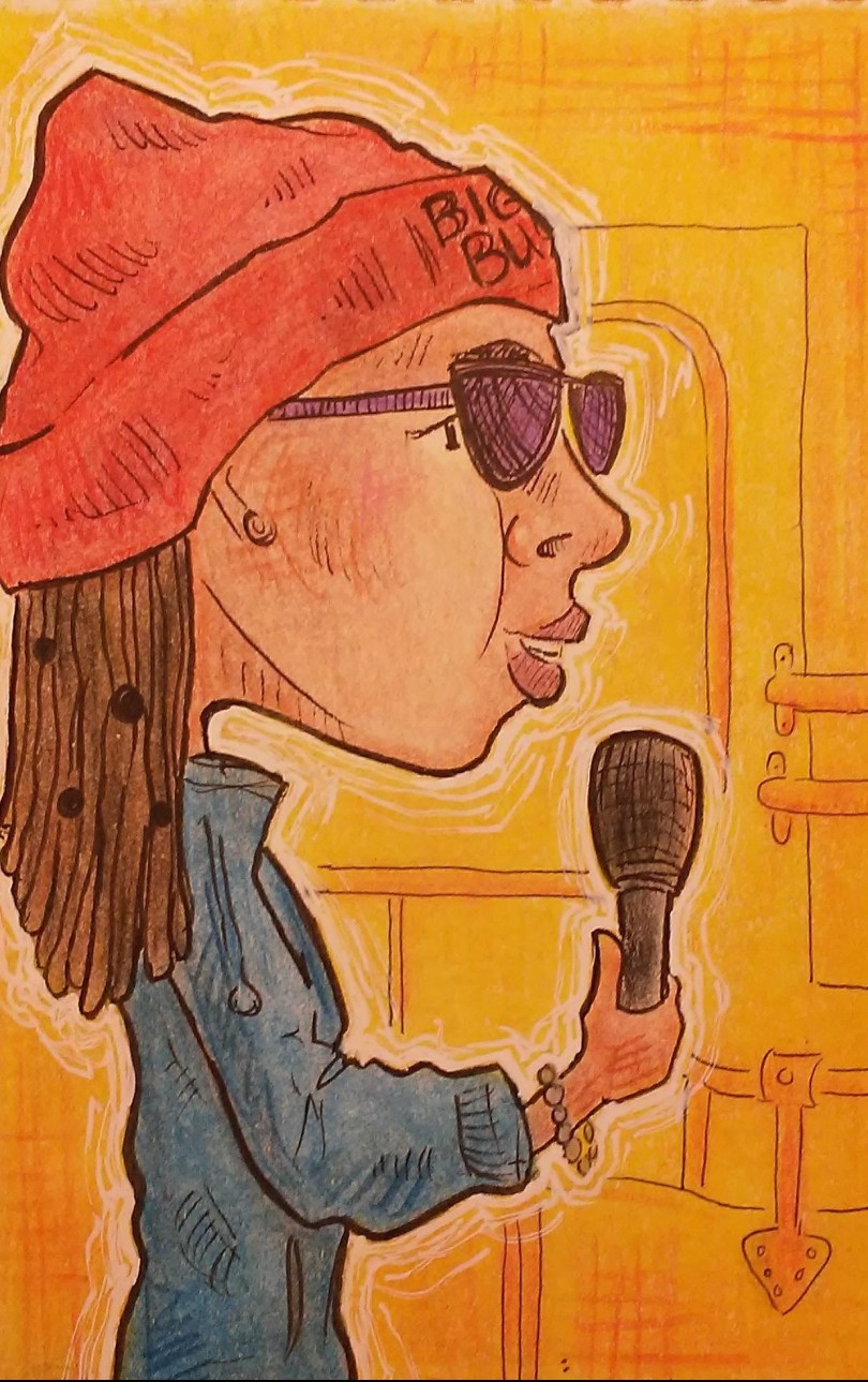
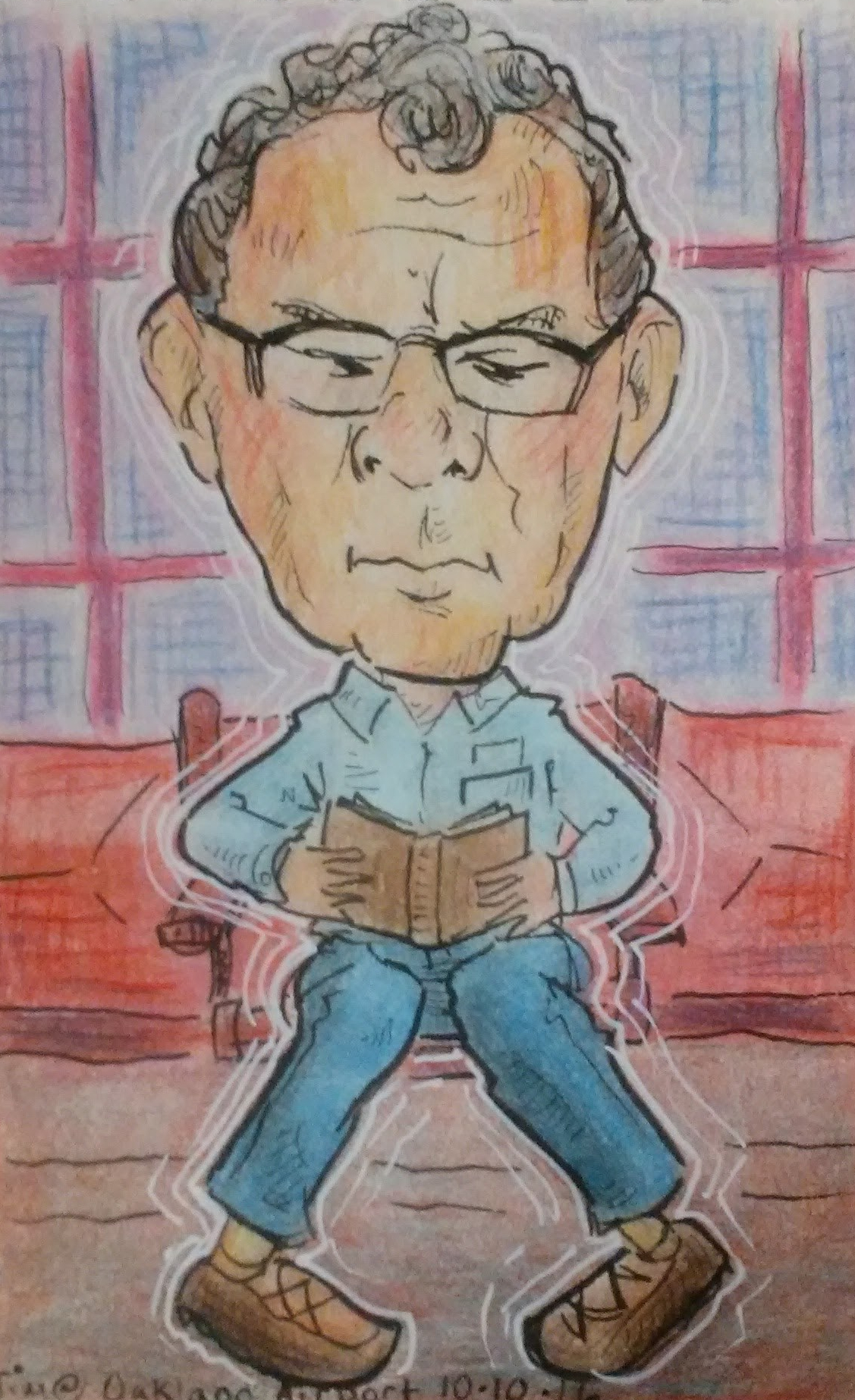
Recently on our trip to San Francisco we took the Big Bus Tour where you can get a pass to ride these cool double decker buses and you can hop on and off whenever you want. It was the perfect opportunity to do little portraits of other riders.
First of all, shout out our tour guide, Sparkle, who was so damn funny she made the rides such a blast. We actually got a 2-day pass for the big bus, and on the second day when we were waiting at the stop Richard said, “Wouldn’t it be cool if Sparkle was the tour guide again?” And then got on and there she was! We were thrilled. With so many buses going around at once, the chances that we would get on her bus two days in a row seemed pretty low. We were so lucky! I’m pretty sure she moonlights as a stand up comedian because she was cracking us up constantly.
The coolest thing about doing these little portraits is that it forces me to really look at strangers. And when I do that I start noticing things.
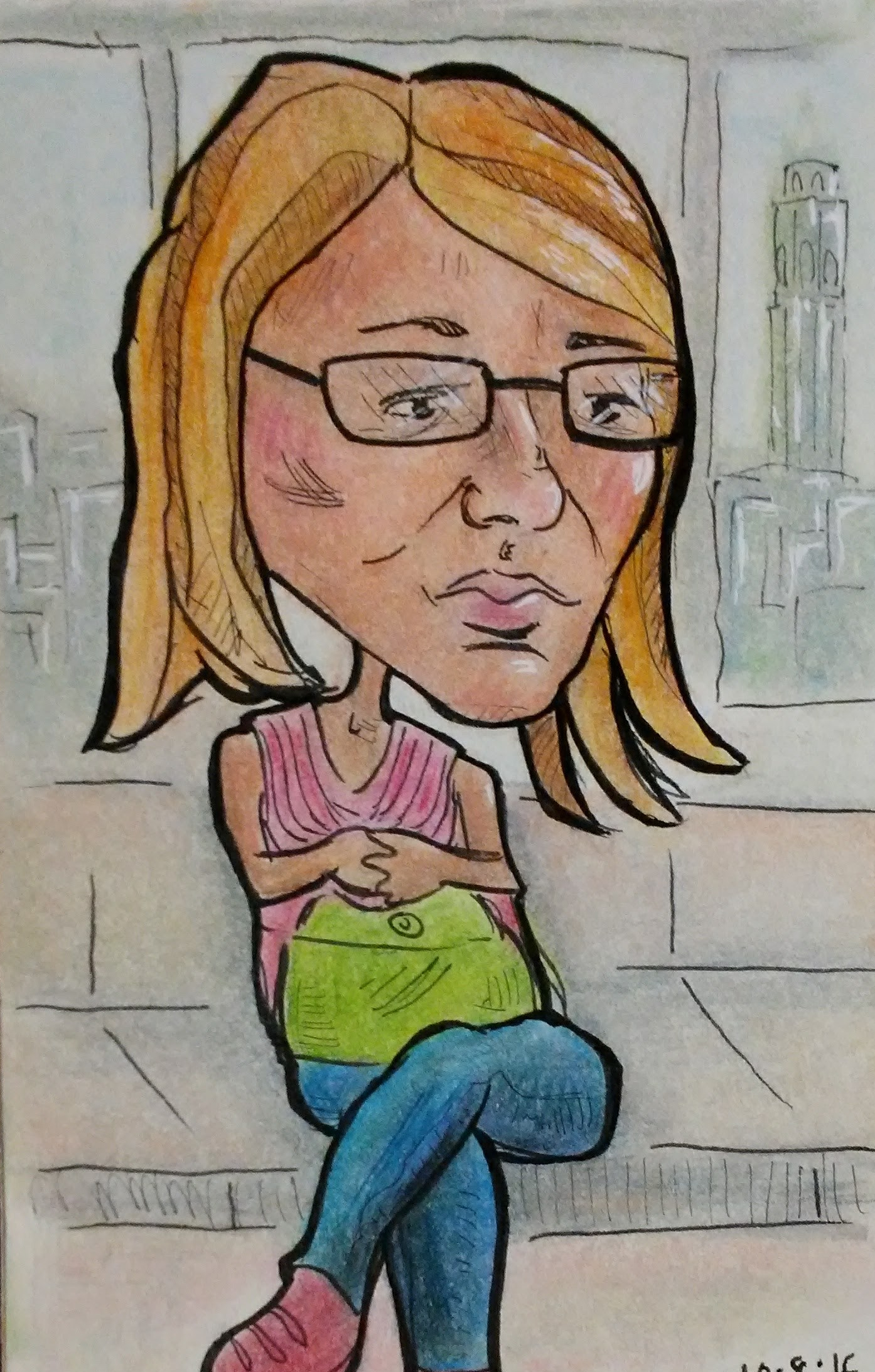
Like if the person has a nervous little tick, or fantastic eye make up, or a really methodical way that they take things out of their bag, or they are reading something really unusual, or they’re wearing shoes that look like they decorated them by hand.
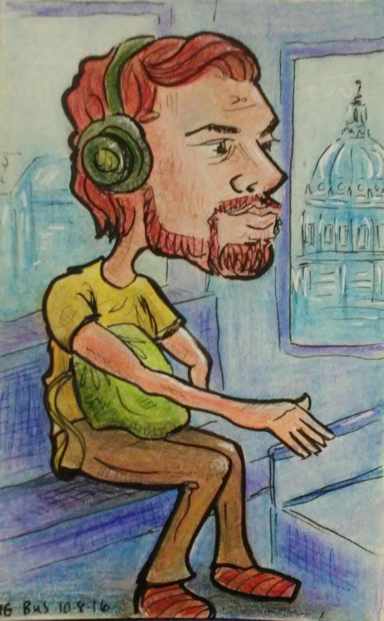
I see all these little things that make them suddenly seem so vulnerable and beautiful and interesting, stuff I never would have seen that if I wasn’t paying so close attention to them. In those moments I feel lucky that I got to see them in that way.
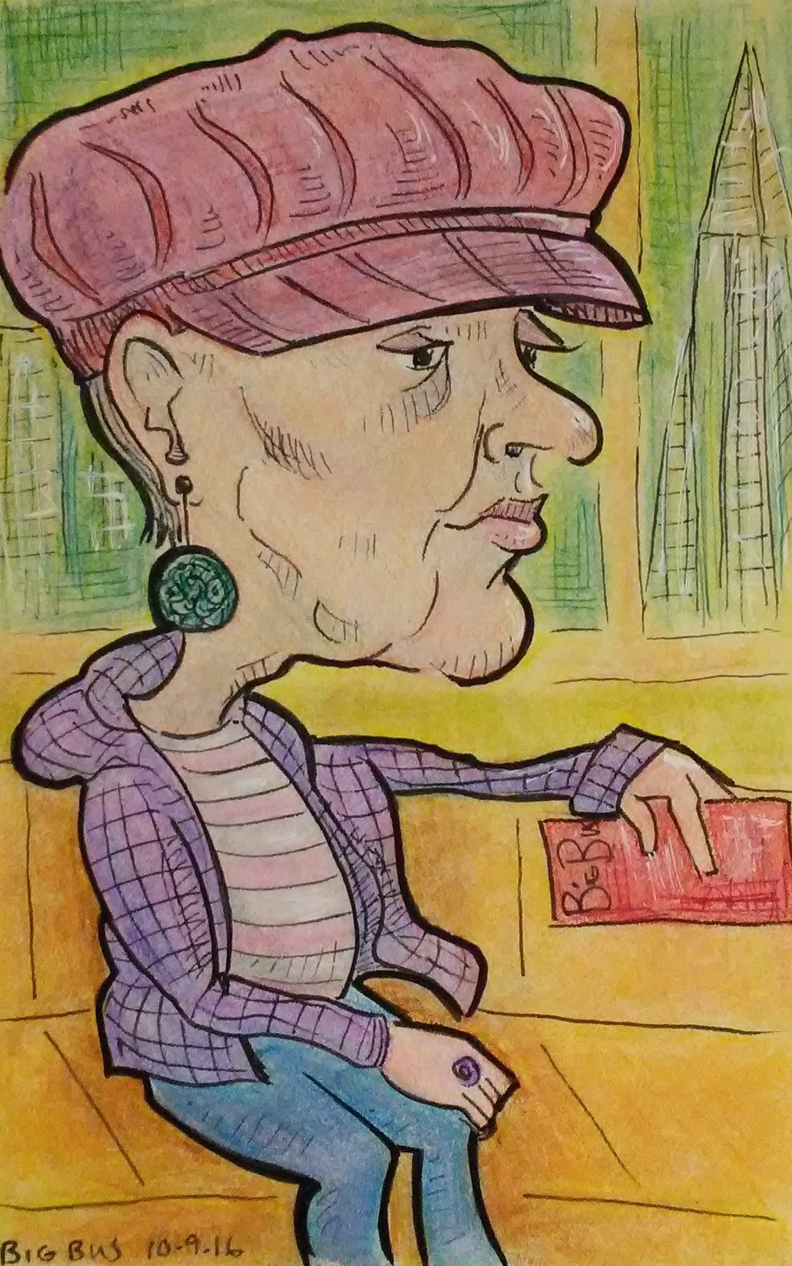
When I am drawing people out in public I try to be as discreet as possible because there is nothing more awkward than that moment when I get caught.
“Hey what are you doing? Are you.. drawing me?”
“Uh, yeah. Sorry. Please don’t be creeped out, I’m not obsessed with you or anything, this is just what I do. And you happened to be in my line of vision which made you the most convenient person to sketch, but as I was looking at you and noticed how beautiful and human you are and I really wanted to document it.”
“Okay, I’m leaving now.”
I carry a small notebook that keep half hidden in my lap and I wear sunglasses so that people are less likely to notice me staring at them.
I only had a few minutes to draw each person on the bus. I started with pencil, quickly sketching their face and the most interesting details about their clothing and stuff.
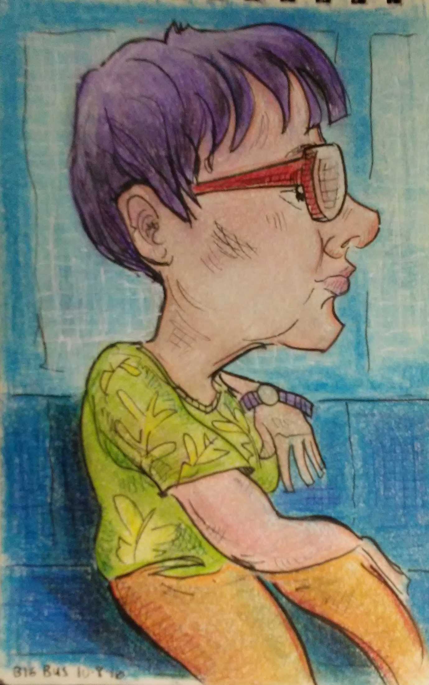
Then later, like back at the hotel, or on the plane ride home, I went back over the lines in ink. And sometimes I added a background. Since we were on a city tour, I threw in major San Francisco landmarks.
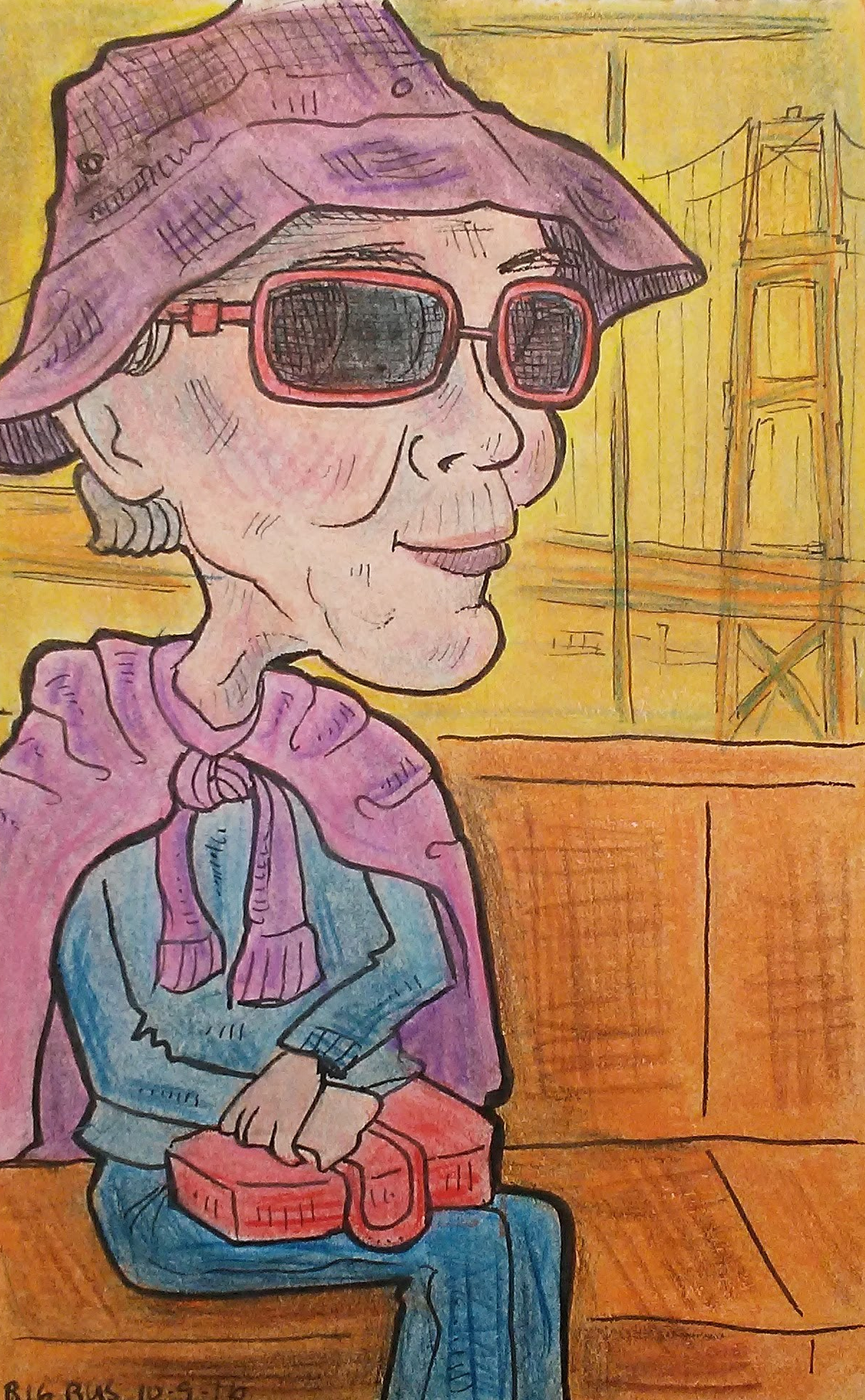
After that I colored them with colored pencil. I did most of these back in Phoenix, after the trip was over, which is sort of a nice way to extend a vacation. Working on the drawings allowed me to relive those moments on the tour.
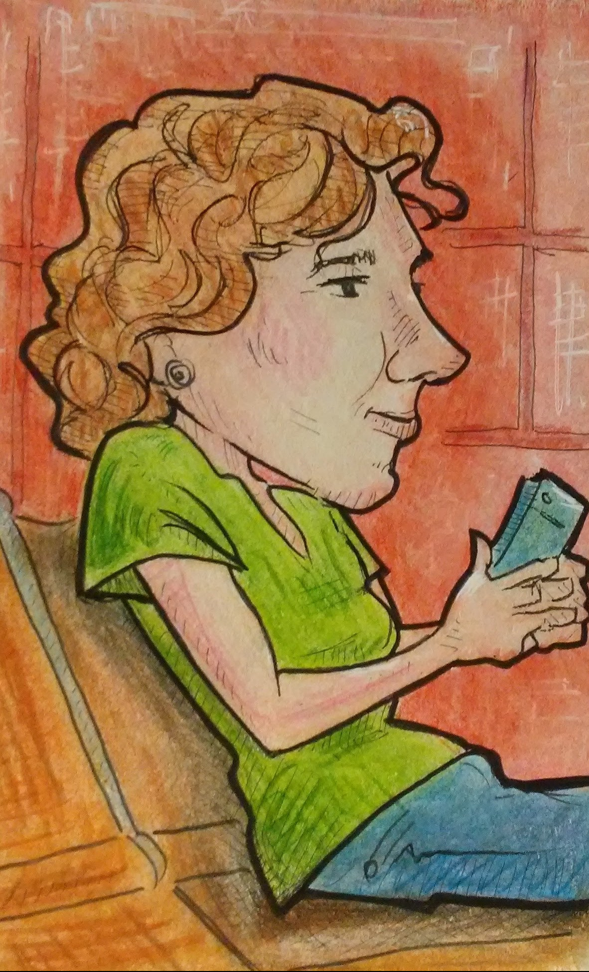
It was also a good chance to experiment with color theory. Since I didn’t make any notes on what colors people were wearing, I just made it up, and played around with combinations.
I had so much fun doing these little portraits.
