Posts Tagged ‘drawing people’

h1

How I learned to stop worrying and love the color wheel…

December 17, 2018

When it comes to drawing people in public I always run into two big challenges:

1) People rarely sit still.

2) I don’t want to get caught staring at them.

That’s why I love going to play readings.

If you aren’t familiar with the theatre world, a reading is part of a playwright’s development process. Once they have finished a draft of their play, they invite actors to come read the script aloud for a small audience of trusted friends and creatives, who then give feedback about their experience. The playwright uses that feedback to help inform their rewrites.

Play readings provide a great opportunity to draw people because the actors sit in relatively the same position for the duration of the play, and as an audience member I am supposed to look at them. So I get to hear a play for free, be part of a playwright’s creative process, AND get some good sketching in. Triple win!

Some time ago I attended a reading of a play called Ear*, written by my brilliant friend, Ashley Naftule. Ear is a f’cking great script, loosely inspired by my man Vincent Van Gogh.

Meet Steve and Marcella, two of the actors from the reading.


I was real happy with how these two drawings came out, and I kinda agonized over whether or not to color them.

This was right around the time I was first starting to become an alcoholic.

On the one hand, I knew that I needed to continue pushing myself out of my comfort zone of black and white, and into the wonderful world of color. On the other hand, I liked them in B&W and was afraid I’d eff ’em up!

Then I remembered that you can’t move forward without taking risks, and you sure as hell shouldn’t be precious about your stuff. So I dove in.

(BTW, I realize that using the word risk in reference to coloring a little 4×6 inch drawing might be a stretch, but I can’t afford to go skydiving.)

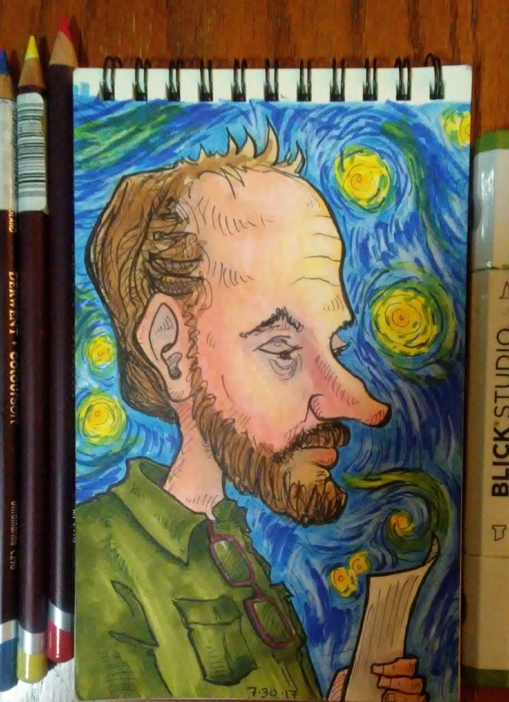
Before going to town with markers I laid down some undertones with red, blue and yellow colored pencil. I learned how to do this on a great You Tube channel called Kiara’s Studio. Kiara calls this “color zoning.”

0902171700

The pencil undertones show through the marker layer and create a level of depth and richness that I think would be difficult to achieve with markers alone.

Since we were reading a play inspired by Van Gogh, I put a third grade quality version of Starry Night in Steve’s background.

(Third gradeness not intentional, just the best I could do.)
0903170813a-e1543766937709.jpg

For Marcella’s background I wanted to do a simple design with colors that would compliment the one’s I used on her face.

I have a pocket color wheel that I use all the time when figuring out color stuff. It’s a great tool. For this picture I chose a split complementary color scheme.

0903170812

The reddish orange area of Marcella’s cheek seemed to be the most eye catching area to me, so I used that as the base point. The complement of red-orange is blue-green. In a split complementary scheme you use the two colors one each side of the complement, hence the blue and green background.

split-complementary-colour-elegant-image-result-for-split-plementary-colors-color-wheel-of-split-complementary-colour-e1543839048839.jpg

In the end I was real happy with how these little portraits came out, and so so so glad I faced my fears and colored them.


I know that I still have a long ways to go when it comes to color and markers, and even when it comes to drawing. But I feel like I’ve made some big strides forward this past year or two — not just in art but in other areas as well — and that has everything to do with trying sh*t that feels kinda scary.

Pretty much 100% of what I know about using alcohol-based markers I learned on You Tube, mostly from Kiara’s studio. She specializes in portraits and is amazing with skin tones. She’s also on IG at kiarasstudio. Her work is lovely so go check it out.

*Happy side note: Ear went on to have a very successful production at Space 55, and was nominated for several awards! Way to go Ash!

h1

Special Features

November 30, 2018

I am crazy lucky that I just happen to be married to my favorite person to draw. And although one might assume that any artist’s favorite person to draw would be their spouse — because they love them so much or whatever — that’s not really true.

(Although I do love him so much or whatever.)

Richard would be my favorite even if I was married to someone else. He just has a really fun face. And he’s actually a life drawing model, so there are lots of artists and teachers around town that agree with me.

0403171413a.jpg

There are some types of faces that I find tough to draw. This has nothing to do with their level of attractiveness. I know tons of people that are super good-looking, but whose likeness I just can’t seem to recreate on the page.

The people I find the most challenging to draw are kids. I think this has something to do with the lack of special features: the things on your face OTHER than eyes, nose, and mouth. This could be things that are actually part of the face such as wrinkles, moles, facial hair and scars. Or it could be add ons, like glasses, braces, nose/lip/eyebrow ring, a cigarette, or a monocle.

(Sadly, I don’t get nearly enough opportunities to draw people with a monocle.)

Richard has a lot of special features. He usually has facial hair. He often wears glasses. He has 3 tiny moles that form a triangle on the upper left side of his face. He has another mole on his right cheek. He has a very distinct nose, and these mischievous eyebrows that sometimes make him look like an evil magician.

0615171010b

All that extra stuff helps break up the face, which makes it easier to translate a 3 dimensional human onto a 2 dimensional plane. I can get the size, shape, and angle of something more accurate by looking at it in relation to something else.

For example, whenever I do someone from a 3/4 angle I almost always draw their face too narrow the first time around, and I end up having to erase and adjust. I never seem to put enough distance between their nose and their ear. That’s because there usually isn’t much there. Cheeks are kinda like the desert of the face. Just a big open space with not much happening, which makes it hard to determine where things land.

In the drawing below I was able to use Richard’s glasses to figure out the distance between his eyes, nose and ear. And even though my style is way more caricature than realistic, the same rules still apply. Your baseline is still reality, you just choose which things to exaggerate and which things to simplify or exclude.

0606170901.jpg

In addition to the special features on his face, Richard is also a big fan of accessories. He loves watches, rings, wristbands, buttons, all kinds of hats, and fun T-shirts. He also likes to change up his look regularly. He’ll shave his head in different ways, reshape his goatee, paint his nails, or put on a tie and jacket for literally no reason.

All of this stuff makes a person more fun and interesting to draw. When I am out in the world trying to discreetly draw strangers, details like these will inform the story that I make up about the person in my head.

I did all of these drawings with pen and colored pencil. One of the challenges with using colored pencils is that because of the nature of the medium, a lot of paper shows through, even with with layering, so the drawing comes out looking kinda dull and muted.

The way to fix this is by blending. There are several methods you can use to blend. My favorite way lately is to use a Prismacolor colorless blender MARKER. This is basically the same as using rubbing alcohol solvent, but it’s contained in a handy dandy marker.

Afterwards I use a white gel pen to add some highlights. (Not too much!)

0406171357.jpg

One cool thing about being married to a life drawing model is that he is used to being stared at AND he’s great at sitting still. So whenever we go out to dinner he lets me sketch him while we’re waiting for our food. It’s way better than staring at our stupid phones.